Generate a section from a component
csdx studio:section:create turns a component you already have into a Studio Section: a block that content authors can drop onto a page and edit on the canvas.
It starts from a component file, reads the props that component takes, works out which CMS fields should fill them, and writes the Section into your Studio project. At render time, Studio hands your component fully-populated props.
It is always interactive. Nothing reaches Contentstack or your files until you confirm.
Terms
| Term | Meaning |
|---|---|
| Section | A composition, created as an entry in your stack. It wraps your component so an author can place it on a page and fill it with content. |
| Section display name | Display name for the Section in Studio. Defaults to one based on the file name, and offers an alternative if it's taken. |
| Content type | The content type the Section binds against, and where its content comes from. |
| Root | The Section's linked schema: the shape it expects, and what Studio matches when an author drops it on a page. A whole content type, a global field, a group, or one block. |
| Bind | Point a prop at a field, so that field's value fills it. |
| Resolve | Load a reference, so data from another content type actually arrives. |
| Slot | A named spot inside the Section where an author can drop a different component. Step 7 turns the children of your component into Slots. |
| Section Prop | A value inside the Section that you expose, such as a headline or a button label, so an author can override it each time they place the Section in a Template. You expose one on the screen that binds a single prop. See Let templates change a value. |
Syntax
csdx studio:section:create [--component <path>] [--content-type <uid>] [--name <name>] [--intro]
| Flag | Alias | Effect |
|---|---|---|
--component | -c | Component file to turn into a Section. Omit it and step 1 lists the components in your project. |
--content-type | -t | UID of the content type to link to. Skips step 2. |
--name | Sets the Section display name. | |
--intro | Print what the command does before it runs. |
All studio:* commands also take -h, --help and -v, --version.
Prerequisites
| You need | Why |
|---|---|
| The CLI installed and a project linked | The Section is written to the active project. See Set up the CLI |
| A component file | The command reads its props from your source |
| A content type to link to | Or let the flow propose one during step 2 |
Your component does not need to be registered first. The command registers it for you, adding it to your register-components file or asking where to create one if you have none. Which file it picks is on Push your code into Studio.
The flow
The command works through a sequence of screens, each one asking a single question. This is the whole path, from picking a component to the Section being written:
Step 1 · Pick the component                   skipped with -c
  └ What goes in each Slot?                   if your component has a <Slot>
Step 2 · Pick the content type                skipped with -t
Step 3 · Pick what the Section links to
Step 4 · Bind your N props
  └ Bind one prop to a field                  when you open a prop from the list
Step 5 · Choose which references load         if a binding crosses a reference
Step 6 · Review before anything is written
  └ Wrap the Section?                         if your root sits inside something that repeats
──────────────────── the Section is written here ────────────────────
Step 7 · Which children become Slots          if your component renders other components
Done
Not every run shows every screen. The numbered steps always run. The indented ones open out of the step above them, and the rest appear only when your component or your schema calls for them. The step numbers on screen count only the screens your run shows, so yours can differ from these.
Headings below are the titles you see on screen.
Step 1 · Pick the component
Which component becomes the Section. Skipped when you pass -c.
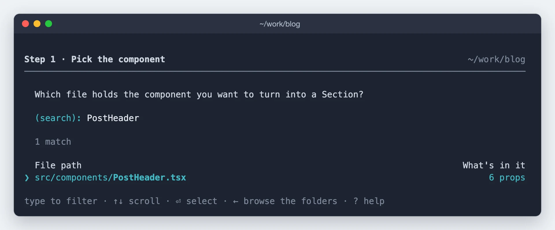
Type to filter, or ← to walk the folders. The command then reads your component's props and Slots from source, and tells you about any props it is skipping because your component never uses them.
What goes in each Slot?
A Slot is a named spot inside your component where an author can drop a different component on the
canvas. This screen asks what fills each <Slot> your component renders, one screen per Slot, in
source order.
You see it when your component's source already has a <Slot> in it, which is what
studio:component:add leaves behind when it extracts a repeated group into its
own component.
If your component has no Slots, this step is skipped.
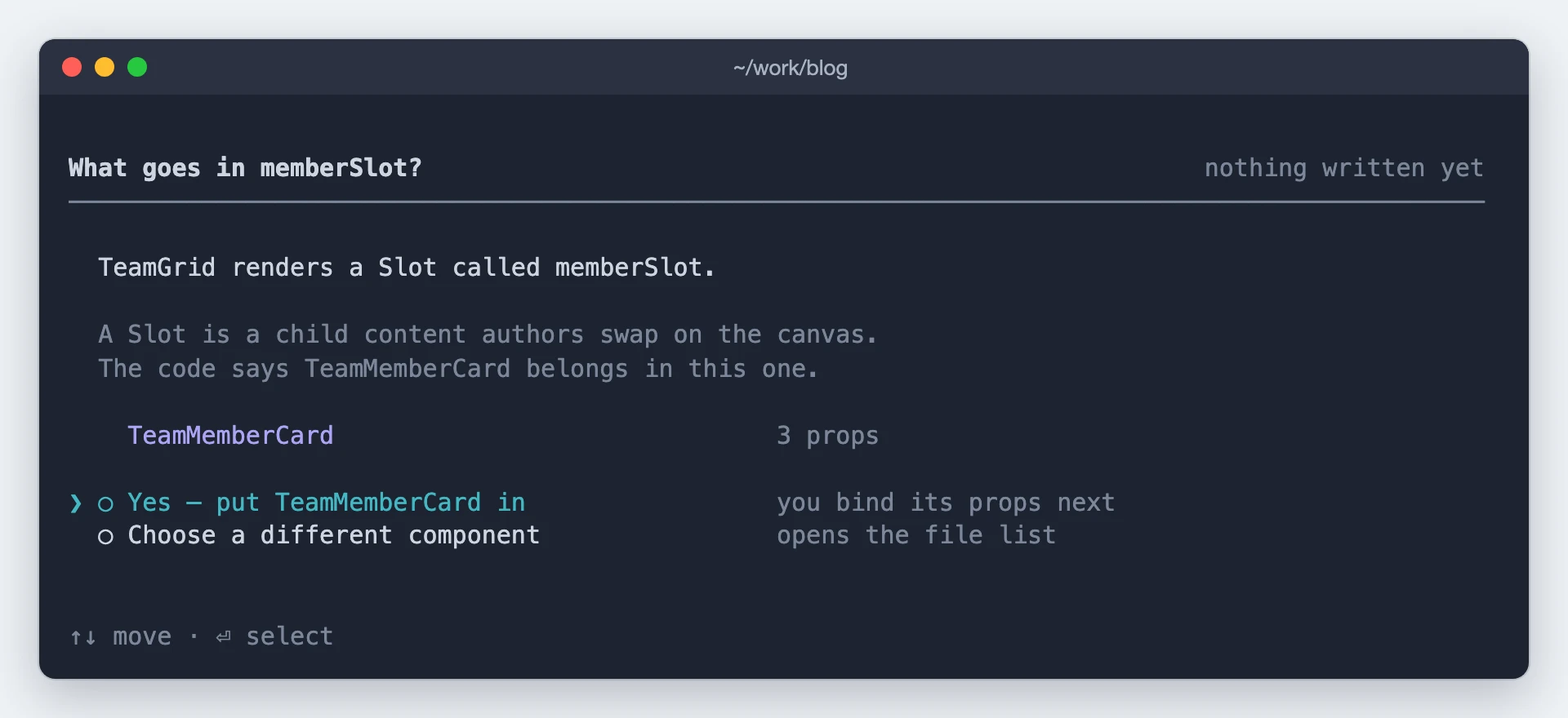
The CLI suggests an inner component to drop into the Slot. Accept it, or pick something else from the same file list step 1 uses. Decline, and the Slot is left empty for an author to fill on the canvas.
It runs before the content type question because the child you settle on brings its own props, and those change what there is to match. Nothing is written at this screen: your answer is held until the review in step 6.
Step 2 · Pick the content type
Which content type the Section links to. Skipped when you pass -t.
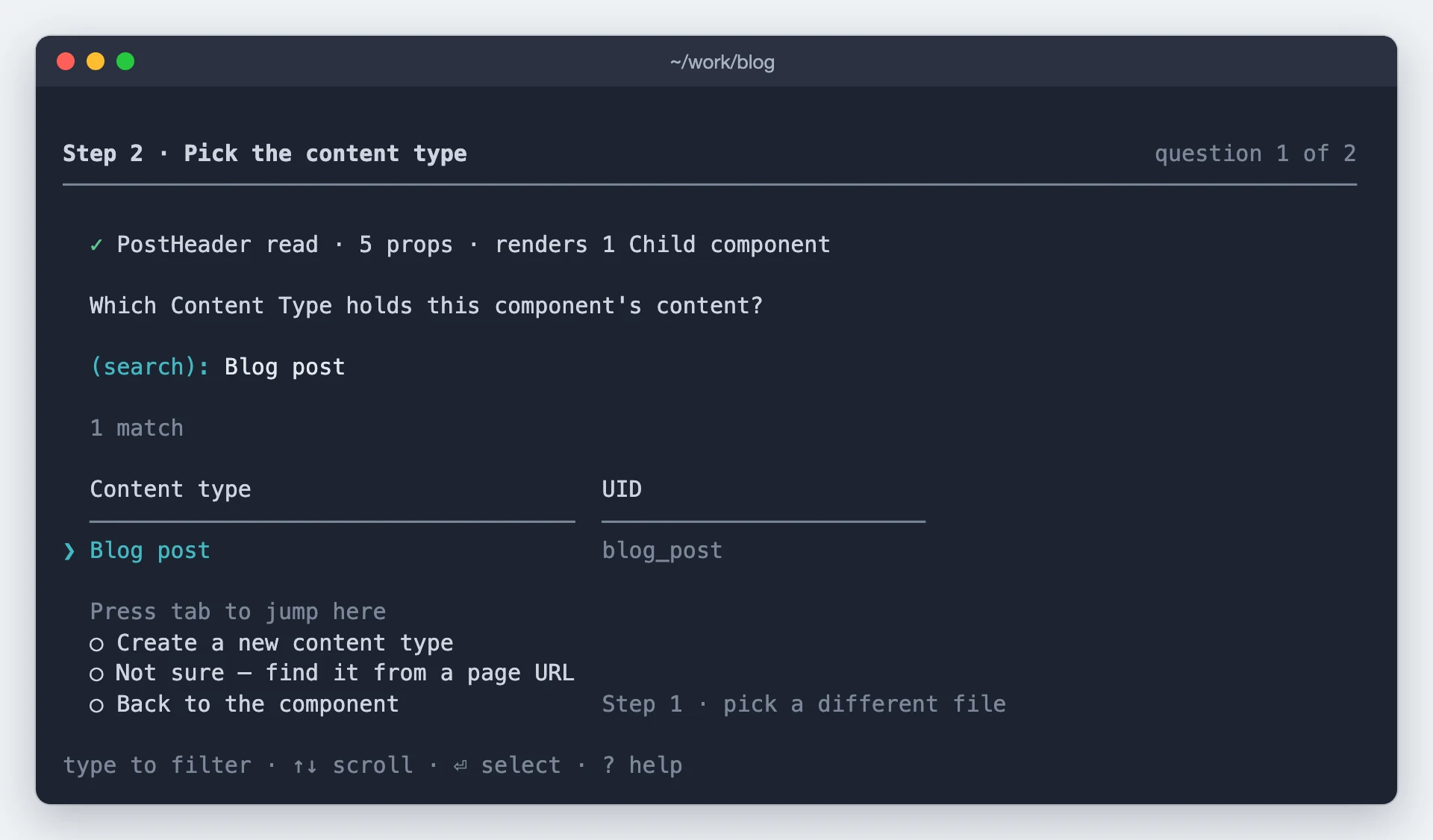
Pick any content type from the list, or create a new one if none of them fit, in which case the command designs its schema from your component's props.
If you don't know which content type to pick, choose the last row. It asks for the path of a live page
where this component renders, such as /pricing, and reports which content type powers that page.
Step 3 · Pick what the Section links to
A content type can be large, and your Section usually needs only part of it. This step picks the Section's Root: the point in the schema it binds to, and the shape Studio matches when an author drops it on a page. That can be the whole content type, a group, a modular blocks field, or a single block.
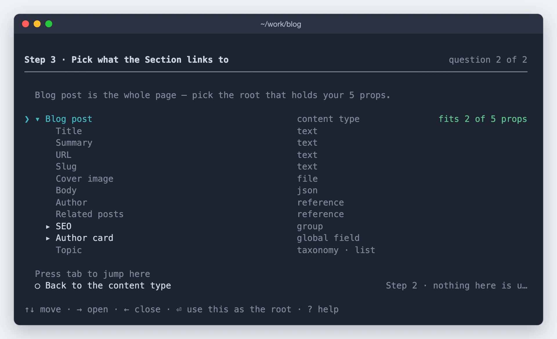
Every row is selectable and the verdict column says whether it can hold a Section. The cursor starts on the whole content type, so ⏎ roots it at the top.
Note: For a Modular Blocks field the level matters. Root it on the field and your Section repeats, rendering once per matching block in the list. Root it on one block and it renders once, for that block only.
Step 4 · Bind your N props
Your component's props need values, and those come from the fields on the content type you picked. This step binds them: each prop is pointed at a field, so that field's value fills it at render time.
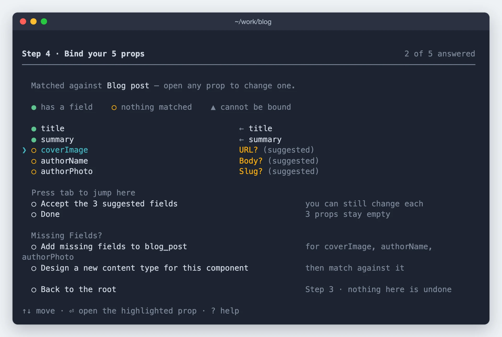
The command has already matched what it can, so this screen is mostly a check. The marker beside each prop tells you where it stands: it has a field, nothing matched it, or it can't be bound at all.
If the matches look right, choose Done and carry on. To change one, select that prop and answer it
yourself. If props are unmatched because your content type doesn't have the fields yet, the Add
missing fields to <your content type> row creates them, or you can go back and pick a different
root.
Props that carry no content, like className, onClick, and data-*, are never bound. Everything else gets an answer, and nothing is quietly dropped.
Bind one prop to a field
To change the binding of one prop, select it on the step 4 list. This screen opens on that prop alone, and shows you the schema again so you can choose where its value comes from.
Only the rows that can actually hold that prop's type are offered. The rest stay greyed, and the
screen says so in as many words, so you never bind a file prop to a text field by accident. A
reference you haven't opened yet shows what it accepts, and → reads it so you can bind to a field
inside it.
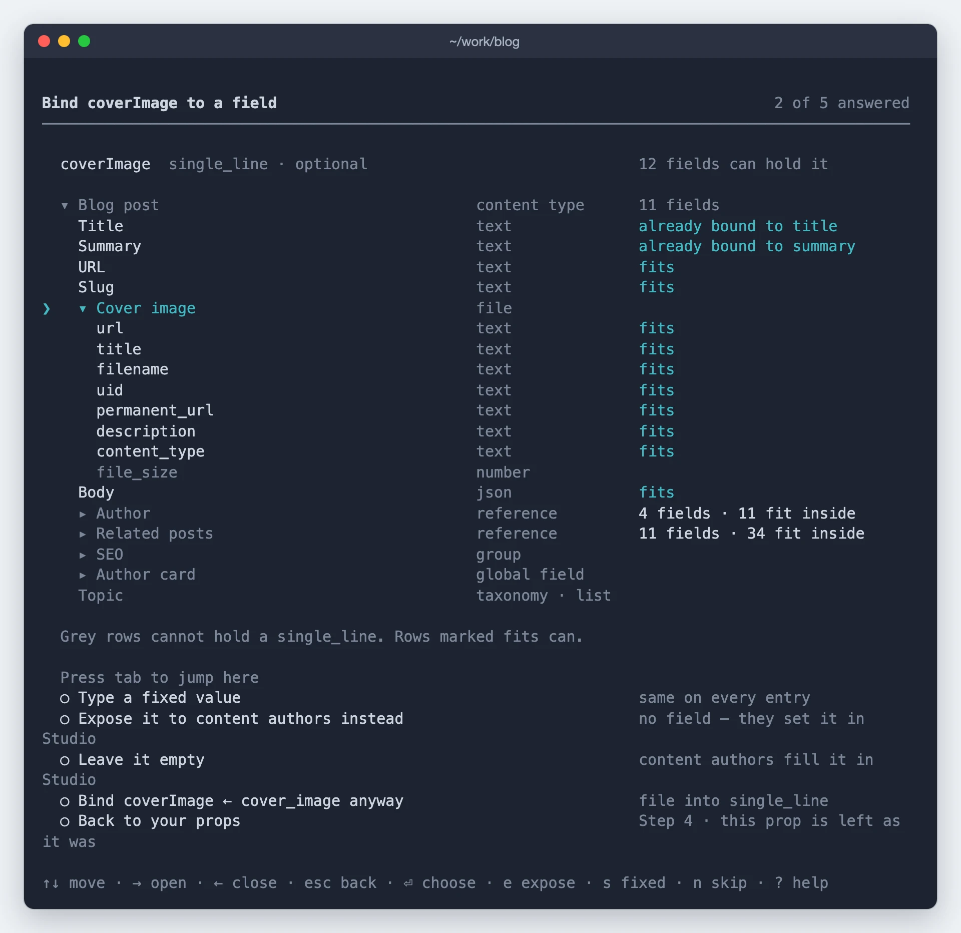
You have four ways to answer, and answering sends you straight back to the step 4 list:
- Bind it to a field, including a field inside a reference.
- Type a fixed value, a static value stored on the Section rather than read from a field, so every entry renders the same thing.
- Leave it empty, so it stays a placeholder for authors to fill on the canvas. Your component's
own default still applies in the meantime, so nothing renders as
undefined. - Expose it, so authors can override it on each instance of the Section. See Expose Section Props.
Step 5 · Choose which references load
Which references to load. Data behind an unloaded reference never arrives.
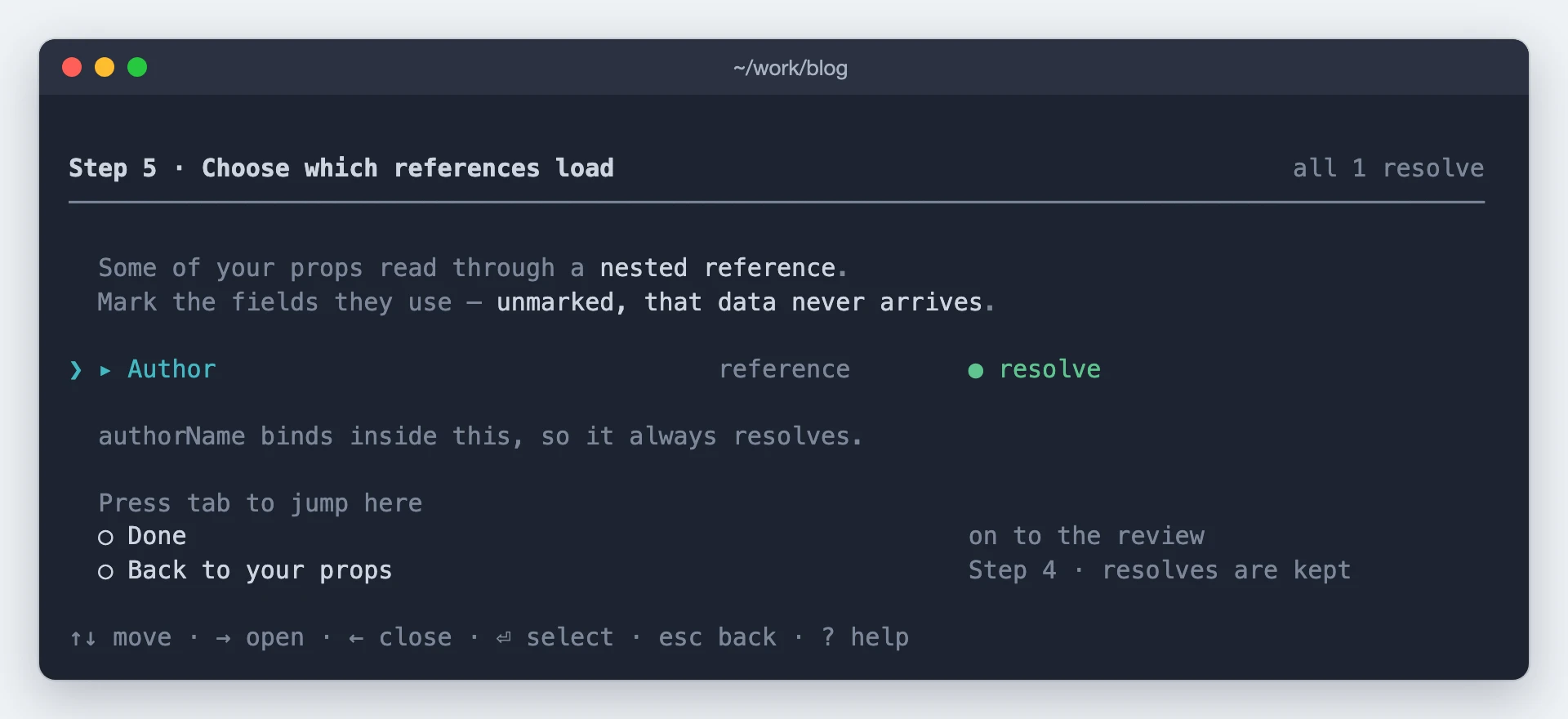
Nothing is switched on for you. The likely ones are ordered first with the cursor on them, so taking the suggestion is one keypress, but each reference you load adds to what Studio fetches for every entry.
Step 6 · Review before anything is written
Whether to go ahead.
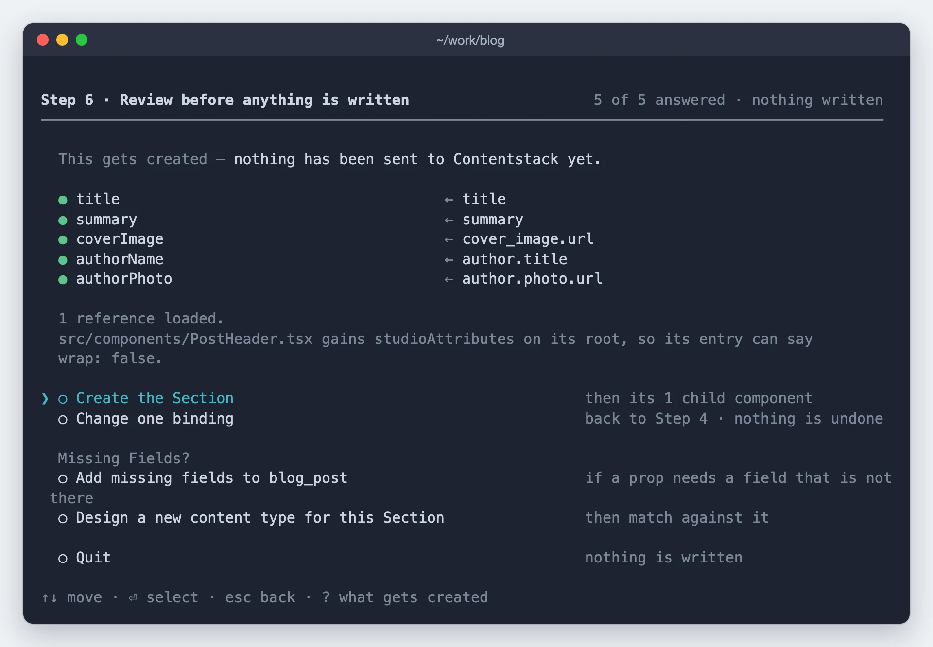
The same props as step 4, now settled, plus what the Section links to. Press ? to see what gets created. Quitting writes nothing.
Wrap the Section?
When your root sits inside something that repeats, the command offers a wrapper: an outer Section that loops over the list and puts your Section into each item. You only see this screen in that case, and only just before anything is written.
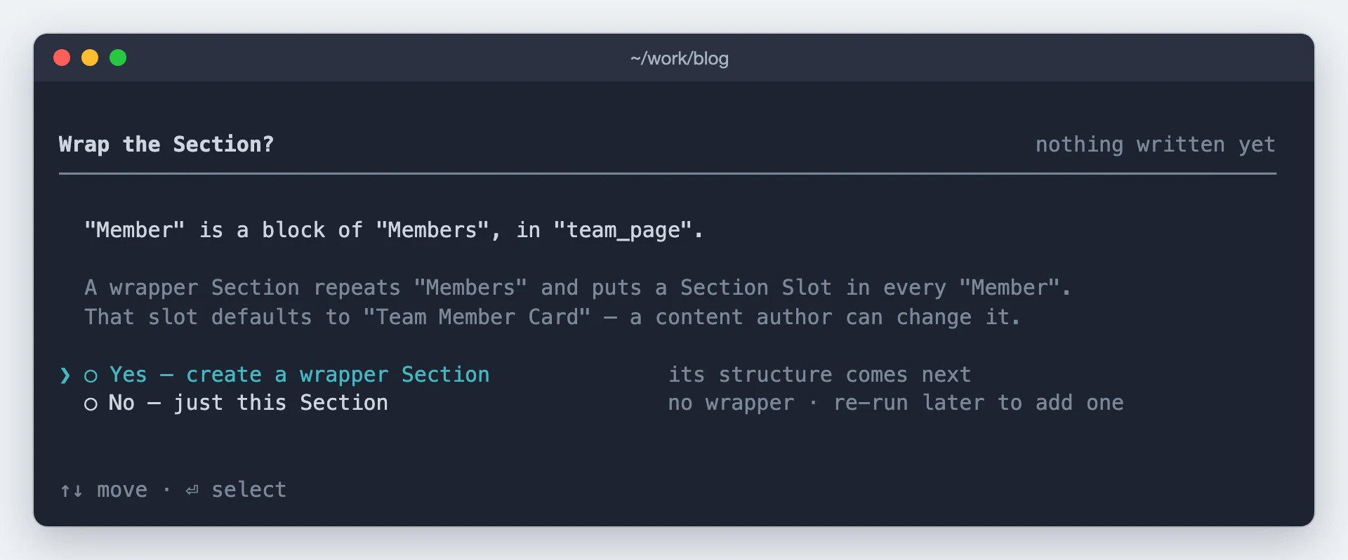
This changes the shape of the Section itself, which is why it can't be added afterwards. Saying yes shows you the structure before it writes it, and the drop zone it creates is a Section Slot defaulting to your new Section.
Step 7 · Which children become Slots
When your component renders other components, this step offers to turn them into Slots, so authors can swap each one on the canvas. You only see it in that case, and it runs after the Section is written, so the Section exists whichever way you answer.
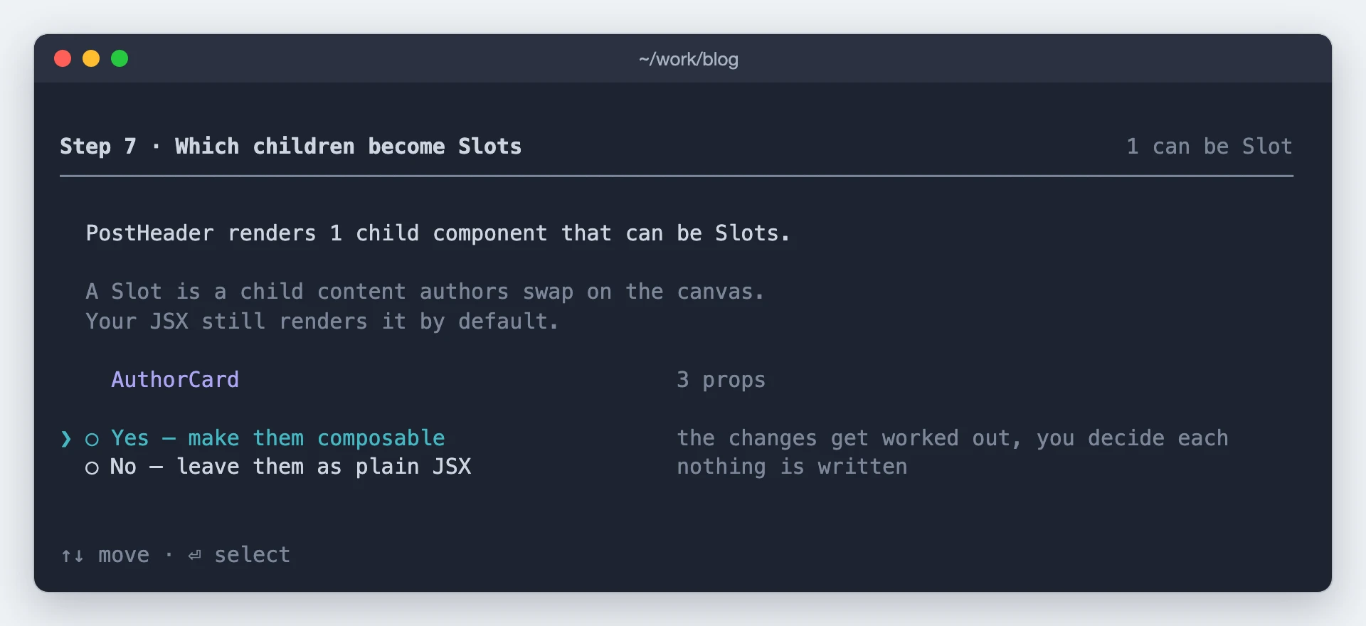
Saying no costs nothing. Saying yes lists the children that can be Slots, and you pick where to start:
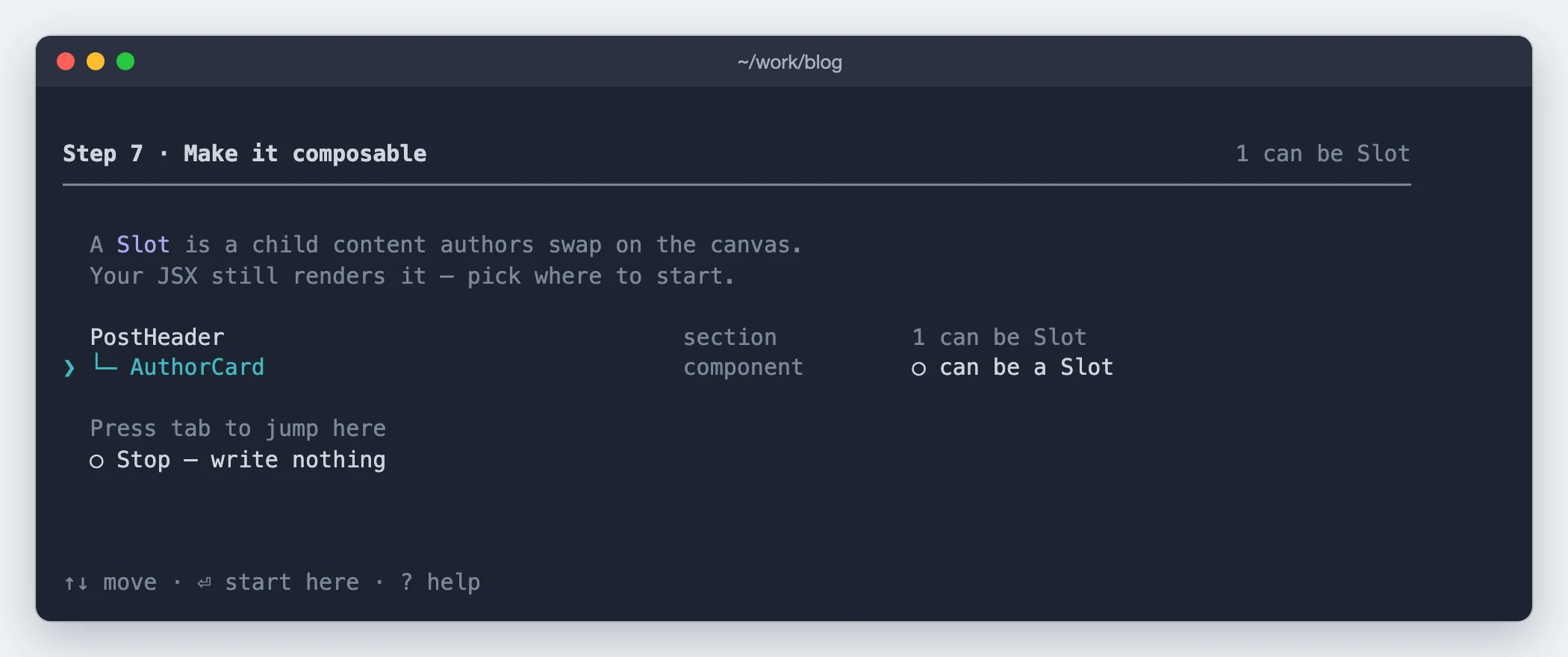
Each child you pick opens a board with its change:
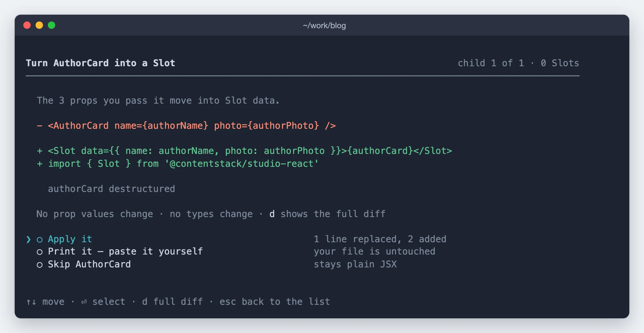
Press d for the full diff. Every choice is shown for approval before it lands. Children that take a callback prop are skipped, since a callback isn't something an author can edit.
Done
Once the Section is created, this screen shows its section composition link, along with a summary of what was bound and anything that still needs your attention.
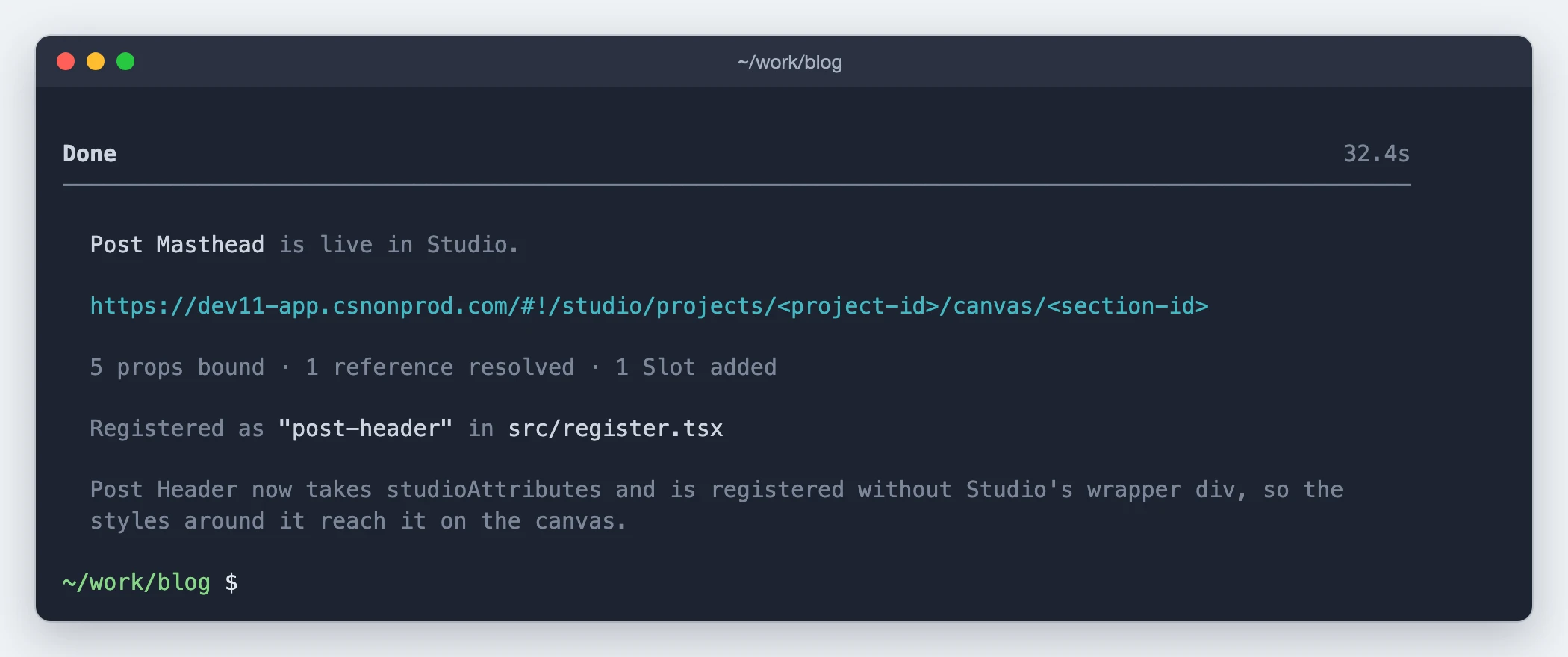
A full run
PostHeader.tsx takes title, summary, coverImage, authorName, and authorPhoto, and renders an
AuthorCard. The blog_post content type has an author reference.
Each screen collapses to a single line once you answer it, so this is what the scrollback looks like by the time the Slots question opens:
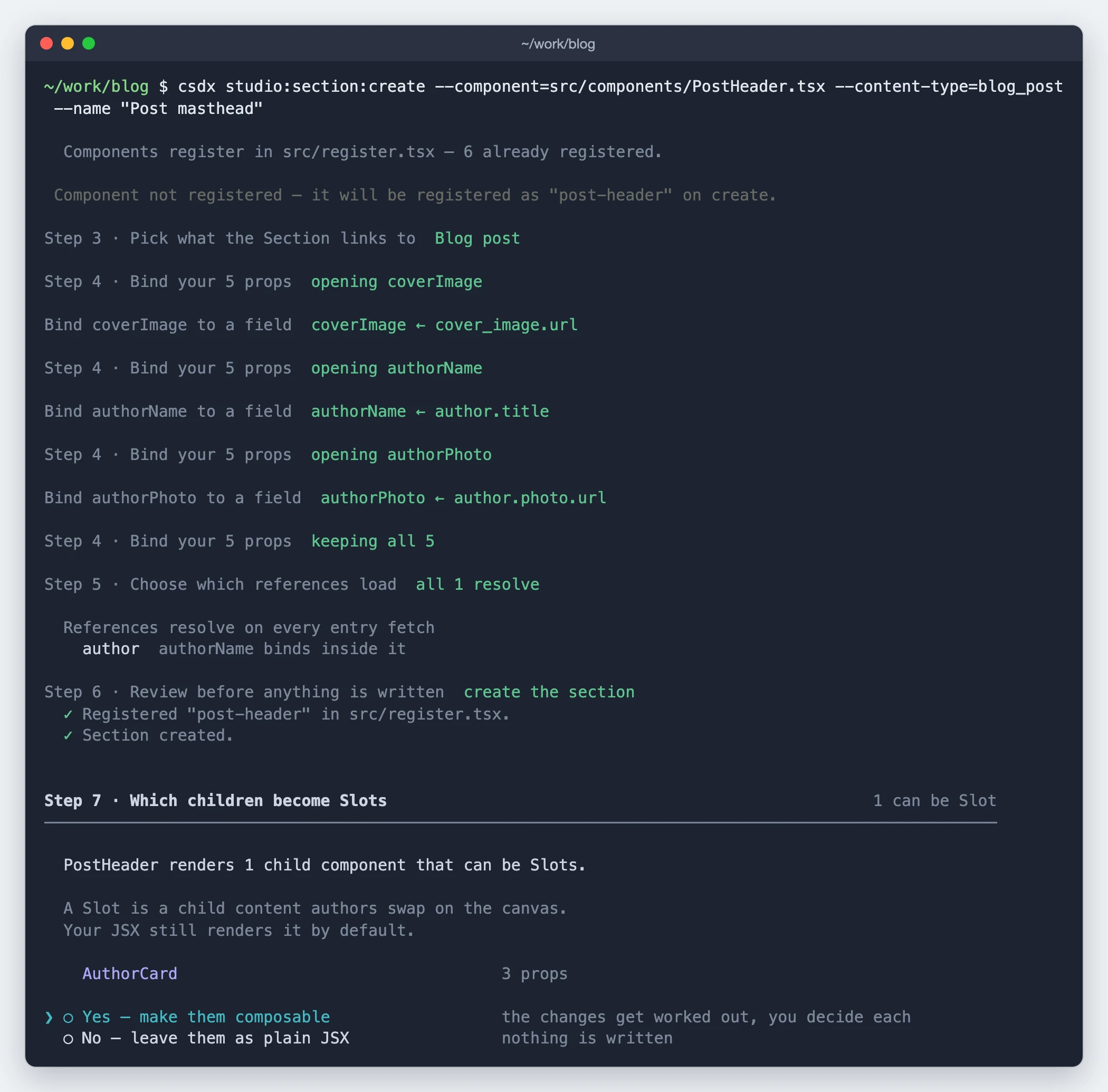
Three screens never appeared. Steps 1 and 2 were answered by -c and -t. The Slot question was
skipped because PostHeader declares no <Slot>, and Wrap the Section? was skipped because the
root is the whole blog_post content type, with nothing repeating above it.
The step 4 lines are the loop: each opening line is a prop opened from the list, the line under it
is the field it was bound to, and keeping all 5 is finishing. Saying yes to the Slots question and
applying the board ends on the Done screen: a Post Masthead Section that authors can drop
on a blog post page, filled from the post and its author, with an AuthorCard they can swap.
What it changes
| Where | What |
|---|---|
| Your stack | A composition entry for the Section, plus a second one if you accepted a wrapper. |
Your register file, usually studio/register-components.ts | An entry for your component, added to the existing file or to one it asks to create. Other entries are left alone, and a failed run undoes its own change. |
| Your component file | A studioAttributes spread on its root when the command registers it, so Studio's wrapper <div> doesn't block your CSS on the canvas. Plus any step 8 change you apply. |
Nothing else in your project is touched.
If it doesn't work
| Problem | Fix |
|---|---|
| A prop is bound but renders nothing | Its value sits behind a reference that was never loaded. Open the Section on the canvas and switch that reference on in the data picker. |
| An inner component renders blank | Same cause as above, one level up: its data sits behind a reference on the parent's entry that was never loaded. Switch that one on in the data picker too. Binding the inner component's prop straight to a field is not the fix, because it gives every item the same value. |
Exit codes
| Code | Meaning |
|---|---|
0 | Done, or you quit early |
1 | Cancelled |
2 | Component missing, its props unreadable, or registering it failed |
3 | No content type, or credentials rejected |
4 | No active project, or project or content type not found |
5 | Failed validation, nothing written |
6 | The write failed |
See also
- Choose your starting point: this command against
composition:build. - Generate from a design: the same job starting from a design rather than a component you already have.
- CLI commands: every
studio:*command, its flags and its output. - Sections and Binding a Section to CMS data: what you just made, and how binding works.
- Expose Section Props: the per-instance overrides you can create while binding.
- design-section-from-jsx: the same decisions, in chat in your editor.