Make your components styleable
Make a registered component styleable to choose what authors can change in the Design tab. You do it in the component's registration and in the component itself, and you need it whenever a Design edit does nothing.
The example on this page is the BlogHero component in the Blog project. It keeps its props, and gets two style groups: Hero and Heading. The code on this page leaves out the props imagePosition and actions to stay short.
Prerequisites
- You've registered the component. See Register a component.
- You've turned on Enable Freeform Feature for the project, or you're on a freeform template. See Enable Freeform Feature.
- You don't need to register tokens first. Without them, the Design tab offers Studio's defaults. To register your own, see Register design tokens.
What this is and what you get
A component you register with no styles gets one group named default with every control. You declare style groups to choose what the Design tab offers instead. The tab offers the controls you choose for each group.
Studio compiles each group's edits into one CSS class, and your component puts that class on an element. If you declare styles, only the groups you declare exist. Declaring only heading removes the default group.
For the model behind this, see How styling works.
Declare style groups
styles is an object. Each key is a style group, shown as its own entry in the Design tab. A group takes these fields.
| Field | What it does |
|---|---|
displayName | The group's label in the Design tab. It defaults to the group's key. |
styleSections | Which controls the group offers. A group with no styleSections gets every control. See Choose which controls a group offers. |
defaultStyles | Styles Studio writes onto the component at the default breakpoint when an author drops it. It takes camelCase CSS properties. |
defaultClasses | Classes the group applies to its element. |
To use a token in defaultStyles, take the value from the object registerDesignTokens returns, such as tokens.typography.color["ink"].
In the registration for BlogHero, add styles with a default group and a heading group. wrap: false keeps Studio from adding a wrapper element around the component.
import { registerComponent } from "@contentstack/studio-react";
import { BlogHero } from "../components/BlogHero";
import { tokens } from "./register-design-tokens";

registerComponent({
  type: "blog-hero",
  component: BlogHero,
  wrap: false,
  // displayName, sections and props stay as you registered them.
  styles: {
    default: {
      displayName: "Hero",
      styleSections: ["block"],
      defaultStyles: {
        backgroundColor: tokens.background.color["surface"],
        paddingBlock: tokens.spacing.padding["space-lg"],
      },
    },
    heading: {
      displayName: "Heading",
      styleSections: ["text"],
      defaultStyles: {
        color: tokens.typography.color["ink"],
        fontSize: tokens.typography.fontSize["heading-1"],
      },
    },
  },
});
If the CLI wrote your register-design-tokens.ts, check the name it exports. The Figma route exports designTokens, so import that name instead of tokens.
If your component doesn't apply a group's class, the Design tab tells you. See Apply each group in your component.
Don't name a group after a registered prop. Studio applies props last, so the prop replaces the group's class. No warning appears in the console when a registered prop shares a group's name. The Design tab shows the className message instead. BlogHero has a title prop, so a group named title would replace its own class.
With several groups, the Design tab lists them by display name, and you open one to see its controls. With one group, the tab opens it.
Choose which controls a group offers
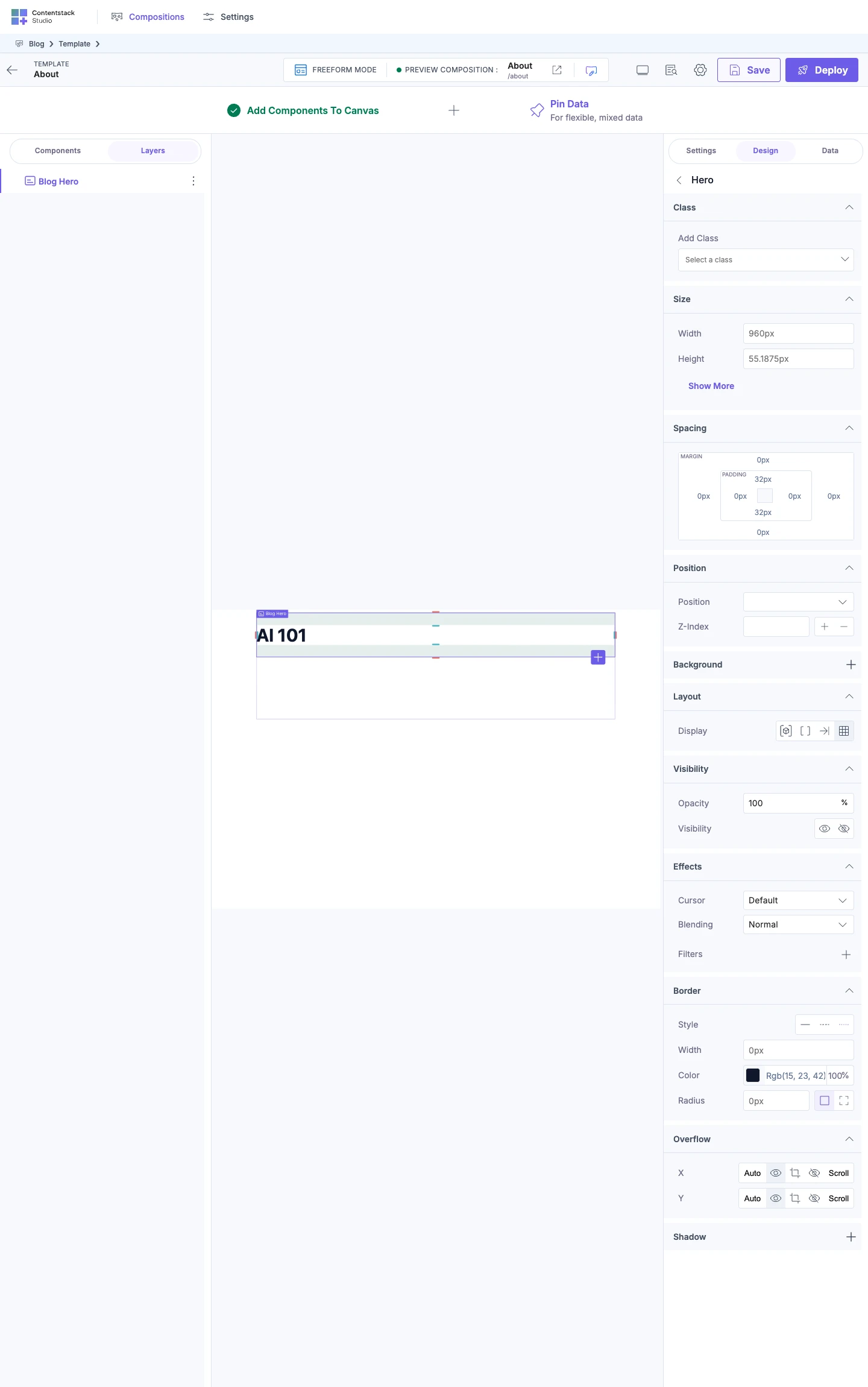
styleSections takes a list of section names, "all" or "none". In a list, "block" is a shortcut for several sections and "text" is a shortcut for Typography.
| Value | Controls the group offers |
|---|---|
"all" | Every control. It's the same as leaving out styleSections. |
["block"] | Class, Size, Spacing, Position, Background, Layout, Visibility, Effects, Border, Overflow and Shadow. |
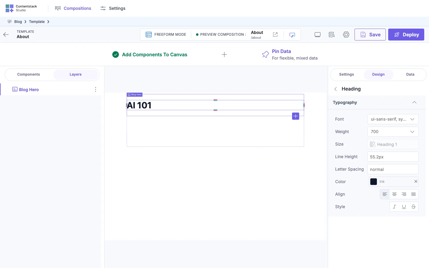
["text"] | Typography. |
"none", or an empty list | No controls. |
Transform and Media are in neither shortcut. Add them by name, such as ["block", "transform"].
These are the section names: class, size, spacing, position, visibility, layout, typography, transform, media, background, shadow, effect, overflow, border and responsive. The block shortcut includes responsive, which adds no control to the Design tab.
Studio ignores a name that isn't on the list and shows no warning. For example, effects adds nothing, because the name is effect. TypeScript flags it when you build.
The Design tab labels the sections Class, Size, Spacing, Position, Typography, Transform, Media, Background, Layout, Visibility, Effects, Border, Overflow and Shadow, in that order. For what each section's controls do, see Design tab controls.
Apply each group in your component
Declaring a group isn't enough. If your component doesn't apply the class, edits do nothing.
Studio passes the default group to your component as className. It passes every other group as a prop named after the group key. Put className on the element the default group styles, and each other group's prop on the element that group styles.
-
In
BlogHero, takeclassNameandheadingfrom the props. PutclassNameon the<section>andheadingon the<h1>.import type { StudioAttributes } from "@contentstack/studio-react";type BlogHeroProps = StudioAttributes & {title?: string;summary?: string;image?: string;className?: string;heading?: string;};export function BlogHero({ studioAttributes, title, summary, image, className, heading }: BlogHeroProps) {return (<section {...studioAttributes} className={className}><h1 className={heading}>{title}</h1><p>{summary}</p>{image && <img src={image} alt="" />}</section>);}The wrapper element Studio adds when
wrapis on doesn't get your styles.studioAttributesdoesn't include the classes either, so applyclassNameyourself. -
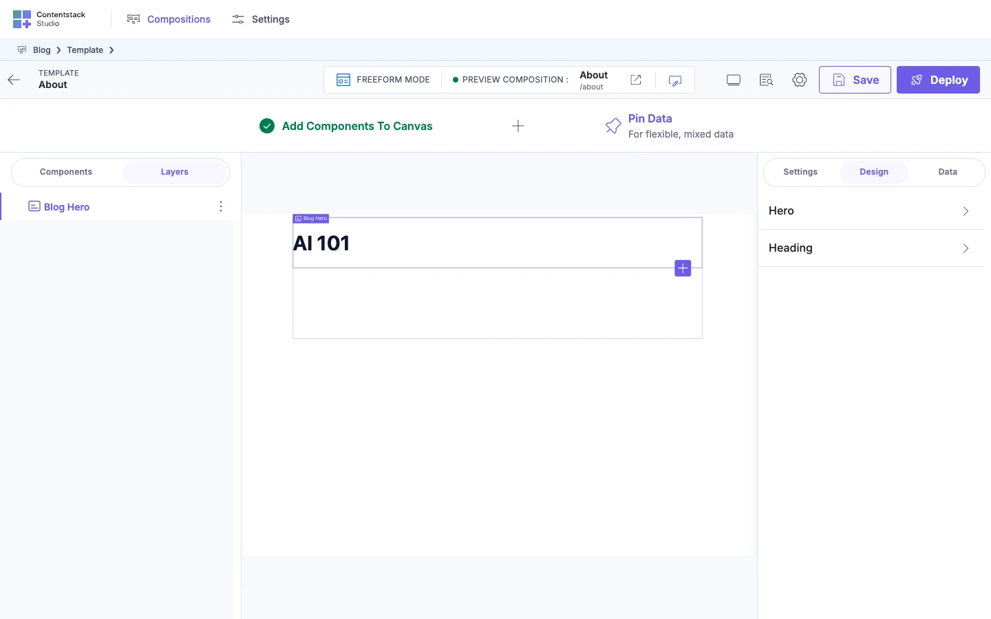
Check the groups. Reload the canvas so it reads your new registration. Open the About template, which has no sections yet. Add Blog Hero from the Components tab, select it, and open the Design tab.
The tab lists two groups, Hero and Heading. Open Heading. It offers only Typography.
If it doesn't work
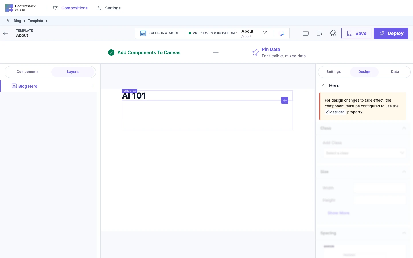
The Design tab says the component must use the className property. The group's class doesn't reach an element. The tab shows "For design changes to take effect, the component must be configured to use the className property." For a group other than default, the same message names the group, such as heading. While the message shows, the group's controls are disabled. Put className, or the group's prop, on an element your component renders. See Apply each group in your component.
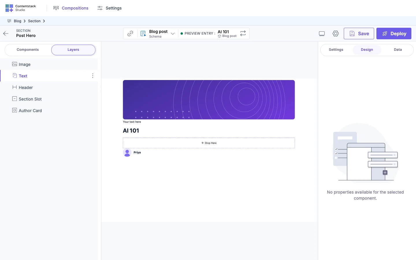
The Design tab says there are no properties. The tab shows "No properties available for the selected component." The component has no style groups, which happens with styles: {}. Declare at least one group.
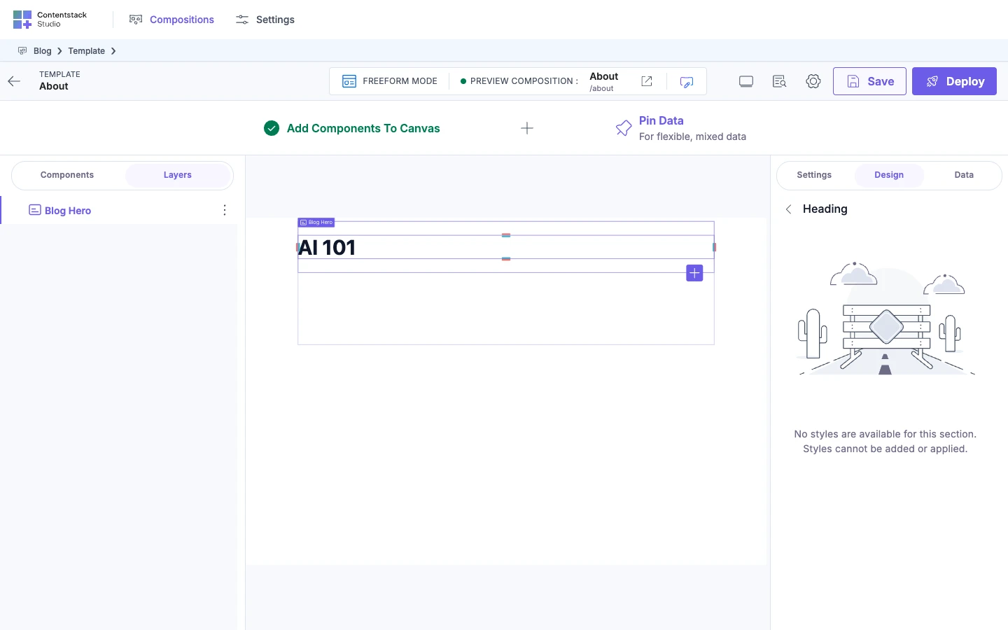
The Design tab says no styles are available for a section. The tab shows "No styles are available for this section. Styles cannot be added or applied." The group's styleSections is "none", an empty list, or only misspelled names. Set it to ["block"], ["text"] or a list of valid names.
A control is missing from a group. Its section isn't in styleSections. Transform and Media aren't in "block", so add them by name. Check the spelling of the other names.
Edits to a group do nothing. A registered prop shares the group's name, so the prop replaces the group's class. The Design tab shows the className message above, and no warning appears in the console. Rename the group.
The Design tab doesn't show. Enable Freeform Feature is off, and you're not on a freeform template. Turn it on. See Enable Freeform Feature.
To style a component on the canvas, see Style on the canvas. For the component checklist, see Component shape checklist.