How styling works
A style set in the Design tab does nothing unless your component puts its class on an element. Read this before you register design tokens, breakpoints or style groups, or when an edit in the Design tab seems to do nothing.
The example on this page is the Blog project's BlogHero component. It has a default style group named Hero and a heading style group named Heading. These names come from a sample team blog, so use your own components and style groups.
Styling has three layers
A developer registers tokens and breakpoints once, in code. After that, anyone styles on the canvas.
| Layer | Who sets it | What it does |
|---|---|---|
| Tokens and breakpoints | A developer, once, in your app's code | Names the values authors can select and the screen sizes they can style. |
| The Design tab | Authors, in the right panel | Authors select tokens and set styles. Studio saves them on the section or template they're editing. |
| Your component | A developer, when registering it | Accepts the class each style group produces and puts it on an element. |
Studio reads your tokens and breakpoints from your app running in the canvas. Until your app registers tokens, the Design tab offers Studio's default tokens.
Design tokens aren't the delivery tokens or management tokens in your stack settings.
If your component ignores the class Studio passes to it, the Design tab says so and the style does nothing.
A style becomes a class, and the class is passed as a prop
Studio compiles the styles set on one element into one CSS class for each style group. It generates that CSS when it renders, so it never edits your stylesheet. Studio saves the edits on the section or template you're editing, for each group and each breakpoint, not in your code.
Studio passes the default group to your component as className. It passes every other group as a prop named after the group. In the example, Hero is the default group, so Studio passes it as className. Heading is the heading group, so Studio passes it as the heading prop. BlogHero puts className on its <section> and heading on its <h1>.
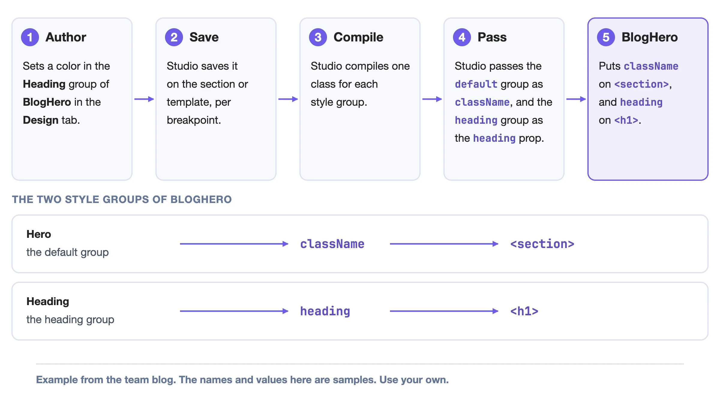
Your component has to put each class on an element. A class that never gets put on an element styles nothing. The Design tab then shows a message that the component must use the className property. For a group other than default, the message names the group's prop, such as heading, instead of className. For the full message, see Make your components styleable.
Studio applies props last. A prop with the same name as a group replaces that group's class. If BlogHero had a group named title, its title prop would replace the group's class.
What Studio styles for you and what your component must do
Built-in components declare their own style groups and put the classes on their own elements. A built-in component also starts with default styles. Header, for example, starts with a color and a font size.
Text and Style Sheet have no style groups, so the Design tab shows "No properties available for the selected component."
If you register a component with no styles, it gets one group named default with every control. If you declare styles, the Design tab offers only the groups you declare. BlogHero declares default and heading, so those are its two groups. For the controls a group can offer, see Design tab controls.
How responsive styling works
Studio saves a style for one breakpoint. The first breakpoint is the base layer and has no media query. Every other breakpoint wraps its styles in an @media rule built from its query.
Studio ships three breakpoints: Desktop, Tablet and Mobile. The Blog site registers its own three with the same names. The shipped set is desktop first, so a style set on Desktop applies at every width until a narrower breakpoint overrides it. The Desktop label doesn't limit the style to desktop screens. For the queries, see Register breakpoints.
A breakpoint's query decides when its styles apply on your live site. Its preview size only sets the width and height of the canvas frame. On the canvas, your site's own CSS at the frame's width decides which breakpoint your edits go to. Studio observes that breakpoint and doesn't assign it.
The canvas opens on the first breakpoint, unless the author selected another viewport earlier for that project.
An empty control shows the value your site applies as a placeholder. That includes values inherited from a wider breakpoint or from your own CSS. To read the panel, see Style on the canvas.
Where to go next
- To register your colors and spacing, see Register design tokens.
- To register your screen sizes, see Register breakpoints.
- To decide what authors can change on one of your components, see Make your components styleable.
- To style on the canvas, see Style on the canvas.