Register a component
Register a component to put it in Studio's Components tab, so anyone building a template or section can drop it on the canvas and set its props. You register once per component, in your app's code, with registerComponent or registerComponents from @contentstack/studio-react.
The example on this page is a blog. Its Blog post content type is blog_post, and the entry AI 101 lives at /blog/ai-101. You're registering four components. BlogHero goes in the group Blog · Components, Avatar and Byline go in Blog · Elements, and Stack goes in Blog · Layout.
BlogHero, fromsrc/components/BlogHero.tsx, with the propstitle,summaryandimage.Avatar, with the propssrcandsize. It renders an author's photo.Byline, with the proptext. It renders an author's name.Stack, with the propsdirectionandgapand the slotchildren. It holds other components in a row or a column.
Authors build the Author card section in Studio from Avatar, Byline and Stack, over the author_card global field. You don't register an author-card component. See From a design to components.
Prerequisites
- The Studio SDK installed and initialized in your app. See Install the Studio SDK.
- A component that passes the Component shape checklist.
- To check your work, a Studio project whose canvas loads your app. See Verify your setup end to end.
What this is and what you get
Registering tells Studio a component's name, its props and how to render it. When you're done, BlogHero has a tile in the Components tab, and its props show in the Settings tab when someone selects it on the canvas.
Register the components your site already has. Studio renders them inside your running app, so authors see the same component your visitors do.
Faster ways to do this
- CLI.
csdx studio:component:register --component-path=src/components/BlogHero.tsxreads your component and writes the registration code into your project. It overwrites any file already at the same path. It doesn't setwrap: falseor add thestudioAttributesspread, so a component it registers keeps Studio's wrapper<div>. Add both yourself, as in Register one component. See CLI commands.
Register one component
-
In
BlogHero, takestudioAttributesfrom the props and spread it on the root element.import type { StudioAttributes } from "@contentstack/studio-react";type BlogHeroProps = StudioAttributes & {title?: string;summary?: string;image?: string;className?: string;};export function BlogHero({ studioAttributes, title, summary, image, className }: BlogHeroProps) {return (<section {...studioAttributes} className={className}><h1>{title}</h1><p>{summary}</p>{image && <img src={image} alt="" />}</section>);} -
Register it with
wrap: false. Without it, Studio wraps your component in a<div>, and a grid or flex parent lays out that<div>instead of your component.import { registerComponent } from "@contentstack/studio-react";import { BlogHero } from "../components/BlogHero";registerComponent({type: "blog-hero",component: BlogHero,displayName: "Blog Hero",description: "Title, summary and cover image for a blog post",sections: "Blog · Components",wrap: false,props: {title: { type: "string", displayName: "Title", placeholder: "Your post title" },summary: { type: "string", displayName: "Summary", control: "large" },image: { type: "imageurl", displayName: "Image" },},});
The next time your app loads in the canvas, Blog Hero shows in the Blog · Components group of the Components tab. To check it, see Verify the registration.
These are the fields you can put in the config. What goes in props is in Component schema: props, types and defaults.
| Field | Required | Default | What it does |
|---|---|---|---|
type | Yes | None | The ID Studio saves on every template that uses the component. Renaming it breaks those templates. See Change a component without breaking templates. |
component | Yes | None | The React component to render. A function with no parameters is treated as a lazy loader, so give your component a props parameter. For lazy loading, see Lazy-load components. |
props | No | No props | The props authors can set or bind. |
displayName | No | The type | The label on the tile and in Layers. |
description | No | None | Shown on the tile. The search in the Components tab matches it, along with displayName and type. |
wrap | No | true | true wraps the component in a <div>. A tag name, such as "article", wraps it in that tag. false wraps nothing and passes studioAttributes, which your component spreads on its root. Your editor's type hint says the default is false, but the SDK uses true. |
sections | No | Registered Components | The group, or a list of groups, the tile appears in. See Group components and add thumbnails. |
thumbnailUrl | No | None | The image on the tile. See Group components and add thumbnails. |
layerIcon | No | Studio's icon | The icon in Layers. See Group components and add thumbnails. |
styles | No | One default group with every style control | The style groups the Design tab offers. See Style groups, briefly. |
hideFromComponentList | No | false | true takes the tile out of the Components tab. Components already placed keep rendering. |
Register many at once
registerComponents takes a list of the same configs, and options for the whole call.
import { registerComponents } from "@contentstack/studio-react";
import { BlogHero } from "../components/BlogHero";
import { Avatar } from "../components/Avatar";
import { Byline } from "../components/Byline";
import { Stack } from "../components/Stack";

registerComponents([
  {
    type: "blog-hero",
    component: BlogHero,
    displayName: "Blog Hero",
    sections: "Blog · Components",
    wrap: false,
    props: {
      title: { type: "string", displayName: "Title", placeholder: "Your post title" },
      summary: { type: "string", displayName: "Summary", control: "large" },
      image: { type: "imageurl", displayName: "Image" },
    },
  },
  {
    type: "avatar",
    component: Avatar,
    displayName: "Avatar",
    sections: "Blog · Elements",
    wrap: false,
    props: {
      src: { type: "imageurl", displayName: "Photo" },
      size: { type: "number", displayName: "Size", defaultValue: 48 },
    },
  },
  {
    type: "byline",
    component: Byline,
    displayName: "Byline",
    sections: "Blog · Elements",
    wrap: false,
    props: {
      text: { type: "string", displayName: "Name", defaultValue: "Author name" },
    },
  },
  {
    type: "stack",
    component: Stack,
    displayName: "Stack",
    sections: "Blog · Layout",
    wrap: false,
    props: {
      direction: { type: "choice", displayName: "Direction", options: ["row", "column"], defaultValue: "row" },
      gap: { type: "number", displayName: "Gap", defaultValue: 12 },
      children: { type: "slot", displayName: "Contents" },
    },
  },
]);
| Option | What it does |
|---|---|
strict | true throws on a duplicate type instead of skipping it. |
overrideDefaultComponents | true lets your component replace one already registered with the same type. |
overrideDefaultComponents stays set for every registration after the call, not only for that call. To replace a built-in component with your own, see Built-in components. For every signature, see SDK API.
Register a layout component
Avatar and Byline are atomic components. They have no slot and render their own content. A layout component holds other components through a slot. Its own props are settings for the container, not content it shows. You register it the same way, with one difference: a prop of type slot.
The blog's Stack puts its children in a row or a column, with a gap between them.
import type { ReactNode } from "react";
import type { StudioAttributes } from "@contentstack/studio-react";

type StackProps = StudioAttributes & {
  direction?: "row" | "column";
  gap?: number;
  children?: ReactNode;
  className?: string;
};

export function Stack({ direction = "row", gap = 12, children, className, studioAttributes }: StackProps) {
  return (
    <div {...studioAttributes} className={className} style={{ display: "flex", flexDirection: direction, gap }}>
      {children}
    </div>
  );
}
import { registerComponent } from "@contentstack/studio-react";
import { Stack } from "../components/Stack";

registerComponent({
  type: "stack",
  component: Stack,
  displayName: "Stack",
  sections: "Blog · Layout",
  wrap: false,
  props: {
    direction: { type: "choice", displayName: "Direction", options: ["row", "column"], defaultValue: "row" },
    gap: { type: "number", displayName: "Gap", defaultValue: 12 },
    children: { type: "slot", displayName: "Contents" },
  },
});
To check it, drop Stack on a template the next time your app loads in the canvas. Its Contents slot appears under it in Layers, ready for authors to drop components into.
Check these when you write a layout component.
- Render the slot prop where the children go. Whatever authors drop into the Stack arrives on that prop as rendered React content. Don't hardcode children inside the component. A hardcoded child gets no row in Layers and no settings, so nobody can select, configure or bind it.
- Put
classNameon the root element. By default, a registered component gets adefaultstyle group, which arrives asclassName. See the Component shape checklist. - Give it settings, not content. A layout component's other props describe the container, such as direction, gap or a link target. If you're adding a
titleor animage, that value belongs in an atomic component dropped into the slot.
With Stack registered, authors build the Author card section on the canvas from pieces that already exist. A Link Container bound to the author's link.href holds a Stack, and the Stack holds an Avatar and a Byline. You don't register anything to make an author card.
Where the call goes, and in what order
Call registerComponents at the top level of a module, such as src/studio/register-components.ts, and import that module on every route that renders Studio: the canvas route and your template preview routes. Registration runs when the module is imported. If nothing imports it, nothing is registered.
The order rules are these.
| Rule | What it means for you |
|---|---|
| Built-in components register first. | Importing @contentstack/studio-react registers Studio's own components. A type that matches one of theirs, such as text, image or button, is skipped with no error, and the built-in stays. Give your components names of their own. |
page is reserved. | Registering type: "page" throws. |
The first registration of a type wins. | A later registration of the same type is skipped. So running the module twice, on a hot reload or a double import, is safe. |
| Register before the first fetch on your live site. | In the browser, before it renders a template, the SDK checks that every component the template uses is registered. If one is missing, the fetch fails. |
| A late registration still reaches Studio. | Inside the canvas, every call sends Studio the full list again. |
| Design tokens don't need init first. | registerComponents, registerDesignTokens and registerDesignClasses don't throw if they run before studioSdk.init. |
Next.js App Router: register in the graph that renders
With the App Router, <StudioComponent /> and <StudioCanvas /> are client components. The SDK checks the registry only in the browser, and the fetch on the server returns the template as data without reading the registry. So your registration has to run where those components render.
Import the registration module from the "use client" component that renders <StudioComponent />, and from the one that renders <StudioCanvas /> on the canvas route.
"use client";

import "@/studio/register-components";
import { StudioComponent } from "@contentstack/studio-react";
That module then runs in the browser, and also on the server while Next.js renders the client component.
Style groups, briefly
styles declares the groups the Design tab offers for a component. The default group reaches your component as className and every other group as a prop named after it, so BlogHero has to put each one on an element, or Design edits render nothing. See Make your components styleable.
Change a component without breaking templates
Templates save each component by its type, and each prop's value and binding by the prop's name. So some changes to a registration reach templates that are already built.
| Change | What happens to templates that use BlogHero |
|---|---|
Rename the type, such as to article-hero | The canvas shows Component Loading Error in its place, and your live site fails to fetch the template. |
Rename a prop, such as summary to standfirst | The saved value and binding stay under summary, and nothing reads them. standfirst shows its defaultValue, with no error. |
| Remove a prop | Its saved value is ignored. |
| Add a prop | Components already placed show the new prop's defaultValue. |
Change a defaultValue | Components already placed keep the old value, because Studio copies the default into the template when the component is dropped. |
Treat renaming a type or a prop as a breaking change to every template built on it. Adding a prop isn't one.
Package your library as one registration call
If your components live in a shared package, export one function that registers them all. Each app then calls it once and has no registration code of its own.
import { registerComponents } from "@contentstack/studio-react";
import { BlogHero } from "./BlogHero";
import { Avatar } from "./Avatar";
import { Byline } from "./Byline";
import { Stack } from "./Stack";

export function registerBlogComponents() {
  registerComponents([
    { type: "blog-hero", component: BlogHero, sections: "Blog · Components", wrap: false },
    { type: "avatar", component: Avatar, sections: "Blog · Elements", wrap: false },
    { type: "byline", component: Byline, sections: "Blog · Elements", wrap: false },
    { type: "stack", component: Stack, sections: "Blog · Layout", wrap: false },
  ]);
}
If the function also registers design tokens, apps have to call it after studioSdk.init. Version the package by its schema, not only its code: a renamed type or prop is a major version, for the reasons in Change a component without breaking templates.
Verify the registration
Check each component in Studio before anyone builds with it.
-
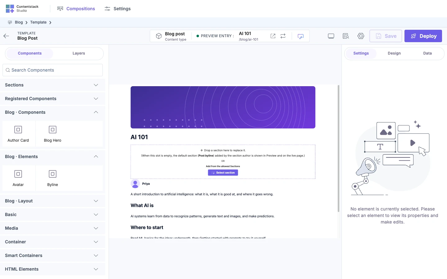
Open a template on the canvas, and on the left, open the Components tab. Find the
Blog · Componentsgroup, or typeblogin Search Components. A component with nosectionsis in Registered Components.The groups of registered components open by default. If the template already offers sections, the Sections group opens instead, and the others stay closed.
-
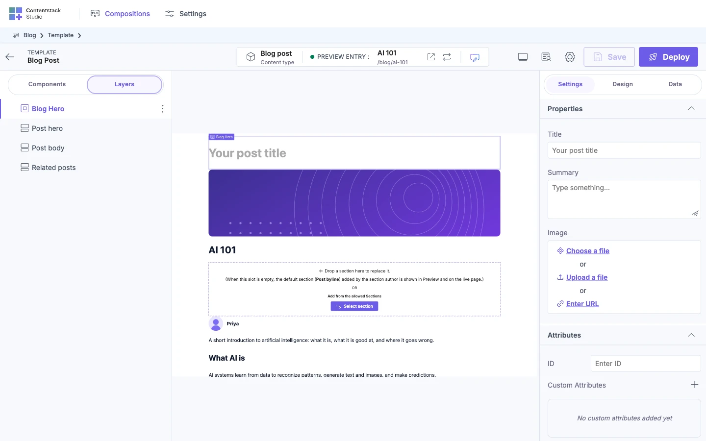
Drag Blog Hero onto the canvas. It renders, with "Your post title" in faded text where the title goes.
-
Select it, and on the right, open the Settings tab. Under Properties, each prop has its control: a text box for Title, a larger text box for Summary, and Choose a file, Upload a file and Enter URL for Image.
-
Bind Title to the entry's
titlefield. The canvas shows "AI 101". See Bind a component.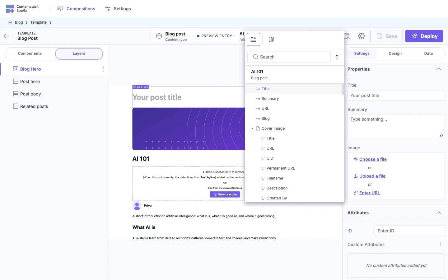
-
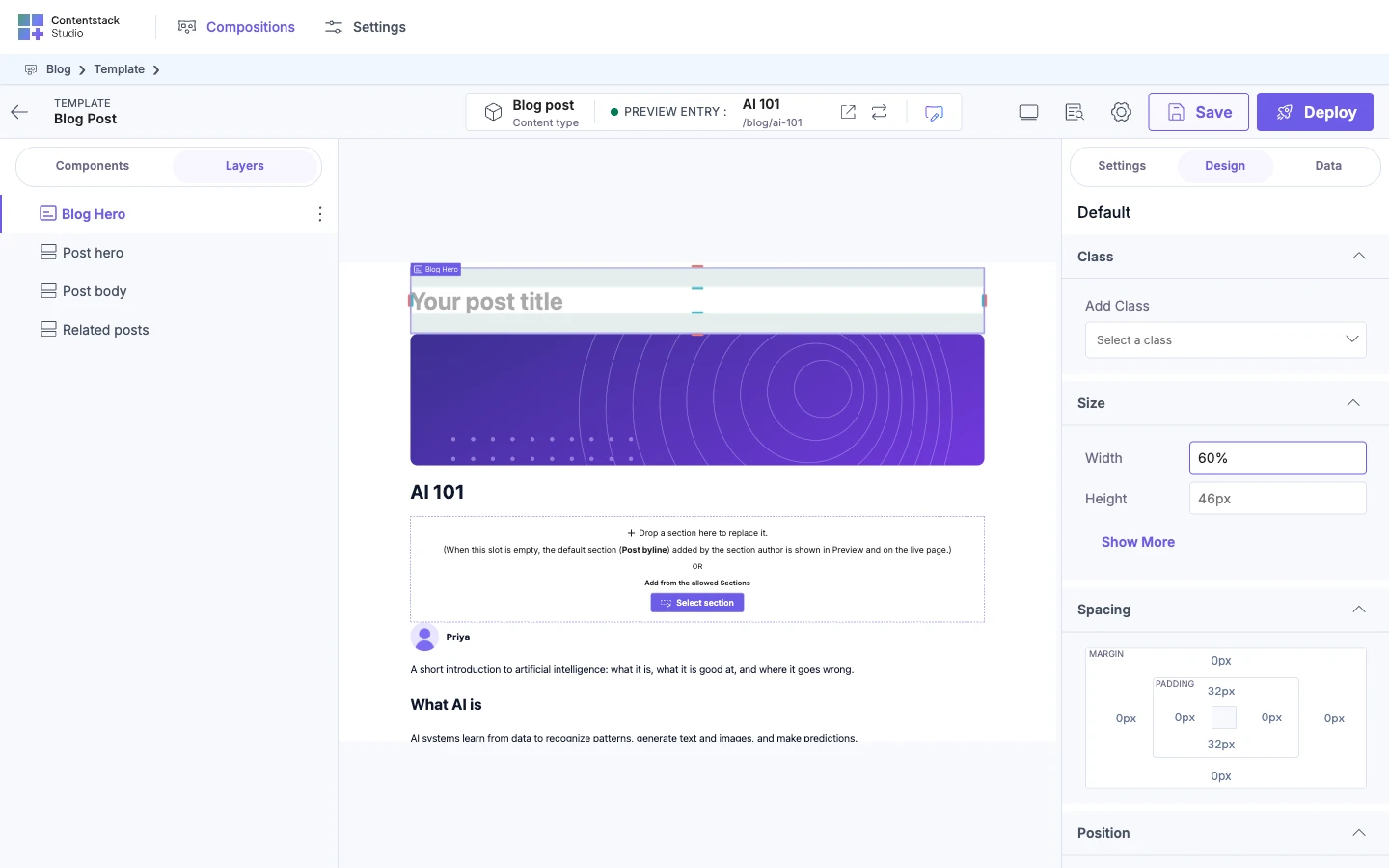
If the component has style groups and the Design tab shows, change one style. The change shows on the canvas. The Design tab appears on freeform templates, and on every composition once Enable Freeform Feature is on for the project.
If it doesn't work
The component isn't in the Components tab
Check these, in this order.
- The module never runs. Nothing imports your registration module on the canvas route. Import it there.
- The
typeis a built-in's. Atypesuch astextorimageis skipped with no error. Rename yours. - It's hidden.
hideFromComponentList: truetakes the tile out of the tab. - Its group is closed. When the template offers sections, the component groups start closed. Open the group, or search for the component.
error while registering components
The browser console shows this, followed by an error whose message is:
contentstack-adv-post-message: No request listener found for event "register-components"
Your app sent its component list to Studio before Studio was listening for it. Every later registration call sends the full list again.
Component Loading Error on the canvas
The box shows the reason under the title.
| Message | What's wrong |
|---|---|
Component with type 'blog-hero' is not registered. | The app on the canvas doesn't register that type. It was renamed, or the registration module isn't imported on the canvas route. |
| Any other message | Your component threw that error while it rendered. The other components on the canvas still render. |
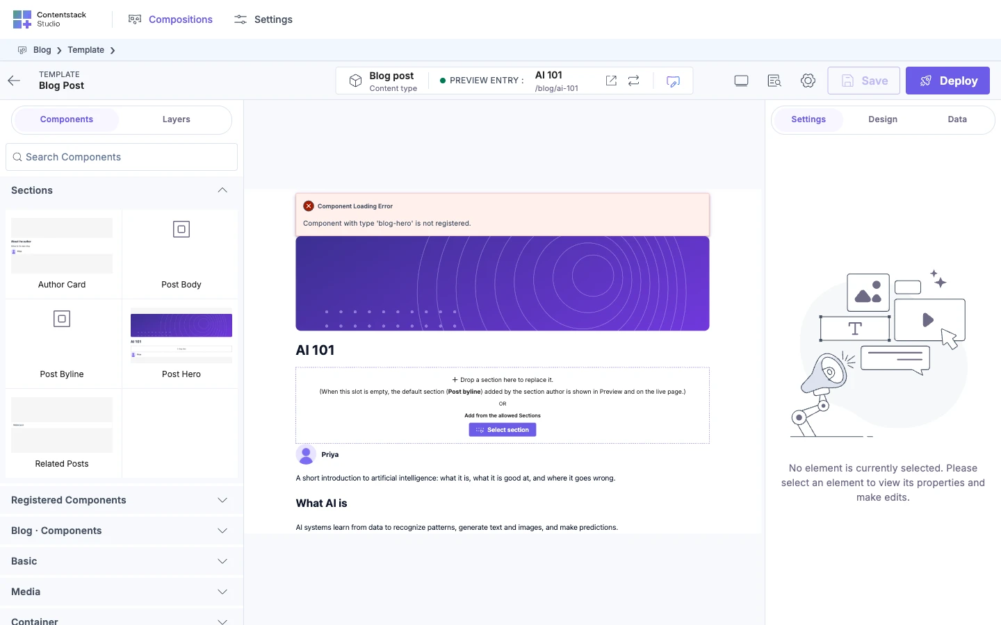
Your live site fails with a "not registered" error
The fetch fails with an error whose message starts like this. sdk.fetchCompositionData throws it, and useCompositionData returns it as error. The SDK doesn't log it, so you see it where your app logs or shows that error.
[Contentstack Studio] COMPONENT_NOT_REGISTERED: These components are used by this composition and not registered: blog-hero.
The template was fetched before BlogHero was registered, or that route doesn't import the registration module. Import it before the component that fetches the template. For every error code the SDK reports, see the Error-message index.
If the message says Studio's own components are not registered instead, nothing on that route imports @contentstack/studio-react itself.
Registration throws
| Message | What's wrong |
|---|---|
Component type is required. | The config has no type. |
Component is required. | The config has no component. |
Component with type 'page' is a system component and cannot be overridden. | page is reserved. Pick another type. |
Component with type 'blog-hero' is already registered. | You passed strict: true, and that type was registered before. |
You can't select the component on the canvas
It's registered with wrap: false, and its root element doesn't spread studioAttributes. Spread it on the root, as in Register one component.
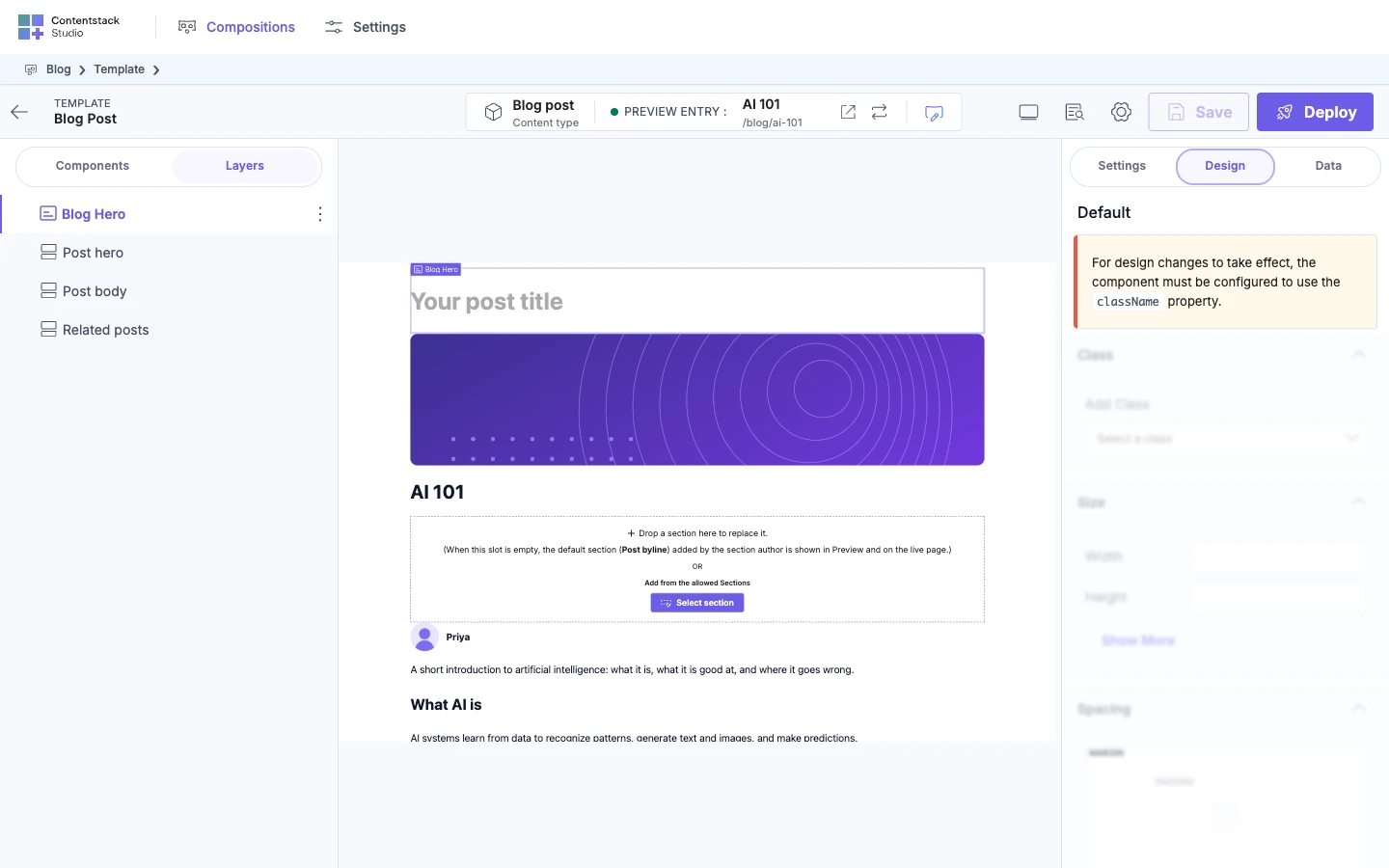
Design edits do nothing
The Design tab shows:
For design changes to take effect, the component must be configured to use the className property.
Your component doesn't put className, or the prop named after the style group, on an element. See Make your components styleable.
Where to go next
- Look up every prop type and default: Component schema: props, types and defaults.
- Put your components in groups with thumbnails: Group components and add thumbnails.
- Build a section from them: Build sections.