Group components and add thumbnails
Put your components in named groups on the Components tab and give each tile a picture, so authors find the one they want without reading every label. You can also give each component its own icon in Layers. Do this once your components register and show up on the Components tab.
The example on this page is the blog. Its developers put BlogHero in a group called Blog · Components and Avatar in one called Blog · Elements, give both tiles thumbnails, and give BlogHero its own icon in Layers.
Prerequisites
- Components that already register and appear on the Components tab. If yours don't yet, see Register a component.
- For a thumbnail or icon file, a place your site serves files from, such as its
public/folder.
What this is and what you get
You add up to three optional fields to each component's registration: sections for the group, thumbnailUrl for the tile's picture and layerIcon for the icon in Layers. When you're done, your components sit in their own group near the top of the Components tab, each tile shows its thumbnail, and Layers shows your icon wherever the component is used.
Put your components in a group
-
Add
sectionsto each component's registration, with the group's name. It takes one name, or a list of names.import { registerComponents } from "@contentstack/studio-react";import { Avatar } from "./components/Avatar";import { BlogHero } from "./components/BlogHero";registerComponents([{type: "blog-hero",component: BlogHero,displayName: "Blog Hero",wrap: false,sections: "Blog · Components",props: {title: { type: "string", displayName: "Title" },summary: { type: "string", displayName: "Summary" },image: { type: "imageurl", displayName: "Image" },},},{type: "avatar",component: Avatar,displayName: "Avatar",wrap: false,sections: "Blog · Elements",props: {src: { type: "imageurl", displayName: "Photo" },size: { type: "number", displayName: "Size", defaultValue: 48 },},},]);With
wrap: false, each component spreadsstudioAttributeson its root element. See Register a component. -
Reload the canvas and open the Components tab. A group called Blog · Components holds the Blog Hero tile, and one called Blog · Elements holds the Avatar tile. The blog registers
Bylinein Blog · Elements too, so its tile sits next to Avatar.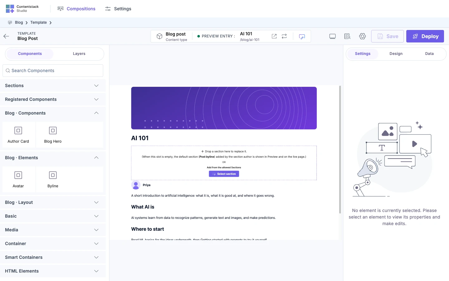
A component with a list of names, such as sections: ["Blog · Elements", "Authors"], shows up in each of those groups. A component with no sections goes in the group called Registered Components.
Name groups for what the components are for, not for how they're built. A prefix such as Blog · keeps your names apart from the ones Studio uses.
Names you can't use
These eight names belong to Studio. A group of yours with one of these exact names doesn't get its own place on the Components tab. The match is exact and counts capital letters, so basic or Smart Container are fine.
| Name | What happens to your components |
|---|---|
Basic, Media, Container, Smart Containers, HTML Elements | They go into Studio's group of that name, sorted among the built-in components, below every group of yours. |
Advanced | They go into a group called Advanced, among Studio's groups. |
Sections | They go into a second group called Sections, at the bottom of the tab. On a template, that's separate from the Sections group at the top, which lists your sections. |
Registered Components | Nothing changes. It's the group your components go in when they have no sections. |
On the blog, naming the group Basic would mix Avatar and Blog Hero in with Studio's Button, Header and Link tiles.
Where your groups appear and which one opens
From top to bottom, the Components tab shows these groups.
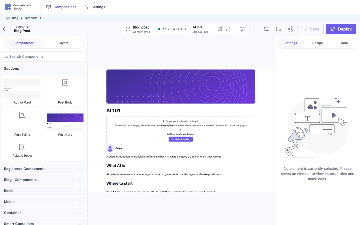
- Sections, on a template only, when the project has at least one section. It lists your sections, such as Author card.
- Registered Components, if any of your components have no
sections. - Your own groups, such as Blog · Components and Blog · Elements.
- Studio's groups: Basic, Media, Container, Smart Containers and HTML Elements.
A group with no components in it doesn't show. You can't set the order of your groups, or of the tiles in a group. Tiles sort A to Z by label, with numbers in order, so Hero 2 comes before Hero 10.
Which groups are open when the tab opens depends on what's there.
| When | What opens |
|---|---|
| You're on a template, and the project has at least one section | Only Sections. Every group of components stays closed. |
| Anything else, and you've registered components | Registered Components and every group of yours |
| You haven't registered any components | Basic |
Typing in Search Components opens every group that has a match. Search matches a component's label, its type and its description.
Thumbnails
-
Save the thumbnail where your site serves it. The blog saves
blog-hero.svgin itspublic/thumbnails/folder, so it's served at/thumbnails/blog-hero.svg. -
Add
thumbnailUrlto the registration.Avataruses adata:URI instead of a file, which is the other shape Studio accepts.{type: "blog-hero",// ...thumbnailUrl: "/thumbnails/blog-hero.svg",},{type: "avatar",// ...thumbnailUrl:"data:image/svg+xml;utf8,<svg xmlns='http://www.w3.org/2000/svg' viewBox='0 0 64 64'><rect width='64' height='64' fill='%23f1f5f9'/><circle cx='32' cy='32' r='22' fill='%236c5ce7'/><circle cx='32' cy='26' r='8' fill='%23ffffff'/><path d='M18 46a14 12 0 0 1 28 0' fill='%23ffffff'/></svg>",}, -
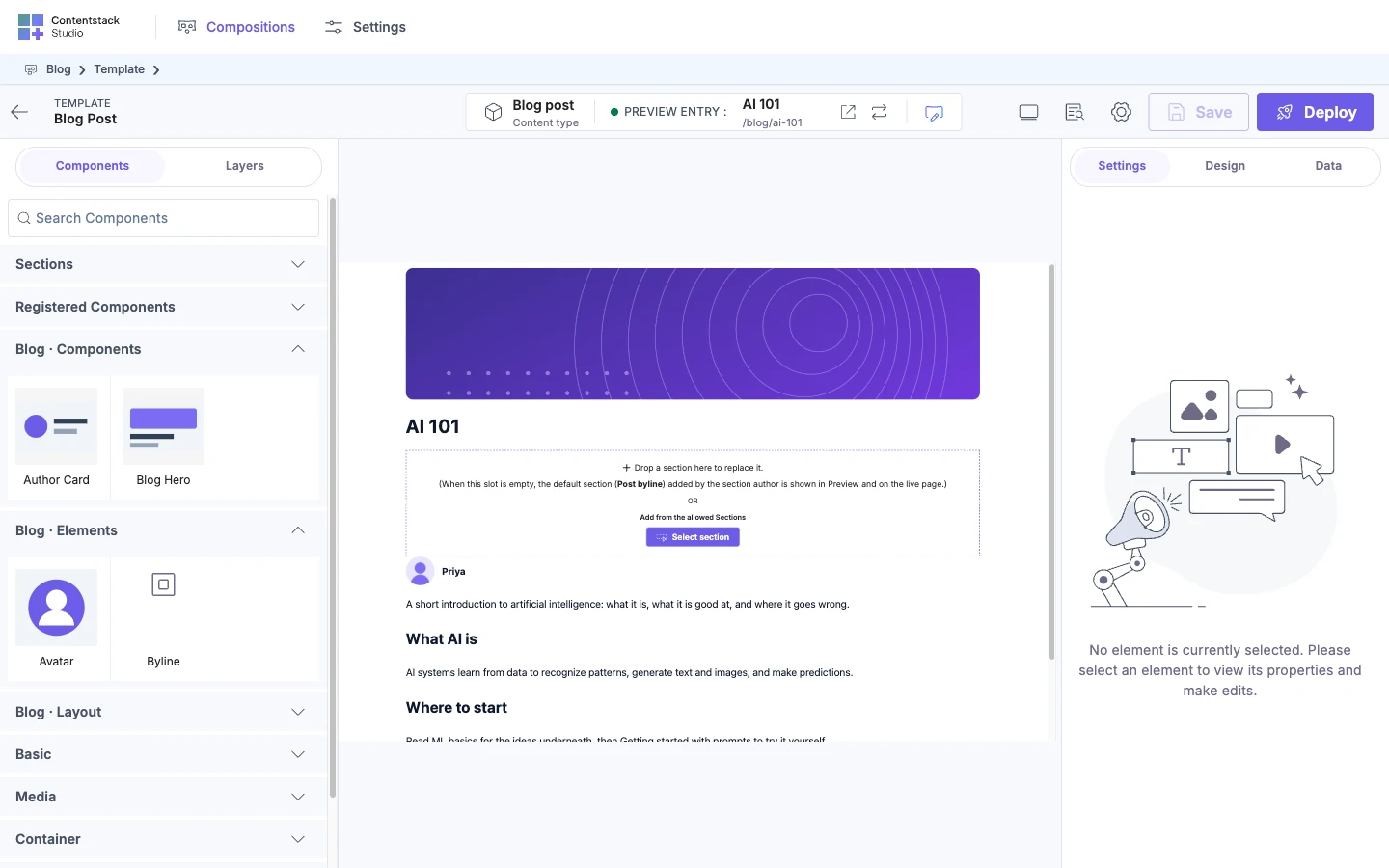
Reload the canvas and open the Components tab. The Avatar and Blog Hero tiles show their pictures.
-
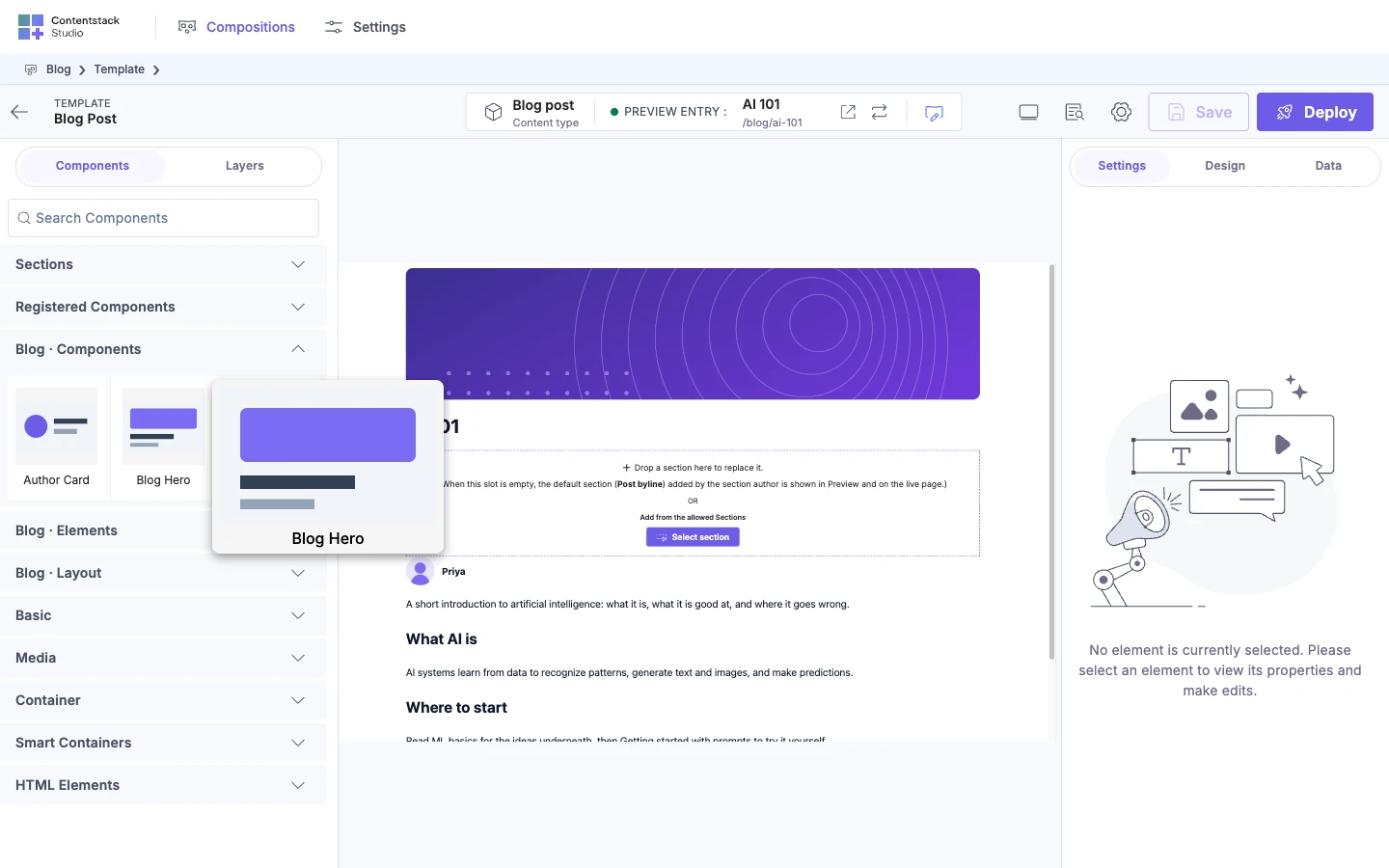
Hover over the Blog Hero tile. A larger preview opens beside the tab, with the label under it.
Studio accepts three shapes for thumbnailUrl.
| Shape | Example | What to know |
|---|---|---|
| A path on your site | /thumbnails/blog-hero.svg | Studio looks for it on the site open in the canvas, so that site has to serve the file at that path. |
An http or https URL | https://cdn.example.com/blog-hero.png | Any host works. |
A data:image URI | data:image/svg+xml;utf8,<svg …> | No file to serve. |
Any other value, such as a javascript: URL, shows the default picture of four small squares.
The tile shows the picture as an image, so an SVG thumbnail can't pick up currentColor or your site's CSS variables. Give it literal colours, as the Avatar example does.
A component gets its thumbnail whether or not you put it in a group.
What else authors see on a tile:
- The label is
displayName. - A tooltip shows
descriptionwhen you set one. It can hold simple HTML. Studio strips anything unsafe. - The larger preview on hover is up to 500 pixels wide and tall. It shows only for a tile with a thumbnail.
To take a component off the Components tab altogether, see Register a component.
Layers icons
Layers shows a default icon for every component you register. To give a component its own, add layerIcon.
{
  type: "blog-hero",
  // ...
  layerIcon:
    '<svg xmlns="http://www.w3.org/2000/svg" viewBox="0 0 20 20" fill="none" stroke="currentColor" stroke-width="1.5"><rect x="2" y="3" width="16" height="14" rx="2"/><path d="M5 13h10M5 9h6"/></svg>',
},
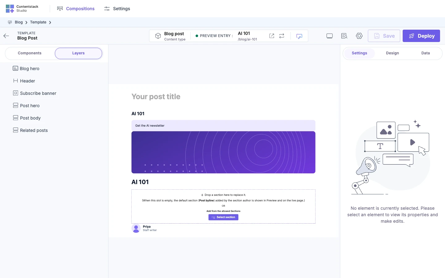
Reload the canvas and open Layers. Every Blog Hero in the outline shows the new icon.
layerIcon takes one of these.
| Shape | Example | What to know |
|---|---|---|
| An inline SVG string | '<svg …>…</svg>' | Can use currentColor, so it takes the colour of the Layers text. Studio strips anything unsafe from it. |
| A path your site serves | /icons/blog-hero.svg | Put the file in public/. A path into your source folders, such as ./icons/blog-hero.svg, doesn't work, because your bundler moves and renames the file. |
| An imported file's URL | import heroIcon from "./BlogHero.svg" | Pass the URL string your bundler gives you for the file. |
An http or https URL, or a data:image URI | https://cdn.example.com/blog-hero.svg | Any host works. |
layerIcon doesn't change the tile on the Components tab, and thumbnailUrl doesn't change Layers. The name of one of Studio's own icons, such as ComponentBox, doesn't work as a layerIcon.
If it doesn't work
Your component is in Basic, or in a second Sections group
The group has one of the names Studio uses, such as Basic or Sections. Rename it, such as Blog · Components. See Names you can't use.
Your group is closed when the Components tab opens
-
You're on a template and the project has a section. Then only Sections opens. Click your group to open it.
-
The group has one of Studio's names. See Names you can't use.
The tile shows four small squares instead of your thumbnail
thumbnailUrlisn't set, or it's empty.- The value isn't a shape Studio accepts. Use a path, an
httporhttpsURL, or adata:imageURI.
Your Layers icon doesn't show
Studio dropped the value and shows the default icon. The browser console on the canvas shows this warning, naming the component by its type:
[studio] Ignoring invalid `layerIcon` for component "blog-hero". Expected an inline SVG string, an absolute http(s)/data:image URL, or a servable relative path.
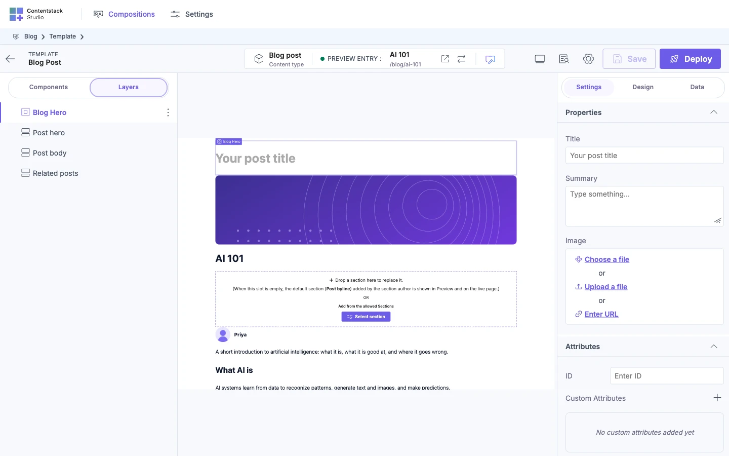
Use one of the shapes in Layers icons. The default icon also shows when the SVG has nothing left after Studio strips what's unsafe, or when you pass the name of one of Studio's own icons.
Where to go next
- See which components Studio already ships in each group: Built-in components.
- Build sections from your components: Build sections.