From a design to components
Turn a design into the list of components you'll build and register, before you write any registration code. Do it when you start a new kind of page, or when a design lands and you need to know what's new.
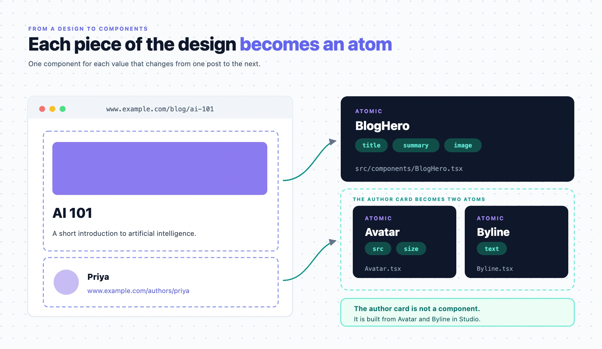
The example is the team blog. Its design is the Blog post page, which renders entries of the Blog post content type (blog_post), such as AI 101 at /blog/ai-101. The page has a hero with the post's title, summary and cover image, and a card about the author.
Prerequisites
- A design of the page. A Figma file, a screenshot, a live URL, a PDF, a wireframe or a written description all work.
- Your design system, or the codebase you'll build it in. The components you register are your own React components, so start from what your team already ships.
- The three layers in your head. This page uses components, sections and templates as Components, sections and templates defines them.
What this is and what you get
If you register one component per page design, you end up with dozens of large components that authors can't rearrange. Every layout change becomes a code release. Splitting the design into small pieces avoids that. You get an inventory: each component you'll register, whether it's atomic or a layout, and the props it takes.
Faster ways to do this
- Skill, from a screenshot, URL, PDF, wireframe or description. Ask your agent to decompose the design, and it uses
decompose-design. It writes a build sheet with a Components table, which is the inventory this page produces. The sheet also proposes sections and a content type shape, and the skill asks before it builds anything. For several page kinds at once, it usesdecompose-site. See What are skills? - Figma plugin, from a Figma file. The Studio Figma plugin generates a code component from a Figma design, and
csdx studio:component:addwrites it into your project. - Studio CLI, to plan and build in one run.
csdx studio:composition:build --referenceplans a template or a section from a design as a build sheet you review. After you approve it, the CLI goes further than this page: it creates the components, their registrations, the sections and the template. See Generate from a design.
If you're starting from React code you already ship rather than from a design, this page isn't the route. Ask your agent to break the component up, and it uses decompose-jsx-to-atomics.
Atomic, layout and compound components
Most components on your list are atomic or layout components. A third kind, the compound, needs a reason before you register it.
| Kind | What it does | Blog example |
|---|---|---|
| Atomic | Has no slot and renders its own content, such as text, an image or a link. | Avatar renders an author's photo. Byline renders a name. |
| Layout | Holds other components through a slot. Its own props are settings for the container, such as direction, gap or a link target, not content it shows. | Stack places what authors drop into it in a row or a column, with a gap. |
| Compound | Renders several pieces of content in an arrangement fixed in your code. | AuthorCard renders a photo, a name and a link. |
Keep the pieces small. You could make the author card one component that takes name, photo and link, and it works. But then the arrangement is in your code. Moving the photo below the name needs a code change and a release. Register Avatar and Byline instead, and let authors build the card from them on the canvas.
Register a compound only when its pieces always appear together, in the same order, and nobody rearranges them. Split it when authors would rearrange the pieces, or when one piece is reused on its own. The blog keeps two compounds on purpose. BlogHero is its one fixed hero treatment. PostCard is a card frame whose call to action goes in a slot.
A component that has content props and slots works in Studio, but it's harder to reuse. Where you can, move the arrangement into a layout and keep the content in atomic components.
Pass 1: find the atomic components, and check what Studio already ships
-
Go through the design top to bottom and mark every piece of content, such as a heading, an image, a name or a photo. For the Blog post page, that's the post title, the summary, the cover image, the author's photo and the author's name.
-
Name each one after what it is, not after where it sits on this page. The author's photo becomes
Avatarinsrc/components/Avatar.tsx, and the author's name becomesByline. Named that way, both are reusable on the Authors page and anywhere a post shows its author. -
List each component's props, one per piece of content that changes from one use to the next.
Avatartakessrcandsize.Bylinetakestext.Keep pieces together in one compound only where they pass the test above.
BlogHerotakestitle,summaryandimage, because the blog's hero is one fixed treatment that nobody rearranges. If authors start rearranging it, split it too. -
Check the list against Built-in components. Studio ships components such as Text, Rich Text, Image, Button, Box, Columns and Repeater. Use one only when it covers a piece you don't need your design system to own. Your own components are the default, because they keep your markup and your styles.
You now have a list of the components that show content, each with its props.
Pass 2: find the layouts, and give each open area a slot
- Mark every place in the design that arranges other pieces, such as a row of cards or a sidebar next to the body.
- For each one, decide whether authors choose what goes inside. If they do, it's a layout. If the arrangement never changes, it belongs in a section, which you build on the canvas from your components. See Build sections.
- Check whether Studio's Box, Columns or Rows already gives you the arrangement. Register your own layout when your design system sets its own grid, gutters or breakpoints.
- Give each layout one slot prop for each open area. A slot prop has the type
slot, and your component receives the dropped children as rendered React elements, which you place where the area goes. Don't hardcode child components inside the layout. Only components that authors drop on the canvas get a row in Layers and their own settings, so a hardcoded child can't be selected, configured or bound.
You now have a list of layouts, each with its slots and arrangement settings.
Pass 3: turn visual options into choice props
- Look for pieces that appear in more than one treatment across the design. Suppose the hero shows its image on the right on most posts and on the left on some.
- Make that one component with a
choiceprop, not two components.BlogHerogets animagePositionprop with the optionsrightandleft. - Name the options for what they mean to an author, not for the CSS they produce. Studio passes the chosen option to your component as a string, and your code maps it to your own classes or tokens.
- Leave out any visual difference that never changes from one use to the next. It stays in your component's CSS.
To let authors restyle a component on the canvas instead, see Make your components styleable.
What doesn't get registered
| Leave out | Why | Where it goes instead |
|---|---|---|
| The page layout, such as the Blog post page as a whole | It's a template. | Create a template |
| How components are arranged in one part of the page, such as the Author card section | It's a section, built on the canvas from your components. | Build sections |
A list of items as one component with an items prop | Items inside your code can't be selected, bound or configured on the canvas. A Repeater renders one registered component per item, and authors bind and configure it there. | Render a list |
| Anything a built-in component covers that you don't need to own | Studio already ships it. | Built-in components |
| Decoration and one-off spacing | Nothing about it changes per use. | Your component's CSS |
Check the inventory
Whether you made the inventory by hand or a tool wrote it, check each row before you register anything. For the blog, it looks like this.
| Component | Kind | Props | Comes from |
|---|---|---|---|
Avatar | Atomic | src, size | Your design system, src/components/Avatar.tsx |
Byline | Atomic | text | Your design system, src/components/Byline.tsx |
Stack | Layout | direction (choice: row, column), gap, slot children | Your design system, src/components/Stack.tsx |
BlogHero | Compound | title, summary, image, imagePosition (choice: right, left) | Your design system, src/components/BlogHero.tsx |
The author card isn't a row. Authors build it in Studio from Avatar, Byline, Stack and Studio's Link Container. See Build sections.
- Every row is atomic or a layout, or a compound you chose to keep. If a row has content props and slots, decide whether to split it.
- No row is an arrangement from one page. A row called
AuthorCardnames an arrangement of a photo, a name and a link. Split it into those pieces, unless it passes the compound test. - Every prop changes from one use to the next. A value that's the same everywhere stays in your code.
- Every visual option is a choice prop. Its options are named for authors.
- Every open area is a slot on a layout. No layout hardcodes its children.
- No row duplicates a built-in component. The exception is one you want your design system to own.
- No row is a template or a section. Those are built in Studio, not registered.
Before you register the components, check their code against the Component shape checklist. Then register them, and arrange them into sections. The Author card section puts Avatar and Byline in a Stack, inside a Link Container, over the author_card global field.