Style on the canvas
Use the Design tab to change how an element looks, with no code. Open it when you want to set size, spacing, type, color or layout on the canvas. The tab is in the right panel, next to Settings and Data.
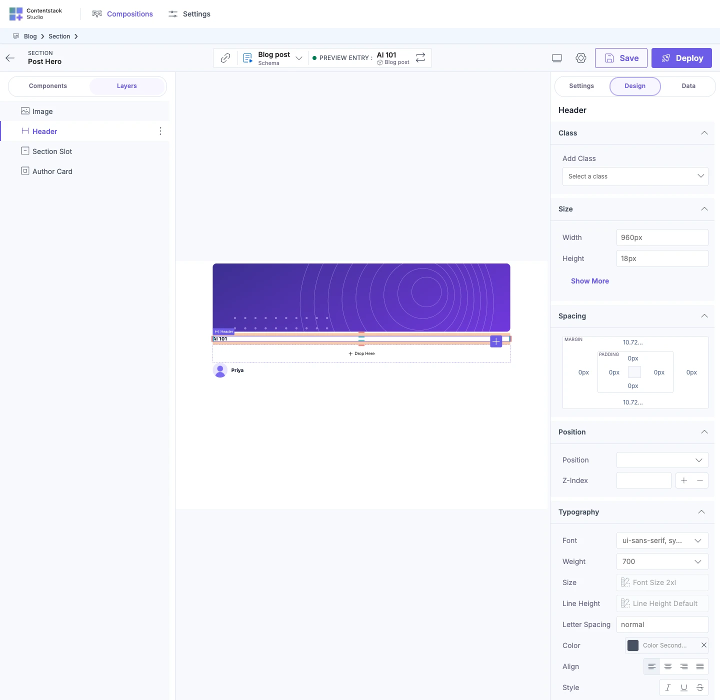
The example on this page is the Post hero section on its canvas, previewing AI 101. You style its Header.
Prerequisites
- Enable Freeform Feature is on, unless you're on a freeform template. The Post hero section needs it on. You turn it on under Settings, then Configuration, and it adds the Design tab. See Feature flags.
- Your developer has registered the tokens and classes you want. Studio ships default tokens, so Use Token lists values before your developer registers any. The Blog site also registers a class named
post-title. Your developer can switch the default tokens off and register their own. See Register design tokens. - If you style a component your developer registered, the component uses the className property. See Make your components styleable.
What this is and what you get
Each edit in the Design tab sets a style value on the selected element. Studio stores each value for one style group and one breakpoint of that element.
The tab can show up to 14 sections, in a fixed order. Studio shows only the sections the element's style group declares, so some elements show fewer. Built-in components such as Header and Box show all 14. Image shows 13, without Typography.
These are the sections you use most:
| Section | What you set |
|---|---|
| Class | One or more classes, in the field under Add Class. |
| Size | Width and Height. Show More adds Min-Width, Max-Width, Min-Height and Max-Height. Width and Height also offer the keywords auto, stretch and fit-content. |
| Spacing | Margin and padding on each side, in a box marked MARGIN and PADDING. |
| Position | Position (Sticky, Relative, Absolute or Fixed), edge offsets for Sticky, Absolute and Fixed, and Z-index. |
| Typography | Font, Weight, Size, Line Height, Letter Spacing, Color, Align and Style (Italic, Underline, Strikethrough). |
For all 14 sections, and which elements show which, see Design tab controls.
Open the Design tab for an element
- Select an element on the canvas or in Layers. For more on selecting, see Select and arrange elements.
- Select Design at the top of the right panel.
If the element has one style group, Studio opens it and shows its name at the top of the tab. For the Header in Post hero, the name is "Header".
-
If the component has more than one style group, the tab lists the groups first. Select one to open it. After that, select its name at the top to go back to the list. See Make your components styleable.
-
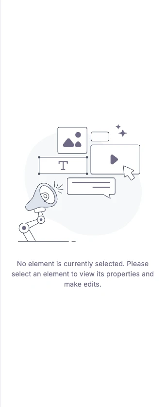
With no element selected, the tab says "No element is currently selected. Please select an element to view its properties and make edits."
-
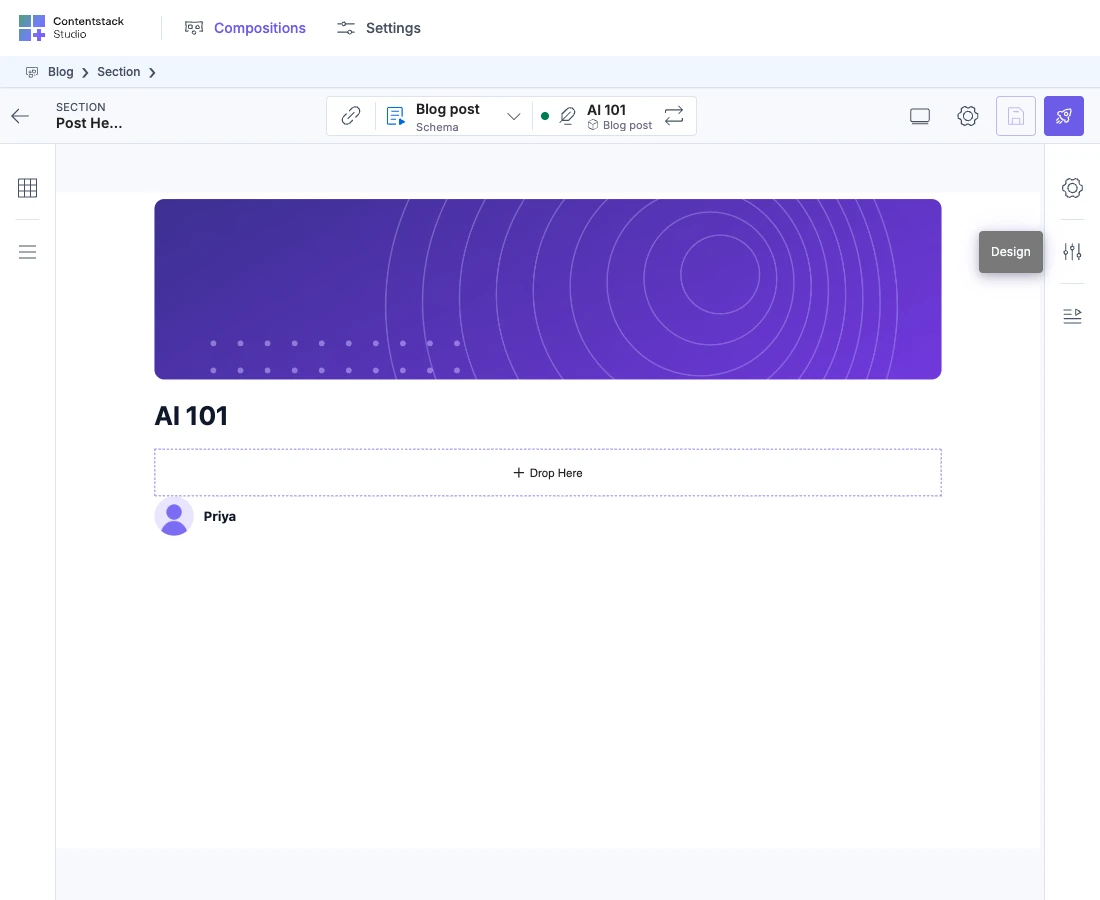
When your browser window is 1200 pixels wide or narrower, the right panel shrinks to a column of icons. Hover for the names, then select Design.
-
A section collapses when you select its heading.
Read the value an empty field shows
A field that has a value is set on this element, in this style group, at this breakpoint. An empty field shows a placeholder instead. The placeholder is the value the element renders with right now, from a wider breakpoint, your site's CSS or the browser. Typing in an empty field sets the value at this breakpoint. For how breakpoints inherit, see How responsive styling works.
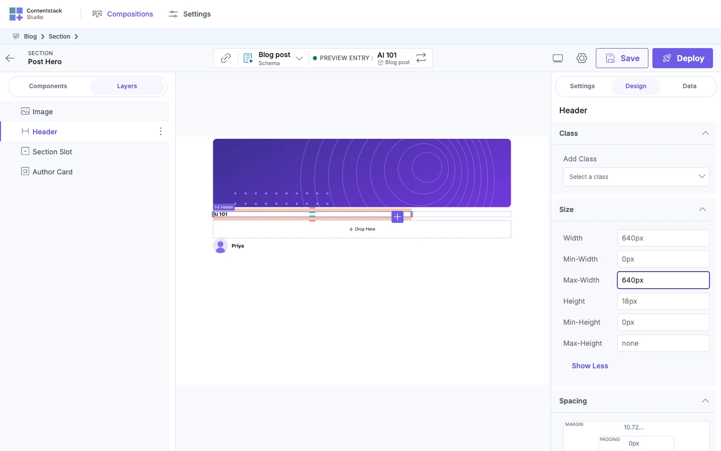
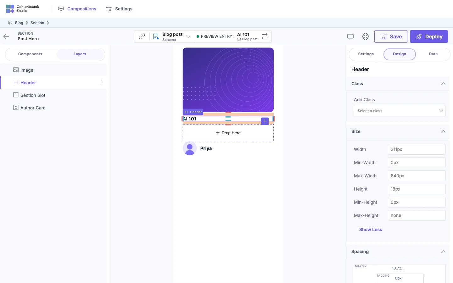
In the example, open Size on Header and select Show More. Width and Height are empty, so they show the sizes Header renders with now. After you type 640px in Max-Width later on this page, it's set here too.
Set a value with a token, a class or your own value
You can set a value three ways: with a token, with a class, or by typing your own value. Your developer sets one allowed values level for the whole project, and the level decides which of these Studio offers. The SDK default is arbitrary, and the Blog project uses it.
| Level | What you can do |
|---|---|
arbitrary | Type values and use tokens. |
tokens | Use tokens or bind a value from an entry. Typed fields are grayed out. |
dynamic | You can't type values or use tokens. Typed fields are grayed out. Use Dynamic Value is the one other route. |
Class works at every level. Your developer registers the level on your site. See Register design tokens.
Each field has a three-dot button. In Spacing, it shows "More options" on hover. The menu has Use Token, Remove ... style and other items. Which items show depends on the control and the level.
Use a token. Use this to get a named value, from your developer's tokens or Studio's default tokens.
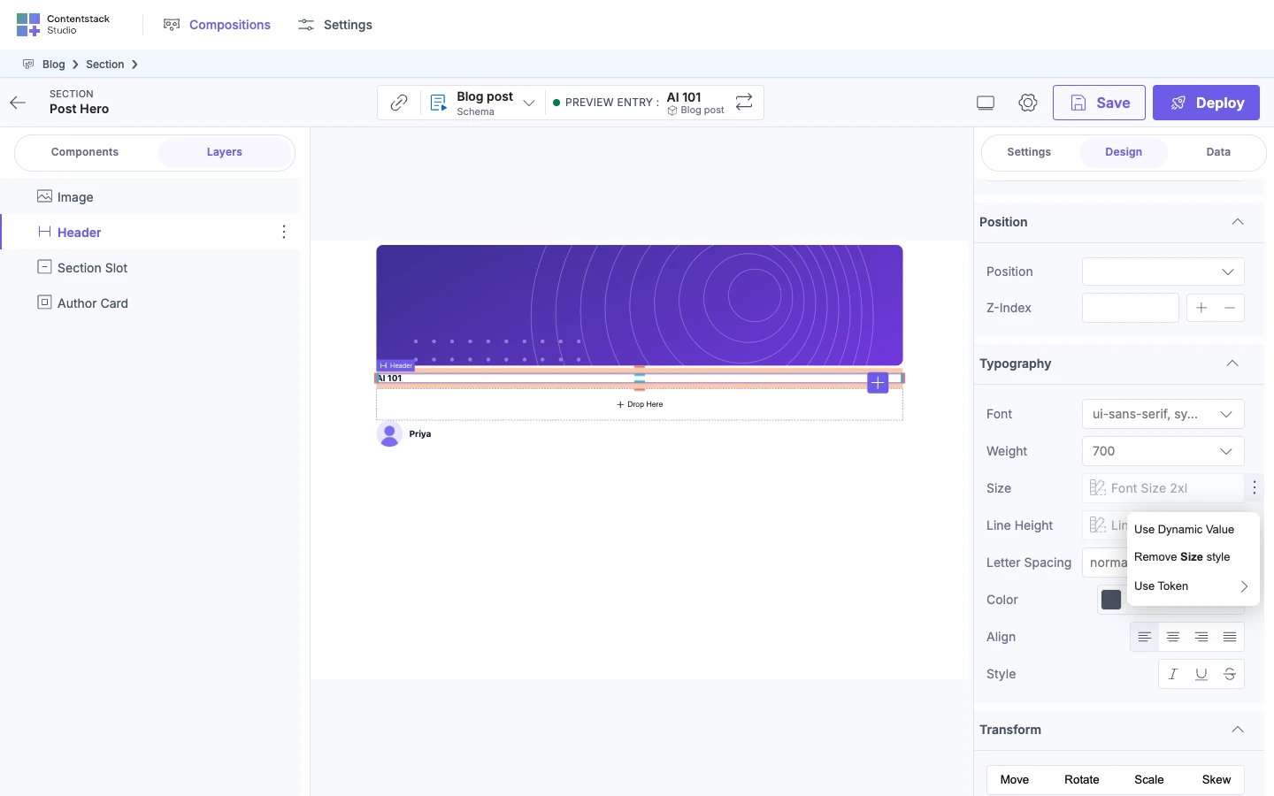
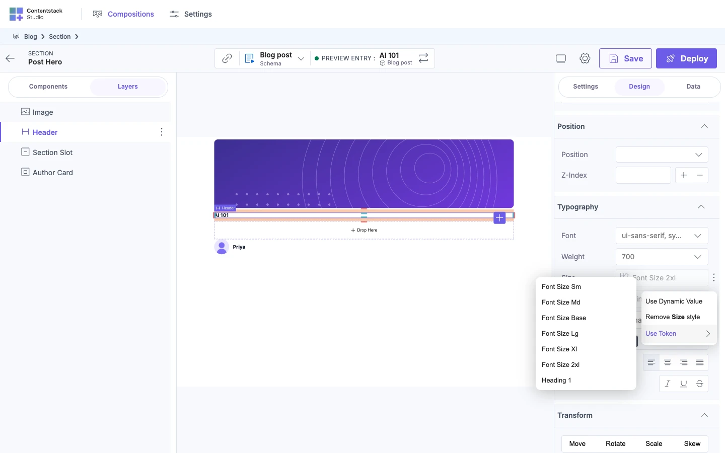
- Select Header, then open Typography. Size already shows Font Size 2xl, Header's default.
- Select the three-dot button on Size, then select Use Token.
- Select Font Size Xl. It's one of Studio's default tokens, which the Blog project keeps.
Use Token opens a list of registered tokens. Each name has every word capitalized, so font-size-xl shows as Font Size Xl. Use Token is grayed out when the property has no tokens. After step 3, Size shows Font Size Xl instead of Font Size 2xl, and the title on the canvas gets smaller.
Add a class. Use this for a class from your own system.
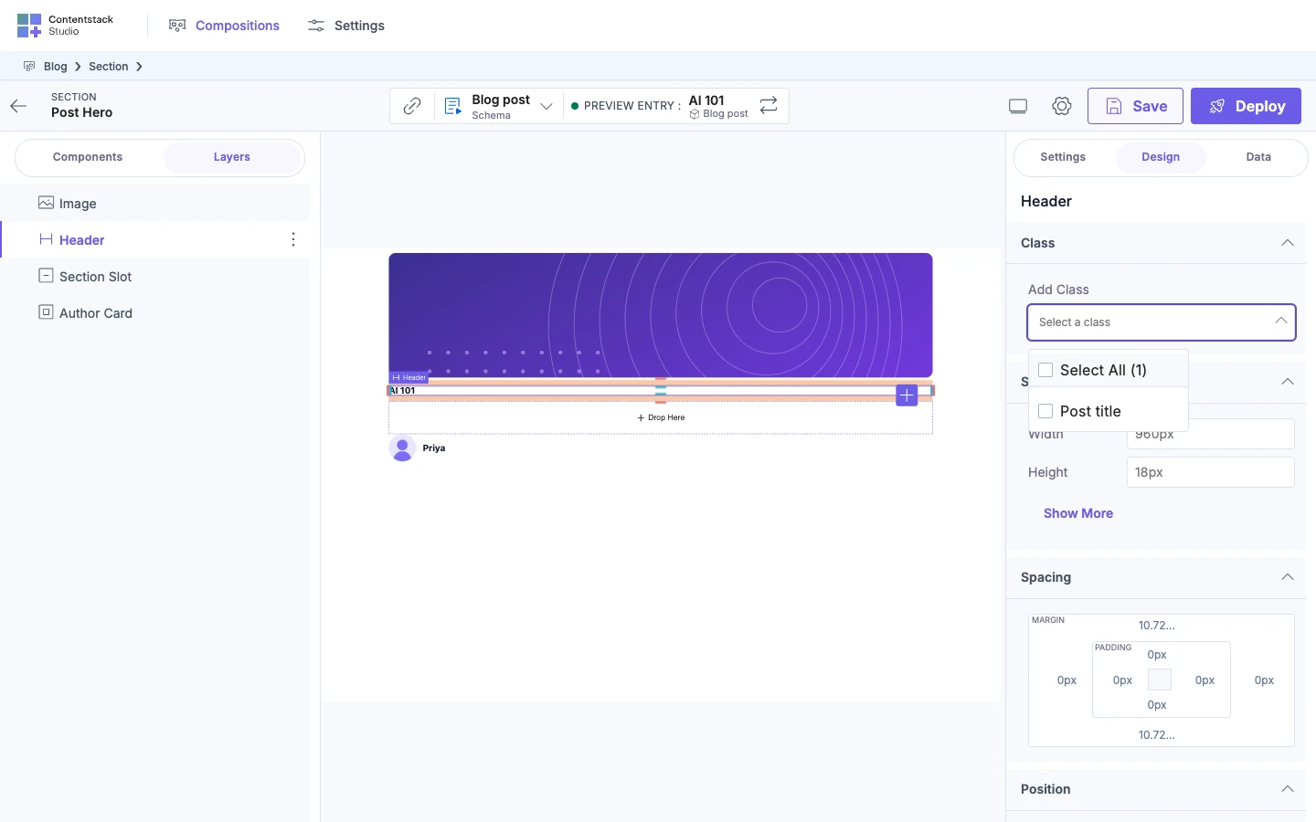
- Select Header, then find Class.
- Select the field under Add Class. Its placeholder reads "Select a class".
- Select Post title.
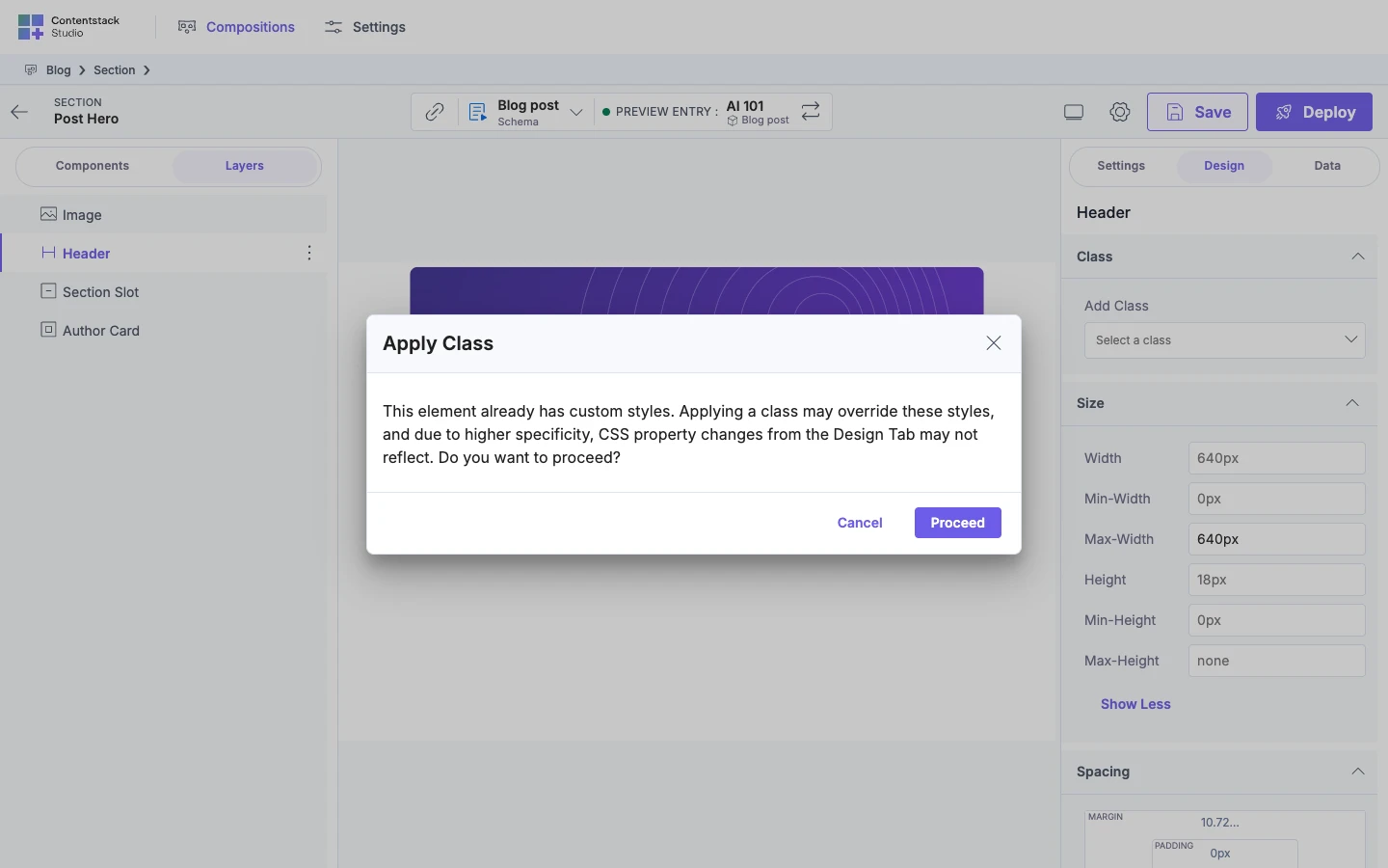
- In the Apply Class dialog, select Proceed. The dialog opens because Header already has styles set at this breakpoint.
After step 4, Post title appears in the Class section of Header. The list has the classes your developer registered, and any class already on the element. A class applies at every breakpoint, because Studio doesn't store classes per breakpoint. Studio adds the class name to the element. If your site's CSS defines the class, the canvas shows what it does.
The dialog is titled "Apply Class" and asks: "This element already has custom styles. Applying a class may override these styles, and due to higher specificity, CSS property changes from the Design Tab may not reflect. Do you want to proceed?" Its buttons are Cancel and Proceed.
Type your own value. Use this when no token or class fits. This needs the arbitrary level.
- Select Header, open Size, then select Show More.
- In Max-Width, type 640px and press Enter.
After step 2, Max-Width is 640px, so it's set on Header at this breakpoint.
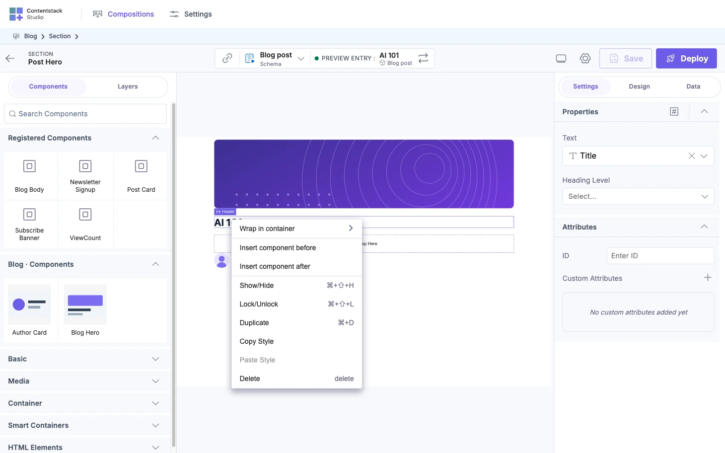
To reuse a style on another element, right-click the element with the style and select Copy Style. Then right-click another element and select Paste Style. Copy Style copies the style group open in the Design tab. Paste Style replaces the other element's styles with that group. See Copy and paste style.
Style each breakpoint separately
The Blog site registers three breakpoints: Desktop, Tablet and Mobile. Desktop is the base. Tablet and Mobile apply on top of it at their widths, so a narrower breakpoint inherits wider values until you override them. To register your own, see Register breakpoints.
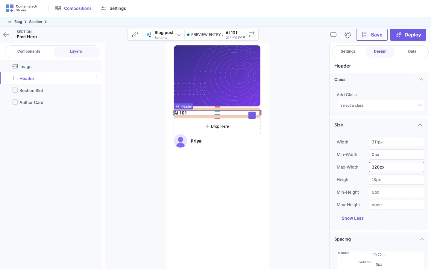
To give Header a narrower Max-Width on Mobile:
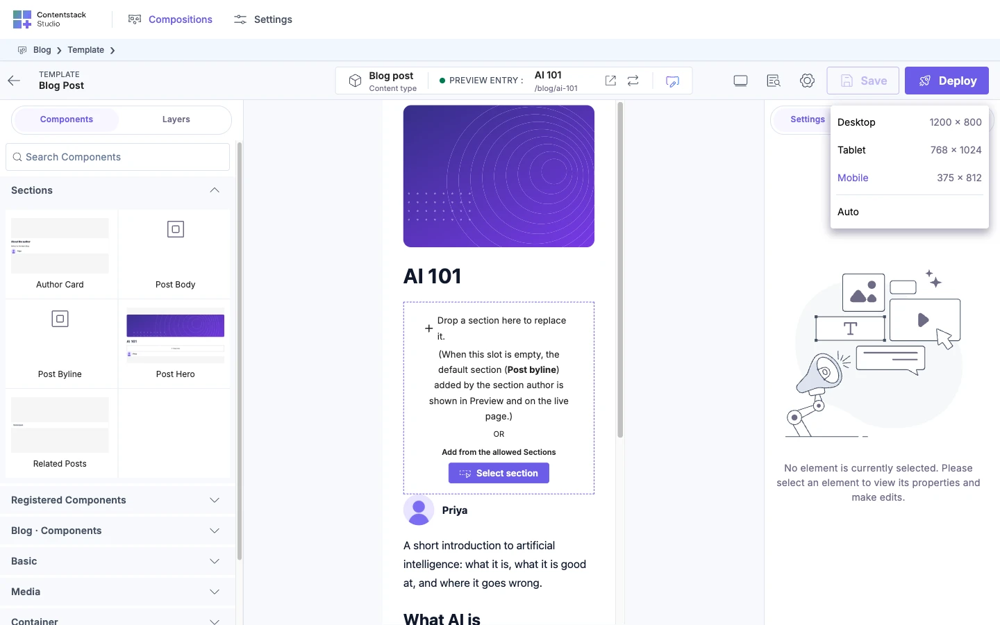
- In the top bar, select the monitor icon, Toggle Viewport. Below 1024 pixels wide, it's in the "More actions" menu.
- Select Mobile.
- Select Header, open Size, then select Show More.
- In Max-Width, type 320px and press Enter.
After step 2, the canvas frame resizes to 375 x 812. The Design tab doesn't show the active breakpoint, so open the viewport menu to confirm it. Mobile is highlighted there.
The viewport menu in step 1 lists each breakpoint with its width and height. Desktop is 1200 x 800, Tablet is 768 x 1024 and Mobile is 375 x 812. It then lists Auto, and highlights the selected one. Studio opens on Desktop, then remembers your last viewport for each project, in your browser.
At Tablet or Mobile, a field shows only that breakpoint's own value. Before step 4, Max-Width on Mobile is empty and shows the wider value, 640px, as a placeholder. After step 4, Studio stores 320px for Mobile.
Under Auto, the canvas fills the space the editor has, so the breakpoint follows the width of your browser window. The menu shows the canvas size and the breakpoint name.
To go back to inheriting, select the field's three-dot button and select Remove ... style, such as Remove Max-Width style. Once something in a section is set at this breakpoint, the section's own three-dot button offers Remove all ... styles. An example is Remove all Size styles.
If it doesn't work
-
The Design tab is missing. With Enable Freeform Feature off, a section or connected template shows only the Settings content, with no tabs. Turn on Enable Freeform Feature. See Feature flags.
-
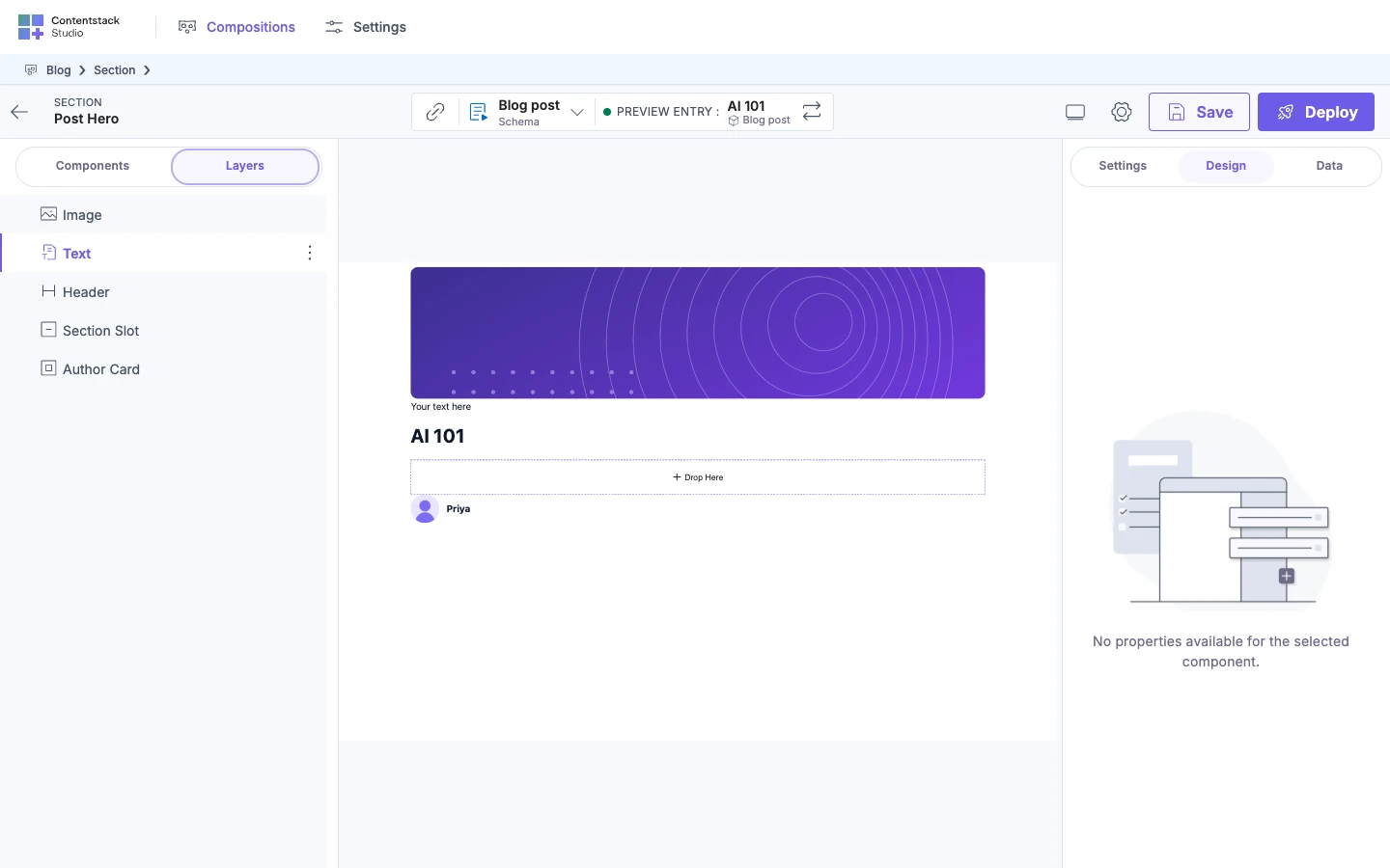
"No properties available for the selected component." The component declares no style groups. The built-in Text component is one. The Settings tab shows the same sentence when a component has no props.
-
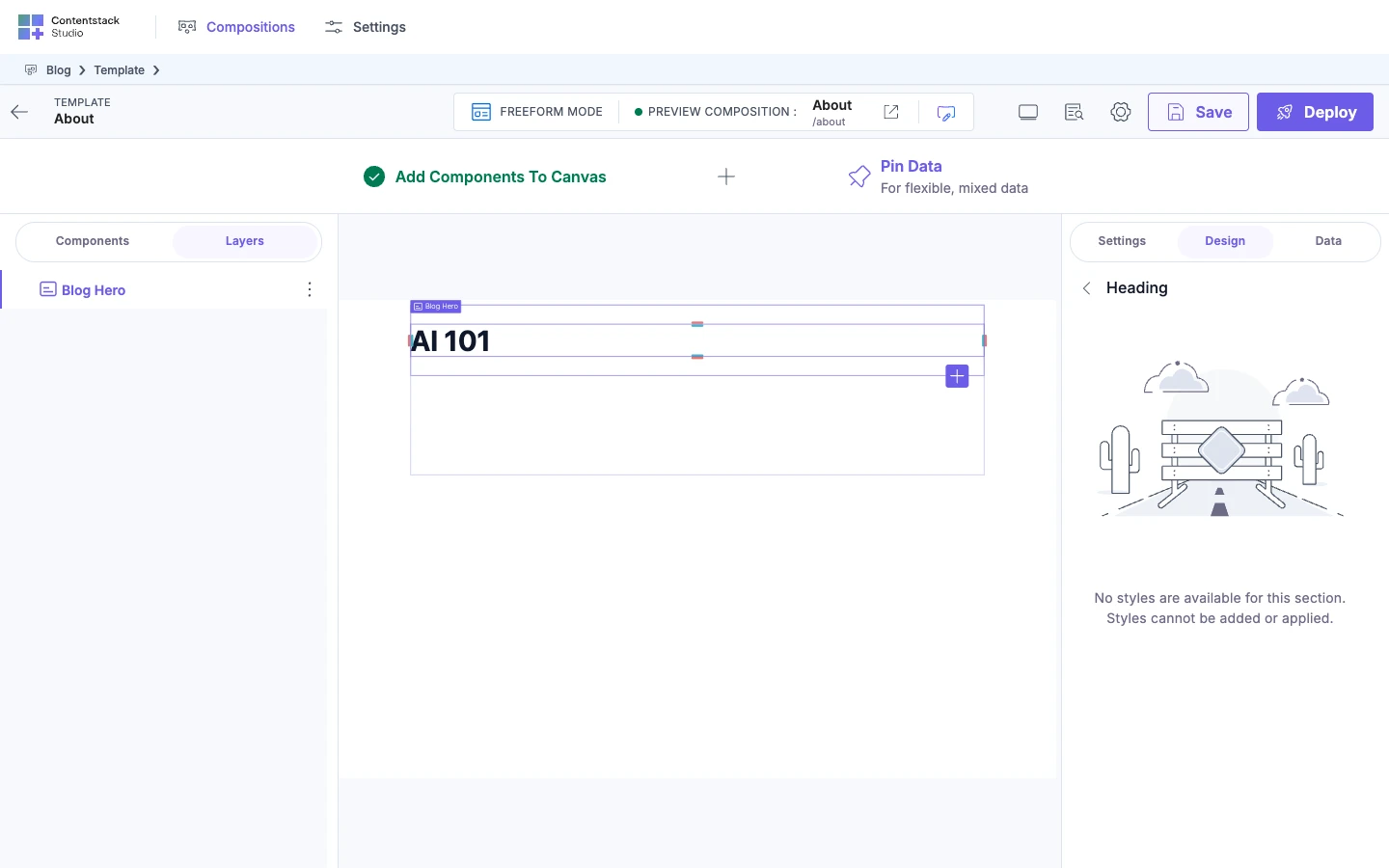
"No styles are available for this section. Styles cannot be added or applied." The style group you opened declares no sections. Select another style group, or see Make your components styleable.
-
"For design changes to take effect, the component must be configured to use the className property." The group's class doesn't reach an element, so the group's controls blur and stop responding. For a group other than
default, the message names the group, and the prop name is the group's name. Ask your developer to apply the class. See Apply each group in your component. -
A field won't let you type. Your project's level limits it, and nothing is broken. Studio doesn't say why the field is grayed out. At the
tokenslevel, select Use Token on the field. At thedynamiclevel, select Use Dynamic Value to bind a value from an entry. Otherwise, ask your developer to change the level.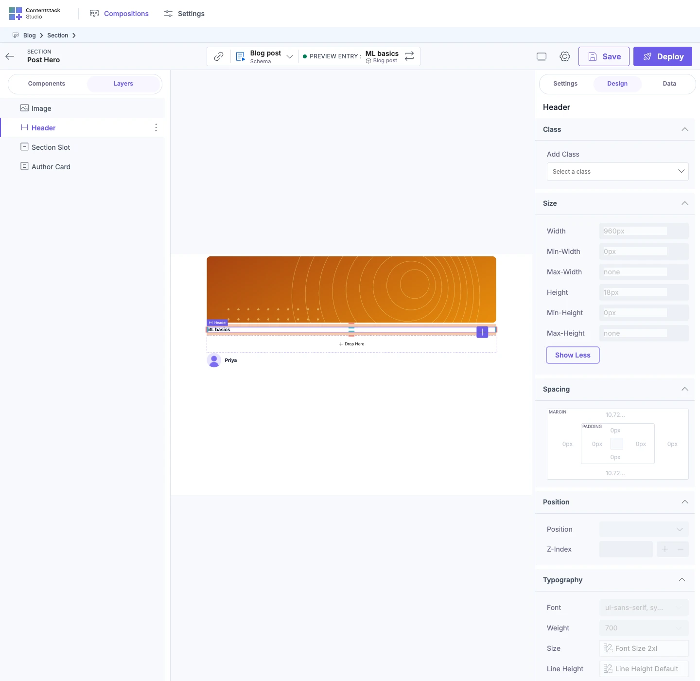
-
A value shows on the canvas, but its field is empty. The value comes from a wider breakpoint, your site's CSS or the browser. See Read the value an empty field shows.
-
Your edit went to a different breakpoint than you expected. Studio writes your edit to the breakpoint your site reports for the canvas width. Check the viewport menu, switch to the breakpoint you want, and use Remove ... style on the wrong one.
-
A value bound from an entry doesn't show. The entry field doesn't hold a CSS value, such as a token name instead of
var(--token-...). Studio writes the bound value straight into the CSS, and the browser drops a value it can't use. The browser console says[studio] Bound design prop "<property>" resolved to "<value>", which is not a valid value for that CSS property — the declaration will be dropped and nothing will render. The field this is bound to has to hold a CSS value (e.g. a var(--token) or a literal).Ask whoever edits the entry to store a CSS value, such as#1e3a8a. -
A class you add changes nothing. Your site has no CSS rule for it. Studio adds the class name to the element, and your CSS defines what the class does.
To change which sections and values show for a component, go to Make your components styleable. To change the tokens and breakpoints your team selects from, go to Register design tokens or Register breakpoints.