Register design tokens
Register design tokens to put your design system's values in the Design tab. Each token also gets a CSS variable you can use in your own code. You do it once, in your app's code, before anyone styles on the canvas. To register your site's screen sizes, see Register breakpoints.
The example on this page is the Blog project. It registers a set of design tokens for the Blog site, and it keeps Studio's default tokens.
Prerequisites
- You've installed
@contentstack/studio-reactin your app. See Install the Studio SDK. - You've turned on Enable Freeform Feature for the project, or you're on a freeform template. See Enable Freeform Feature.
- You've made sure that every route that renders Studio content loads your registration code, including your canvas route. Studio reads your tokens from your app running in the canvas.
What this is and what you get
After you register tokens, the Design tab offers your values by name. Until you register, it offers Studio's default tokens.
Register once. A second registerDesignTokens call replaces the first call's tokens and its options.
Faster ways to do this
- Skill. The
import-design-tokensskill reads a Tailwind config, CSS custom properties or a tokens JSON file and writes aregisterDesignTokenscall. Check the allowed values level in that call against the SDK default,arbitrary. See import-design-tokens. To install skills, see LLM skills. - CLI. Run
csdx studio:design-token:addwith no flags. The CLI reads your project and writes aregister-design-tokens.tsfile. You need to be logged in to the CLI. If no project is linked, the CLI asks you to select one. See Studio CLI. - CLI, from Figma. With
--design-token-id, the CLI fetches colors, typography and effects from Figma instead. It writessrc/studio/figma-design-tokens.tsand aregister-design-tokens.tsbeside it. It doesn't import spacing tokens.
After the CLI writes the file, import it in your app's entry file so the tokens register at start. For every flag, see CLI commands.
Register your design tokens
Studio takes two kinds of tokens, global and section. The global tokens are colorTokens and spaceTokens.
| Global token | Where it appears in the Design tab |
|---|---|
colorTokens | The color controls of Typography, Background, Border and Shadow. |
spaceTokens | Spacing margin and padding, and the Layout gap. |
spaceTokens don't appear in the Size controls. For those, use size.tokens. TypeScript requires a unit on every length, such as 8px or 0.5rem.
Section tokens cover twelve groups. Register only the groups your design system defines. These are the groups you'll use most.
| Section | What it takes |
|---|---|
size | width, height, minWidth, minHeight, maxWidth, maxHeight, and tokens to set all six at once. |
spacing | margin, padding, tokens for both, and style presets that set margin and padding together. |
typography | color, fontWeight as numbers, fontSize, lineHeight, letterSpacing, and style presets that can include a fontFamily. |
background | color, and style presets: solid color, linear gradient, radial gradient or image. |
For all twelve groups, see Design token keys.
To register the Blog tokens:
-
In a file your app loads at start, such as
register-design-tokens.ts, callregisterDesignTokensonce with your tokens. Export the result, so your components can use the tokens. Declare the object withas const satisfies DesignTokensInput, so TypeScript keeps each value such as"8px"as a literal instead of widening it tostring.import { registerDesignTokens, type DesignTokensInput } from "@contentstack/studio-react";const blogTokens = {colorTokens: {"brand-primary": "#1e3a8a","brand-accent": "#f59e0b",ink: "#0f172a",surface: "#ffffff",},spaceTokens: {"space-sm": "8px","space-md": "16px","space-lg": "32px",},size: { maxWidth: { prose: "680px" } },typography: { fontSize: { "heading-1": "3rem" } },} as const satisfies DesignTokensInput;export const tokens = registerDesignTokens(blogTokens); -
Import that file on every route that renders Studio content, including the canvas route. Call
registerDesignTokensbefore Studio renders. You can call it before or afterstudioSdk.init. You check the result in step 3. -
Check your tokens. Open the Post hero section, select the Header, and open the Design tab in the right panel. Select the three-dot button on Color, then select Use Token.
The Design tab offers your values by name. It shows each hyphenated word with a capital, so
brand-primaryshows as Brand Primary. A dotted name such asbrand.primaryshows asBrand.primary. The list also shows Studio's default colors, because the Blog project keeps them.
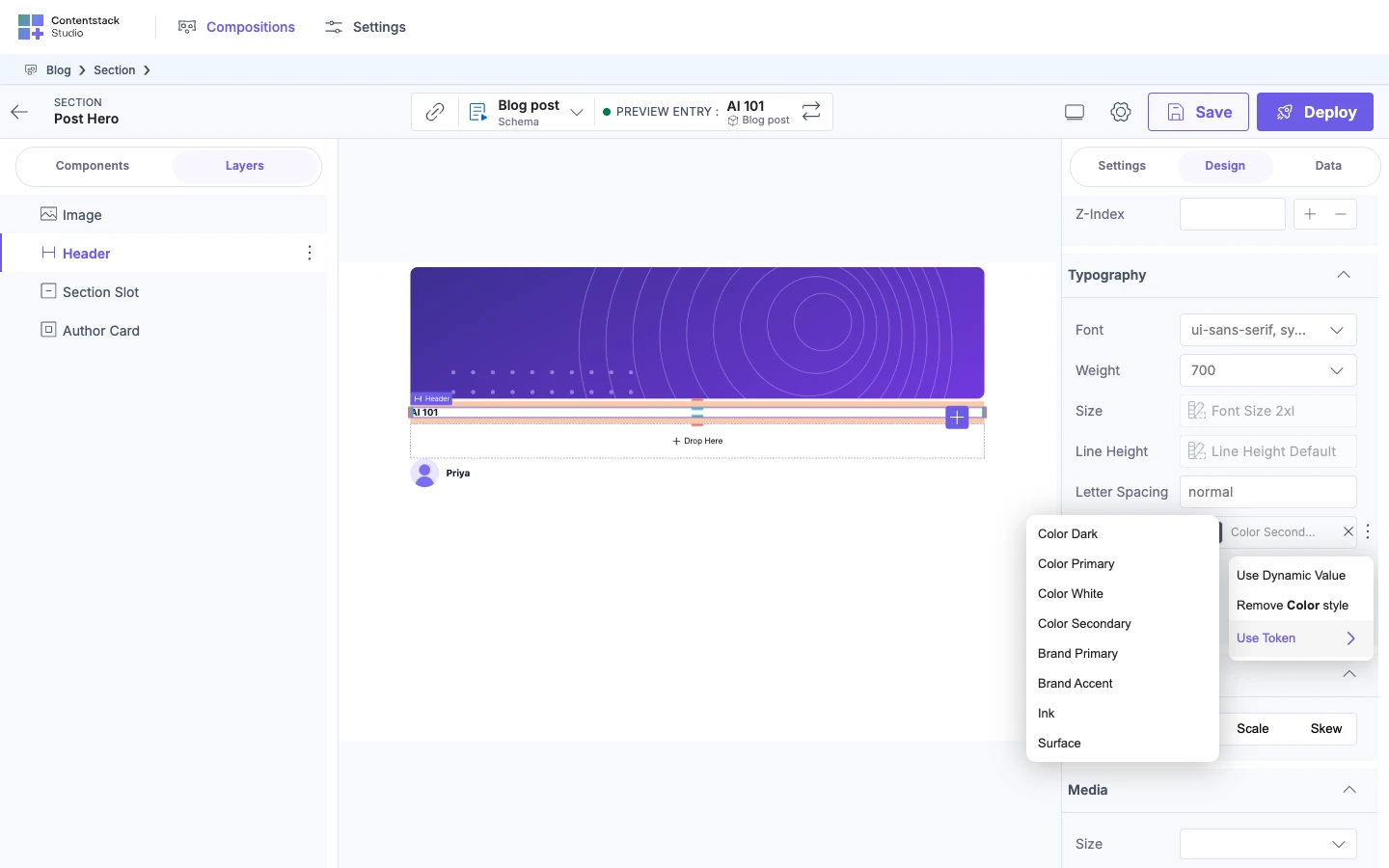
Merge or replace Studio's defaults. By default, your tokens merge with Studio's defaults, and a token with the same name replaces the default. Studio's defaults cover color, size, gap, font size, font weight, line height, border radius, border color, spacing, z-index, opacity and shadow. Pass allowDefaultDesignTokens: false to offer only your tokens.
Choose how strict the Design tab is
The allowed values level is the allowedValuesLevel option, with the values dynamic, tokens and arbitrary. It applies to the whole project, not to one component.
| Level | What you can do |
|---|---|
arbitrary | Select a token, bind a value from an entry, or type any value. This is the SDK default. |
tokens | Select a token or bind a value from an entry. You can't type a value. |
dynamic | Bind a value from an entry. Your tokens aren't offered. |
The SDK default is arbitrary, so registering tokens doesn't stop authors typing any value. The Blog project keeps the SDK default.
A value bound from an entry is written straight into the CSS. It doesn't go through your tokens. So the entry field must hold a valid CSS value, such as var(--token-typography_color_brand_primary) or #1e3a8a, not a token name such as brand-primary.
To limit authors to your tokens, pass tokens in the options argument of the same call. Options in a second call replace the first call's options.
registerDesignTokens(blogTokens, { allowedValuesLevel: "tokens" });
At tokens, the fields where authors type a value are disabled.
When no register-design-tokens.ts exists, csdx studio:design-token:add asks two questions. The first asks whether to use Studio's default tokens. That question has no default, so you type y or n. The second asks which allowed values level to use. The CLI preselects dynamic, which differs from the SDK default, arbitrary. Select tokens if you want authors to select your tokens.
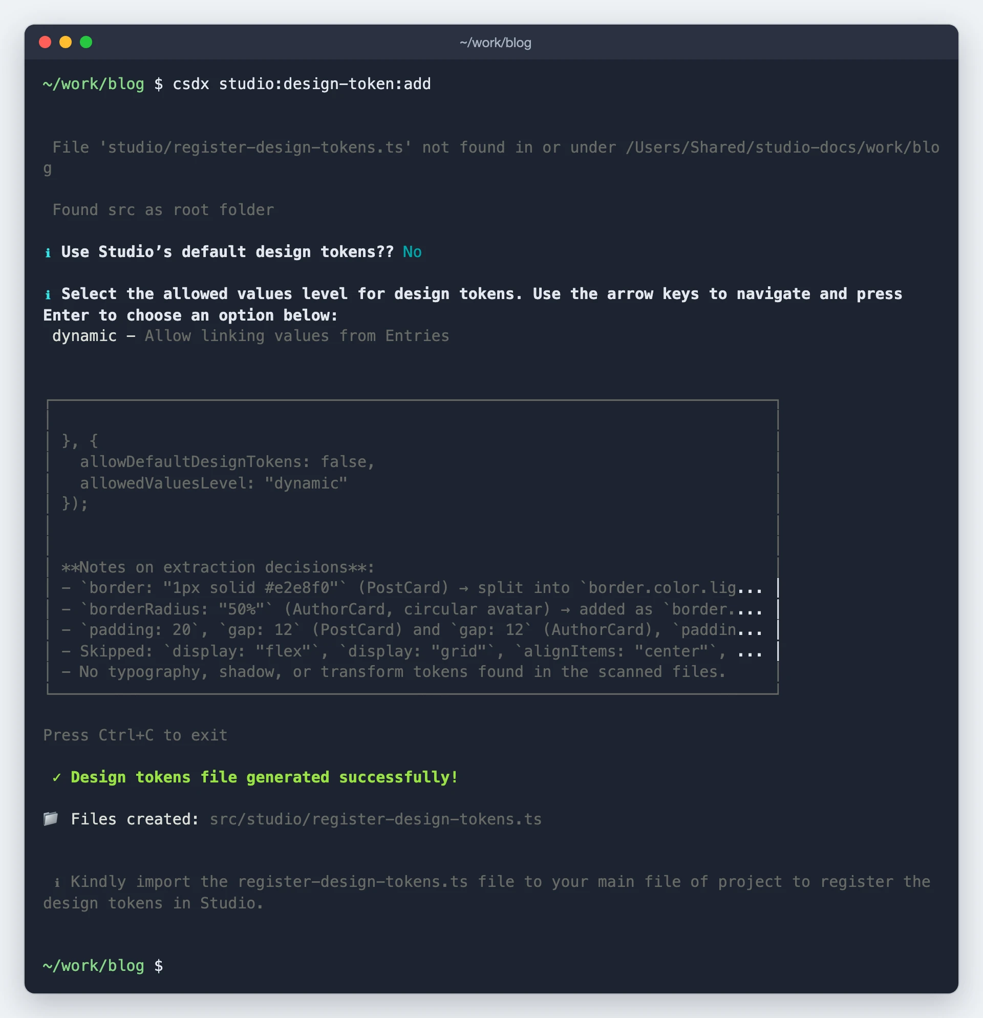
In a file the CLI generated, run csdx studio:design-token:config to change allowDefaultDesignTokens or the level. The CLI prints "Configuration updated successfully!" when it saves the change. The command stops with an error that names the missing path if register-design-tokens.ts doesn't exist.
The command reads the two settings from the file as written. If your registerDesignTokens call has no options object, add { allowDefaultDesignTokens: true, allowedValuesLevel: "arbitrary" } yourself first.
At tokens or dynamic, pasting a design with unregistered values from Figma shows a warning.
Use a token's value in your own code
Studio names each variable --token- plus the section, property and token name in snake case. A color named brand-primary becomes --token-typography_color_brand_primary, plus one variable each for the background, border and shadow colors.
Studio puts the variables on :root whenever it renders a composition.
getDesignTokens() returns every token as its var(--token-...) reference, and registerDesignTokens returns the same object. For example, getDesignTokens().spacing.margin["space-sm"] is var(--token-spacing_margin_space_sm).
Read names from getDesignTokens() rather than typing them. The suffix depends on the group, such as size_min_width_....
On a server-rendered page, getSSRStyles includes the variables unless you pass includeDesignTokens: false. See Server rendering helpers.
If it doesn't work
| What you see | Why | Fix |
|---|---|---|
| The Design tab offers Studio's default tokens, not yours. | Your registration code isn't running in the canvas. | Run getDesignTokens() where your app starts and compare the names. Import the registration file on every route that renders Studio content, including the canvas route. |
| A token isn't in a control's list. | It's in the wrong group, such as a spacing value used for width. | Move it to the group the control uses. For Size controls, use size.tokens. |
| Controls offer no tokens. | The level is dynamic, which the CLI prompt preselects. | Set the level to tokens. |
| Authors still type raw values. | The level is arbitrary, which is the SDK default. | Set the level to tokens. |
| Tokens you registered earlier are gone. | A second registerDesignTokens call replaces the tokens from the first, such as when you register once per source. | Register once, with all your tokens and options in one call. |
A style bound from an entry doesn't show, and the browser console says [studio] Bound design prop "<property>" resolved to "<value>", which is not a valid value for that CSS property — the declaration will be dropped and nothing will render. The field this is bound to has to hold a CSS value (e.g. a var(--token) or a literal). | The entry field holds something that isn't a CSS value for that property, such as a token name. The browser drops the style. | Store a CSS value in the field, such as a var(--token-...) reference or a literal like #1e3a8a. |
To register your site's screen sizes, see Register breakpoints. To decide what authors can change on one of your components, see Make your components styleable. To see how these values reach your live site, see How styling works.