Using Sections and Components in a Template
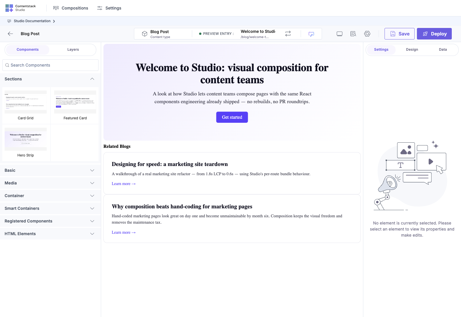
Open a template on the canvas, and you compose it by dragging from the left palette into the center.
Do It With a Skill
build-connected-template drops the sections and components described here onto a template and saves the result.
curl -fsSL https://studio-documentation.contentstackapps.com/install.sh | sh
The Canvas, in Plain English
- Left panel: what you can drop. Components, sections, layers, search.
- Center: the canvas. Drop targets are highlighted as you drag.
- Right panel: properties of whatever you selected. Tabs: Settings (component properties and data bindings) and Design (styles). In page/component-authoring contexts an extra Data or Component Data tab appears for page- or component-level data.
- Top bar: composition title, content type chip, preview entry, URL editor, view toggles, Save and Deploy.
What You Can Drop
The left palette has seven main categories (Advanced is hidden when empty):
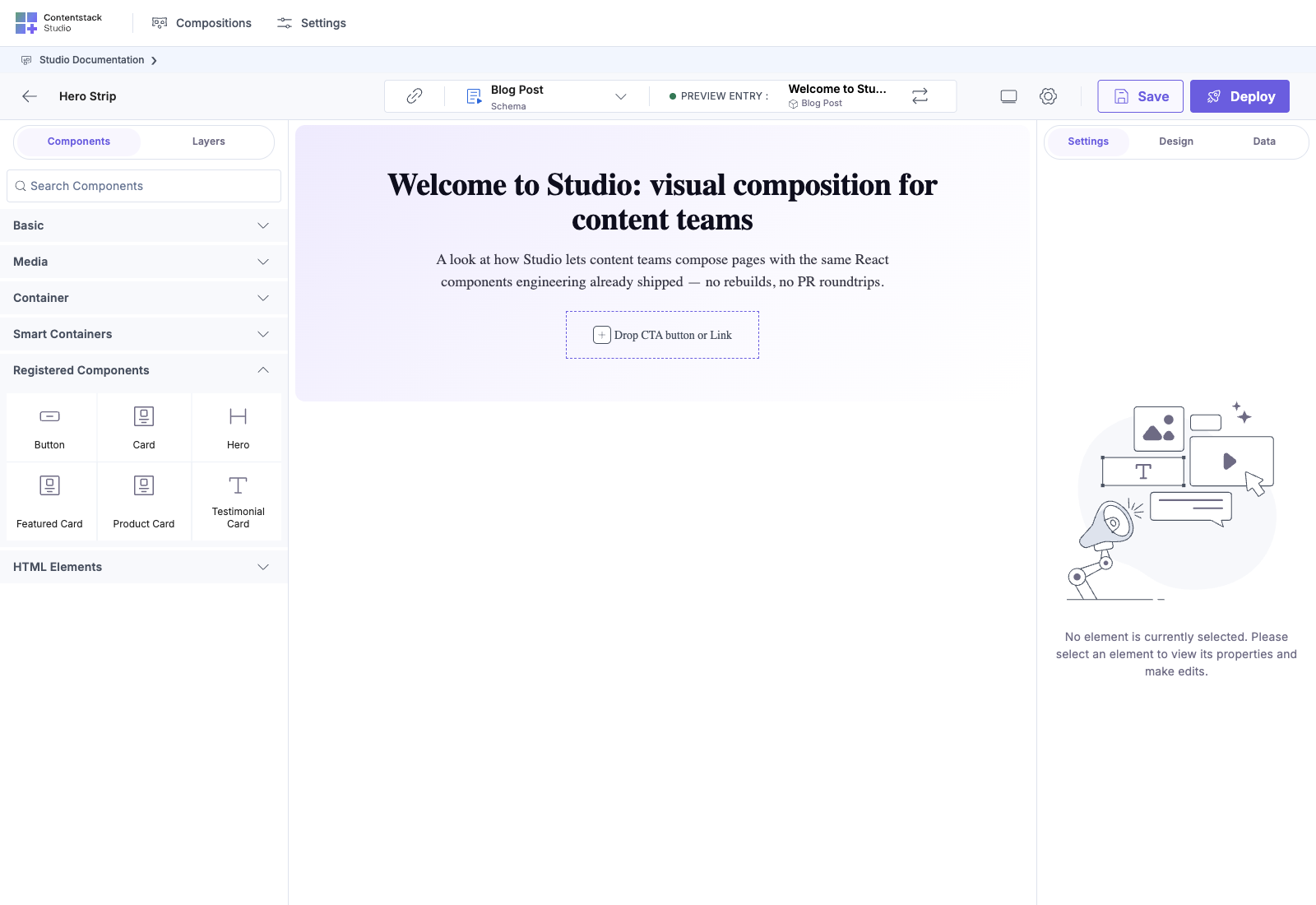
| Category | What’s in it |
|---|---|
| Basic | Text, heading, button, link primitives |
| Media | Image, video, asset placeholders |
| Container | Box, Row, Column (layout primitives) |
| Smart Containers | Repeater, Condition Block, Section Slot |
| Advanced | Advanced built-in components (hidden when empty) |
| Registered Components | Your registered React components |
| HTML Elements | Raw HTML primitives |
On a template, sections live in the Layers panel or can be dragged in from the compositions list.
Full template assembled from sections
Here’s a Blog Post template assembled by drag-dropping two section compositions: Hero Strip (filled with a Button in its section slot) and Card Grid (with its Card Title exposed prop overridden to “Related Blogs”). The right panel shows the section’s exposed prop ready for further editing.
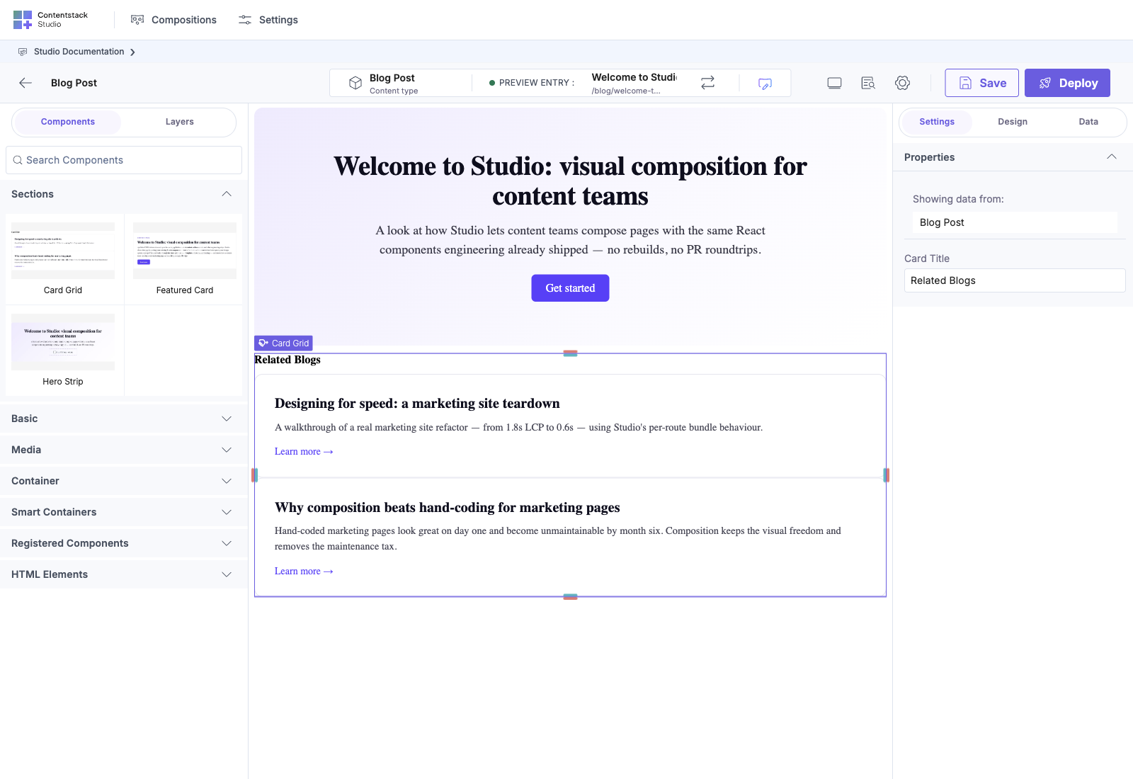
This single template demonstrates the full architectural chain:
- Registered Components (Hero, Card) declared in code
- Sections built from those components (Hero Strip, Card Grid)
- Template consuming the sections via drag-drop + filling section slots + overriding exposed props
Every authored decision (what’s static, what’s linked-schema, what’s iterated, what’s overridable) lives in this one canvas.
Binding a Component to Entry Data
Canonical: CMS binding, how components pull data. This section is a quick walkthrough of the UI flow. The mechanics live on the canonical page.
When you select a component on the canvas, the right panel switches to its properties.
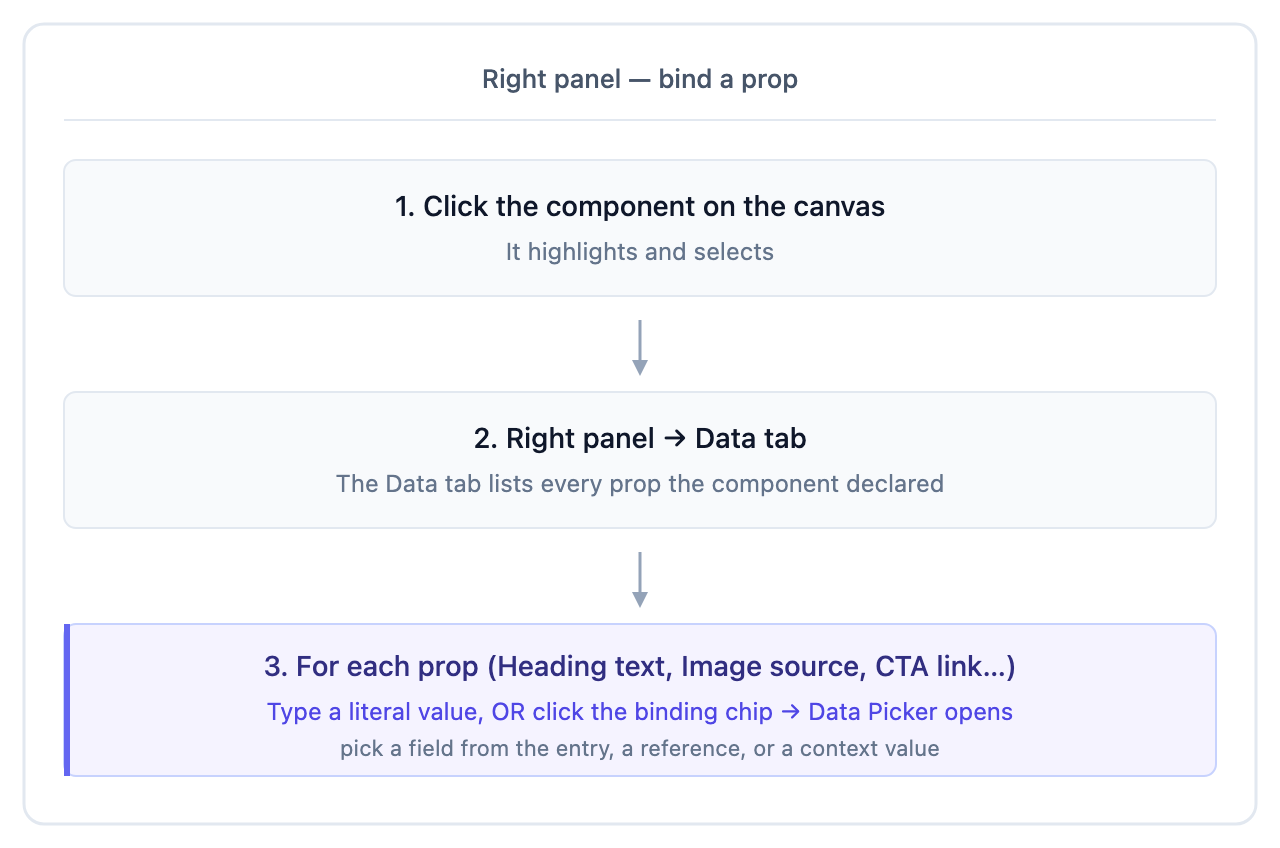
The same flow works for your registered components: each prop you declared becomes bindable in the same Data Picker.
Dropping a Section Onto a Template
When you drop a section onto a template, Studio uses the section’s linked schema to decide which field on your page’s content type it should bind to.
- One match: bound automatically.
- Multiple matches: bound to one, with a dropdown in the section’s right-panel settings to switch.
- No match: drops unbound. You can pick a field manually if a compatible one exists.
See Auto-binding for details.
Save vs Deploy
| Button | What it does |
|---|---|
| Save | Persists your changes to Contentstack. Doesn’t push to a live environment. |
| Deploy | Moves the composition through your publishing workflow to a target environment. |
Saving a section has an extra step: Studio may open the Expose Props modal so you can decide which component props on the section should be tunable per-template-instance. See Expose Section Props.
Common Pitfalls
- ”No element is currently selected” in the right panel: click a component on the canvas first.
- A bound value renders empty: the connected entry doesn’t have that field set. Switch the Preview Entry from the canvas toolbar (the swap icon) to an entry that has the field populated.
- A registered component drops but renders blank: it may be missing default data. Have your developer add sensible defaults. See Component default data.