Sections
Two audiences on this page. Content authors: read the two sentences below then jump to For Authors → Working with Sections. The “Studio Component / pure React” callout is engineering context. You don’t need it. Developers: keep reading. The next callout gives you the “what’s really shipping” mental model.
A section is a reusable block of layout (a hero, a CTA strip, a card grid, a footer) authored once and dropped into many pages.
💡 for Engineers (a Section is a Studio Component) Pure React, With Extra Knowledge
A Section is not a new kind of component. It’s still pure React, composed of your Registered Components (the React components you’ve already registered with Studio: <Hero>, <Card>, <Button>, or whatever else you’ve exposed). The Registered Components inside a Section run exactly as they would in any hand-coded page, same bundle, same render path, same lifecycle. Nothing in your component library changes when you wrap them into a Section.
What a Section adds is a wrapper of knowledge around those Registered Components, knowledge that lives as data in Studio, not as new code in your repo:
The “extra knowledge” a Section carries What it gets you | CMS wiring: the prop ↔ field binding map (which CMS field drives which prop, on which inner component, in which iteration scope) | Authors re-bind props in the canvas. The React code never changes. Studio also auto-emits the data-cslp tags from this same map. A VE-installed app then uses those tags for its own inline-editing surface. Studio itself has no inline-edit surface. See CMS Binding → data-cslp tag emission. | | Composition: how N React components combine into one bigger composed unit (with slots for substitution and exposed props for per-instance overrides) | One drop on a template renders the whole composed shape. You stop hand-wiring inner components inside every page. Swap one inner component for another inside a slot to get a new look, same structure, no code change. | | Live preview: the composed unit renders against any real entry in your stack, in any locale, under any variant alias | Storybook previews one component with fake data. A Section previews the composed shape with the real data visitors see, the missing rung between Storybook and the live URL. |
Put another way: the Section is the reusable block of layout from the definition above, expressed for engineers as a Studio Component, a pure React composition of Registered Components whose CMS wiring (prop ↔ field binding map + emitted data-cslp tags) and composition shape (slots, exposed props, layout) travel with it as data.
If your team thinks of “components” as React functions in a repo, a Section is the same idea pulled up one level: a composed, bindable, previewable React component. The rest of this page treats Section and “Studio Component” as the same thing.
Do It With a Skill
build-section authors a Section: it links the section to a structural schema (a content type, Global Field, Group, Modular Block, Block or Reference) and drops your registered components onto it.
curl -fsSL https://studio-documentation.contentstackapps.com/install.sh | sh
For the concept rather than the procedure, read What is a section?, or run understand-sections.
Why Use Sections
- Reuse. One source of truth for repeated UI. Update once, propagates everywhere.
- Cleaner pages. Keep page-level layouts short by composing them out of sections.
- Parallel work. Different authors own different sections without stepping on each other’s templates.
- Consistency. The same hero looks identical across pages by construction.
- Per-page flexibility. Use slots and exposed props to let each page customize the same section.
What’s Special About Sections
- No URL of their own. They preview on your project’s canvas URL, a single route (e.g. /canvas) on your app that mounts <StudioCanvas /> and gives Studio’s iframe a place to render Section previews. Visitors only see Sections as part of a page.
- Linked schema instead of a connected content type. A section declares the shape it expects, and Studio matches it to fields on whatever page it’s dropped into.
- Auto-binding follows where you drop it. Drop the same section at the root of a page or inside a Repeater. Studio picks the right binding per drop site.
- Section Slots let template authors customize what goes inside the section.
- Exposed Section Props let template authors override individual values per instance.
- Independent instances. Drop the same section twice on a page. Each instance has its own slot contents, prop overrides, and binding choices.
The Sections Tab
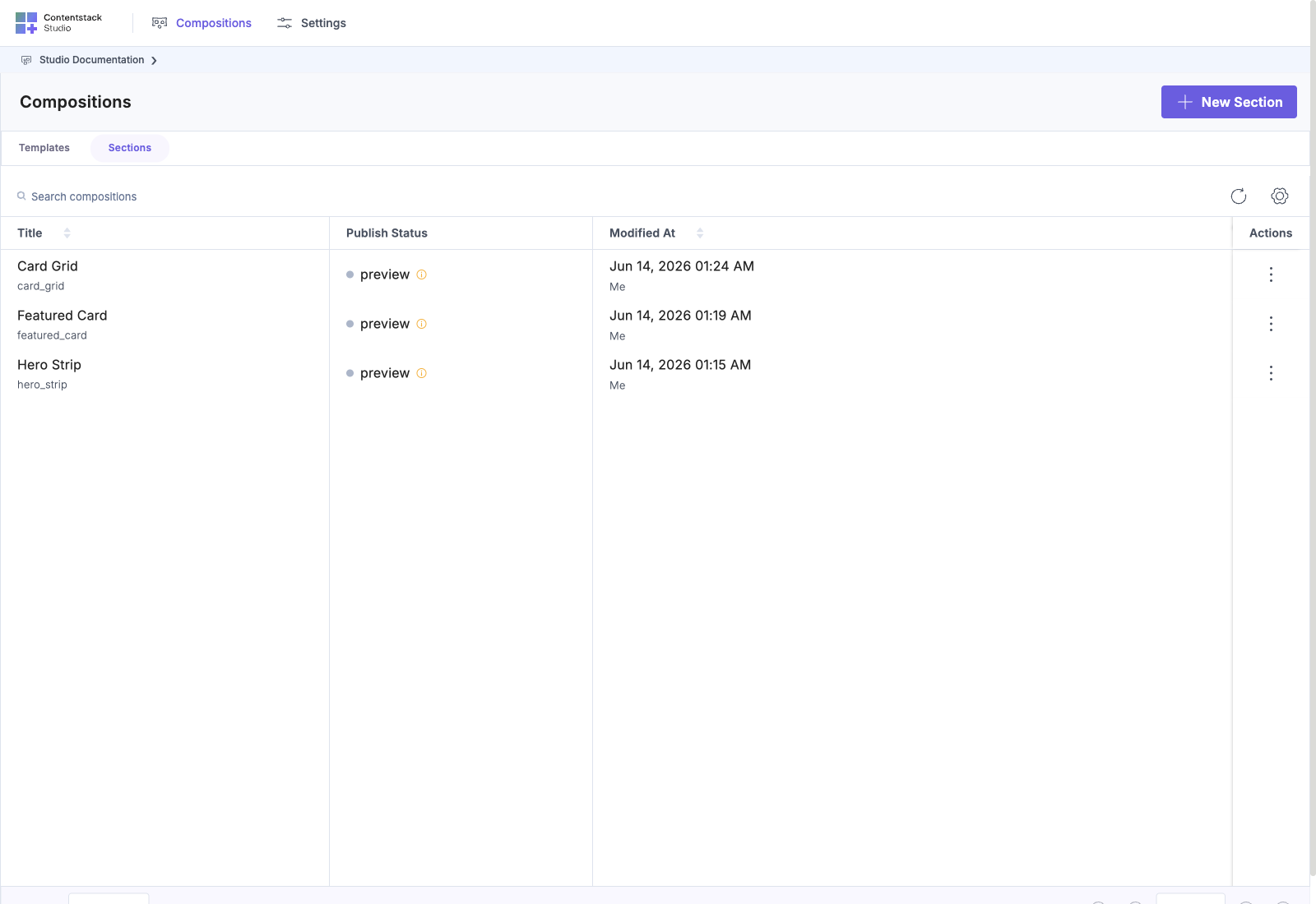
Project → Compositions → Sections tab.
Columns: Title · Publish Status · Modified At · Actions. No “Connected Content Type” column. Sections have a linked schema instead.
Button at top right: + New Section.
What the Section Canvas Looks Like
Open a section and the canvas is structurally similar to a template’s, but with two important differences:
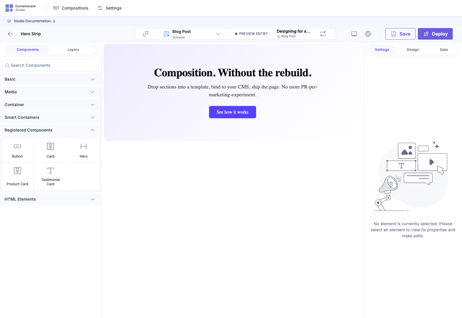
- No preview entry strip in the header. A section isn’t connected to a content type, so there’s no “current entry” to render against. The canvas previews against whatever the section is bound to via its linked schema (or empty, until you connect one).
- The Connect A Schema guided card appears alongside Add Components To Canvas. Wiring up the schema is the section equivalent of “pick a connected content type” for templates. The card is marked Recommended because section auto-binding only works if the schema is declared.
Picking Connect A Schema asks for a content type first, then opens the Select Schema Root picker over that content type’s field tree. The row you choose here is the section’s schema root (every binding inside the section is later resolved against it), so the picker offers structural shapes (the whole content type, a Global Field, Group, Modular Block, Block or Reference), not scalar values:
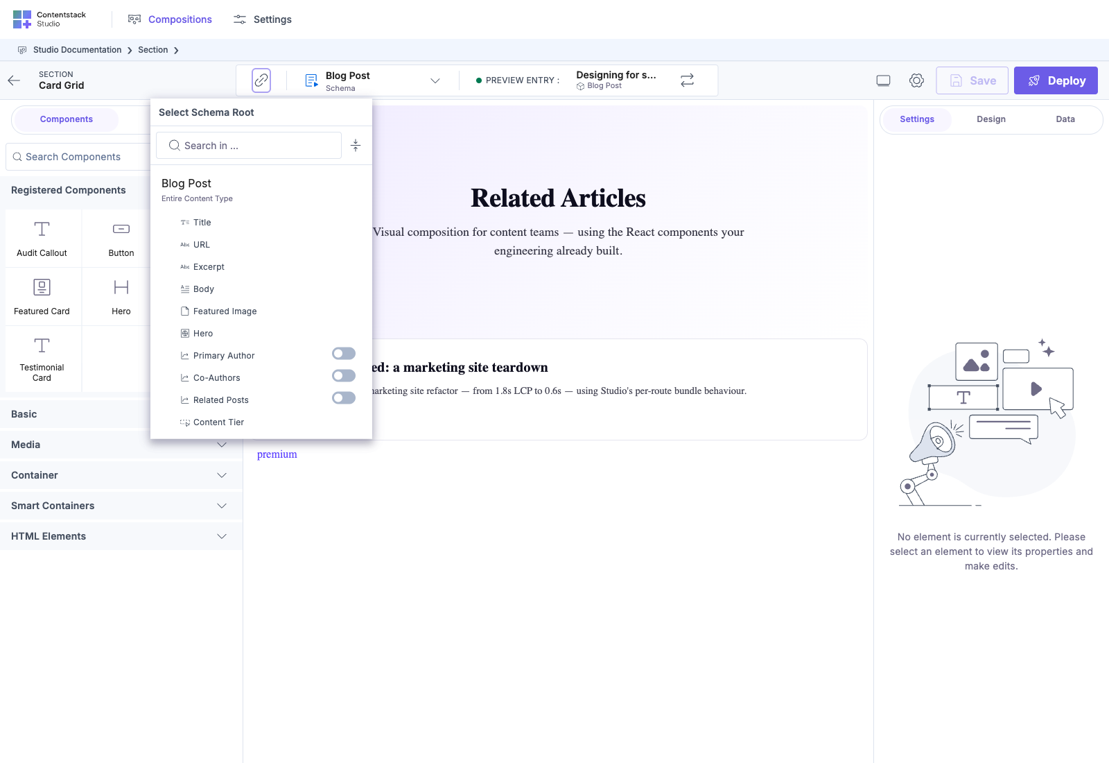
Once the schema is connected and components dropped, the canvas behaves the same way as a template canvas. The palette, the Layers panel, and the right-panel Properties all work identically.
What’s in This Chapter
| Page | Covers |
|---|---|
| Linked schema | Bind a section to a shape. One section can link to multiple schemas across content types |
| Auto-binding | Studio matches the linked schema to the drop scope |
| Section Slots | Named drop placeholders, chainable and recursive |
| Expose Section Props | Surface a component prop as overridable on the section |
| Repeaters | Render the same shape once per item in a list |
| Condition Blocks | Render different designs per item type (Modular Blocks, multi-reference fields) |