Compose a Hero From Primitives
Five distinct Hero variants built from the same 10 registered primitives. No Hero component, no engineering ticket for the next variant.
Prerequisite reading. This recipe assumes you’ve read Design a component library that composes, not sprawls and registered the 10 primitives (4 atoms + 6 layouts) it describes.
Do It With a Skill
compose-marketing-section takes a design comp or a description and assembles it from primitives you have already registered.
curl -fsSL https://studio-documentation.contentstackapps.com/install.sh | sh
What You’ll Build
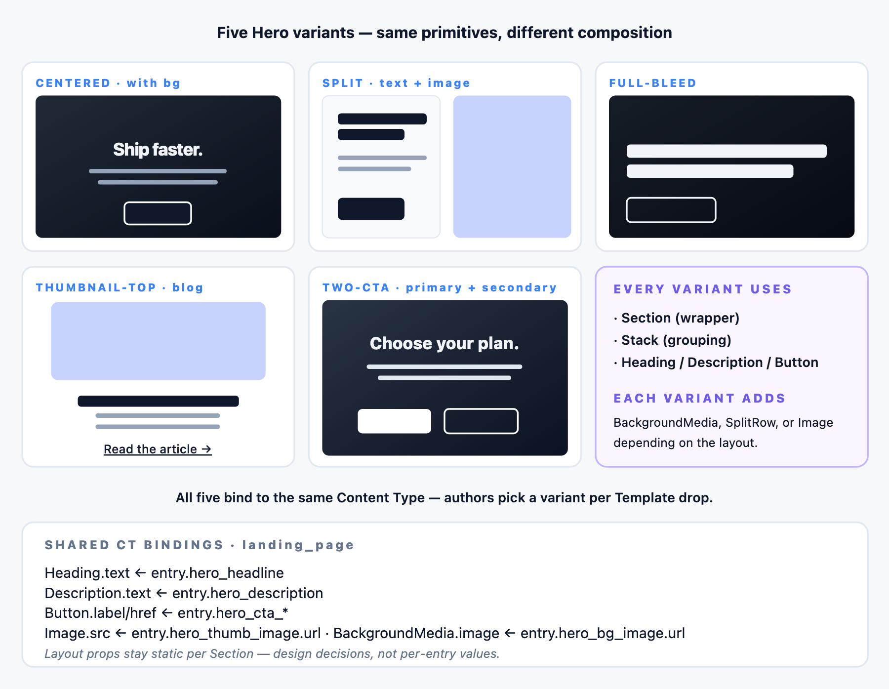
- Variant 1: Centered Hero with a background image
- Variant 2: Split Hero (text left, thumbnail right)
- Variant 3: Full-bleed Hero (immersive, minimal text)
- Variant 4: Thumbnail-on-top Hero (blog / product launch)
- Variant 5: Two-CTA Hero (primary + secondary actions)
All five bind to the same Content Type shape: you write the CT once, and authors pick a variant per Template drop.
Prerequisite: the Content Type
Every Hero binds to fields on a landing_page Content Type. Suggested fields:
| Field UID | Type | Notes |
|---|---|---|
| hero_headline | Single-line text | Bound to Heading.text |
| hero_description | Multi-line text | Bound to Description.text |
| hero_cta_label | Single-line text | Bound to Button.label |
| hero_cta_url | Link | Bound to Button.href |
| hero_secondary_cta_label | Single-line text | Optional, for the two-CTA variant |
| hero_secondary_cta_url | Link | Optional |
| hero_bg_image | File (asset) | Bound to BackgroundMedia.image |
| hero_thumb_image | File (asset) | Bound to Image.src for split / thumbnail-top variants |
You don’t need every field for every variant: the CT is a superset, each variant binds to the subset it needs.
Variant 1: Centered Hero With Background Image
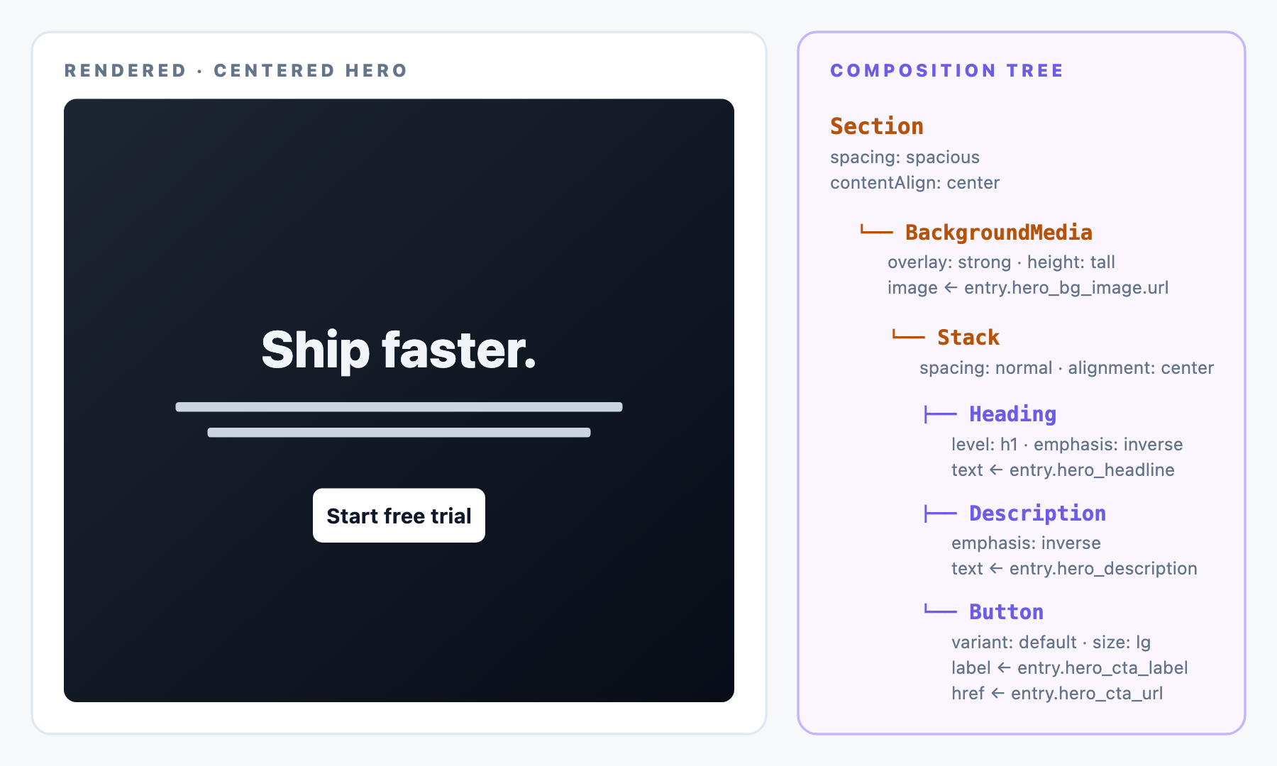
Composition tree:
Section (spacing: spacious, contentAlign: center)
└── BackgroundMedia (image: hero-bg.jpg, overlay: strong, height: tall)
    └── Stack (spacing: normal, alignment: center)
        ├── Heading (text: "Ship faster.", level: h1, emphasis: inverse)
        ├── Description (text: "The platform that…", emphasis: inverse)
        └── Button (label: "Start free trial", variant: default, size: lg)
Bindings:
- Heading.text binds to entry.hero_headline
- Description.text binds to entry.hero_description
- Button.label binds to entry.hero_cta_label
- Button.href binds to entry.hero_cta_url
- BackgroundMedia.image binds to entry.hero_bg_image.url
Design-system does the rest: H1 sizing, overlay tint, spacing, button color. Every visual token resolves without an author choosing.
Variant 2: Split Hero (text Left, Thumbnail Right)
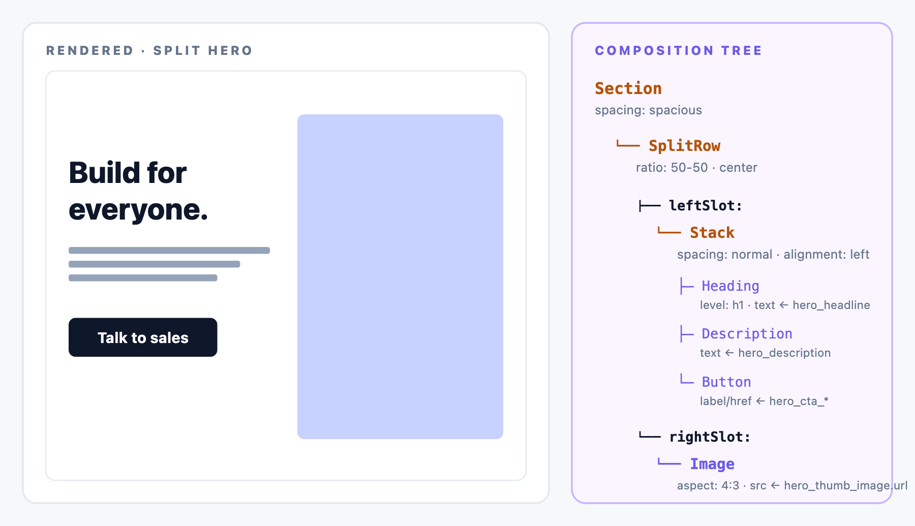
Composition tree:
Section (spacing: spacious)
└── SplitRow (ratio: 50-50, verticalAlign: center)
    ├── leftSlot:
    │   └── Stack (spacing: normal, alignment: left)
    │       ├── Heading (text: "…", level: h1)
    │       ├── Description (text: "…")
    │       └── Button (label: "Talk to sales", variant: default, size: lg)
    └── rightSlot:
        └── Image (src: hero-thumb.png, aspect: 4:3, fit: cover)
Bindings:
- Heading.text binds to entry.hero_headline
- Description.text binds to entry.hero_description
- Button.label binds to entry.hero_cta_label, and Button.href binds to entry.hero_cta_url
- Image.src binds to entry.hero_thumb_image.url
Varieties from the same tree:
- Change SplitRow.ratio: 60-40 to give the text more room.
- Swap leftSlot and rightSlot contents for image-left layouts: no schema change, just re-arrange on canvas.
- Set reverseOnMobile: true if the design wants image-first on small screens.
Variant 3: Full-Bleed Hero (immersive)
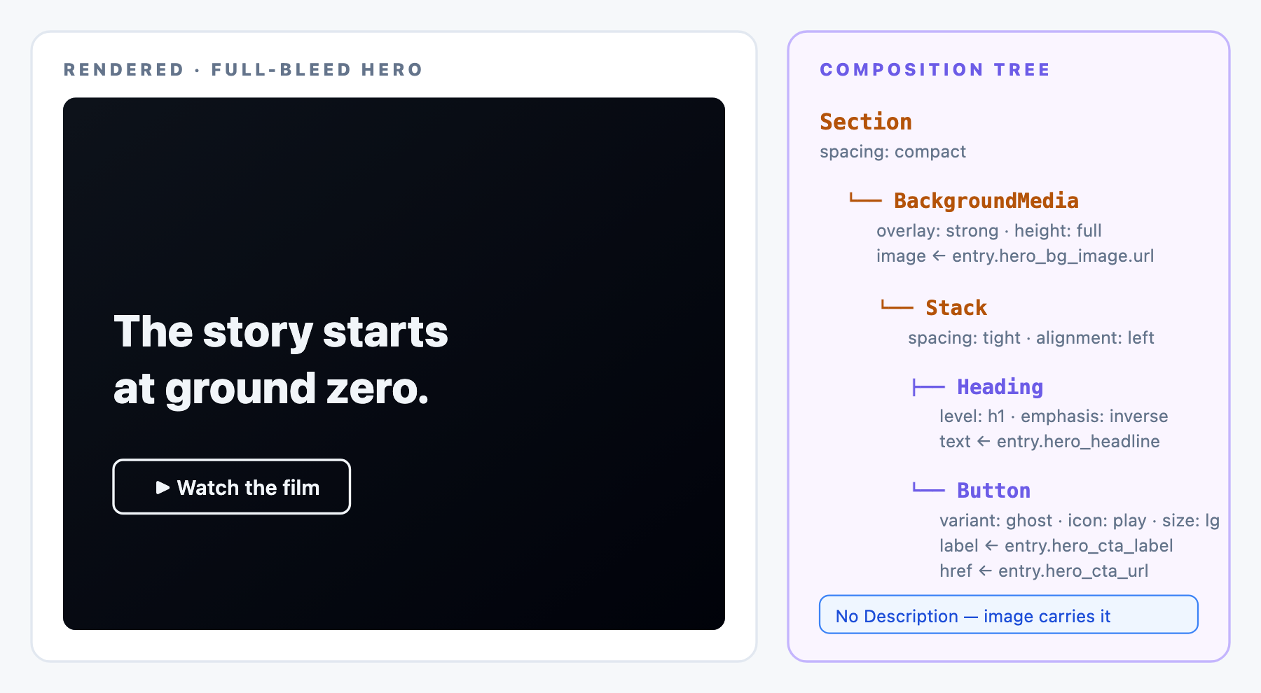
Composition tree:
Section (spacing: compact)
└── BackgroundMedia (image: hero-full.jpg, overlay: strong, height: full)
    └── Stack (spacing: tight, alignment: left)
        ├── Heading (text: "…", level: h1, emphasis: inverse)
        └── Button (label: "Watch the film", variant: ghost, icon: play, size: lg)
Bindings:
- Heading.text binds to entry.hero_headline
- Button.label binds to entry.hero_cta_label, and Button.href binds to entry.hero_cta_url
- BackgroundMedia.image binds to entry.hero_bg_image.url
No Description binding for this variant. Full viewport height. Minimal overlay content: the image carries the message.
Variant 4: Thumbnail-on-Top Hero (blog / Product)
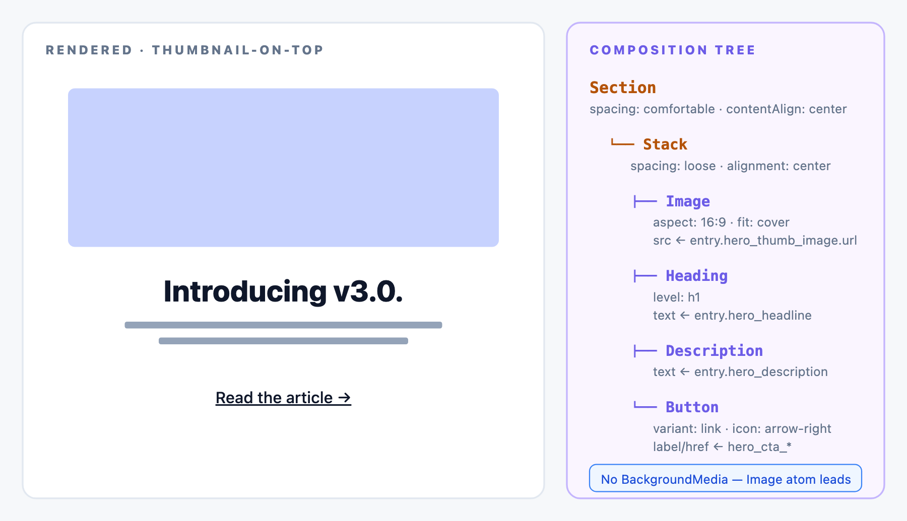
Composition tree:
Section (spacing: comfortable, contentAlign: center)
└── Stack (spacing: loose, alignment: center)
    ├── Image (src: article-thumb.jpg, aspect: 16:9, fit: cover)
    ├── Heading (text: "…", level: h1)
    ├── Description (text: "…")
    └── Button (label: "Read the article", variant: link, icon: arrow-right)
No BackgroundMedia. Image sits above the text. Common for blog post headers and product launch pages.
Bindings:
- Image.src binds to entry.hero_thumb_image.url
- Heading.text binds to entry.hero_headline
- Description.text binds to entry.hero_description
- Button.label binds to entry.hero_cta_label, and Button.href binds to entry.hero_cta_url
Variant 5: Two-CTA Hero
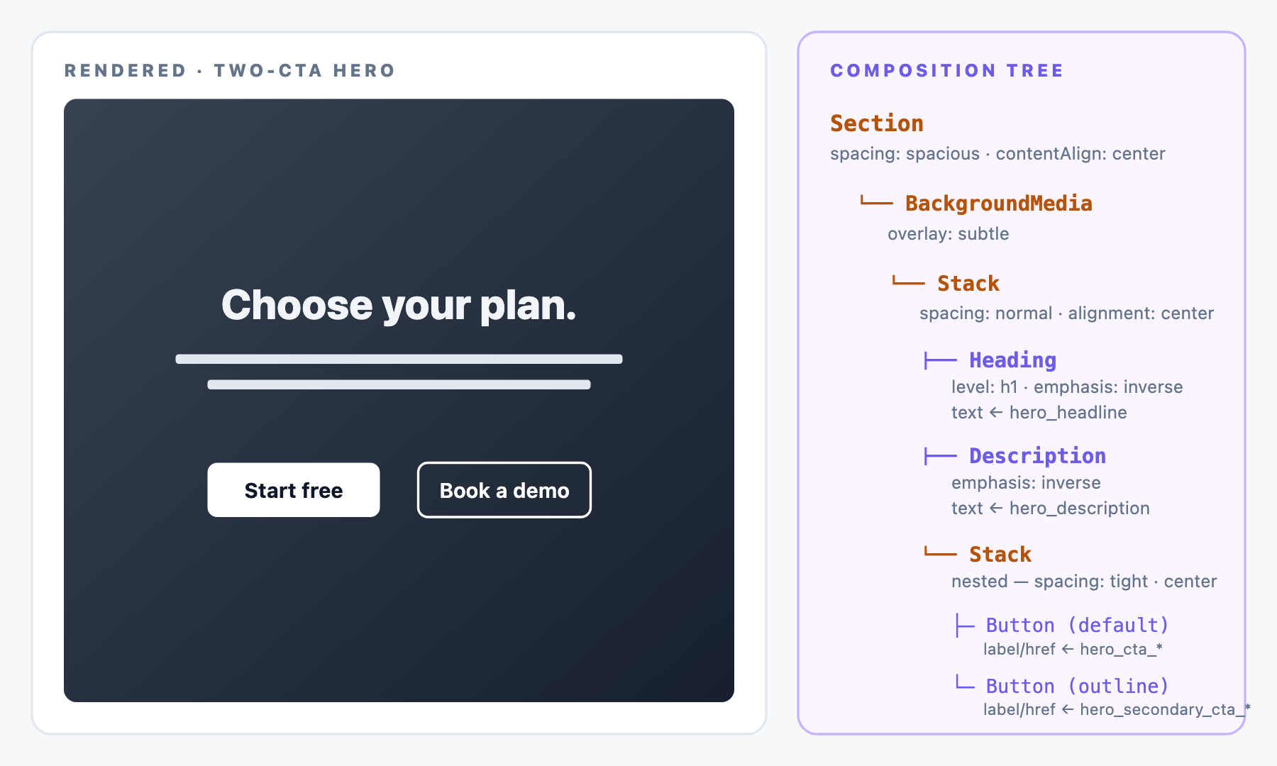
Composition tree:
Section (spacing: spacious, contentAlign: center)
└── BackgroundMedia (image: hero-abstract.jpg, overlay: subtle)
    └── Stack (spacing: normal, alignment: center)
        ├── Heading (text: "…", level: h1, emphasis: inverse)
        ├── Description (text: "…", emphasis: inverse)
        └── Stack (spacing: tight, alignment: center)
            ├── Button (label: "Start free", variant: default, size: lg)
            └── Button (label: "Book a demo", variant: outline, size: lg)
Two buttons in a nested Stack. If you want them strictly side-by-side rather than gap-stacked, extend Stack with a direction: row option or introduce a horizontal Row layout primitive, a one-time addition to the library.
Bindings:
- Primary Button.label binds to entry.hero_cta_label
- Primary Button.href binds to entry.hero_cta_url
- Secondary Button.label binds to entry.hero_secondary_cta_label
- Secondary Button.href binds to entry.hero_secondary_cta_url
- Plus Heading, Description, BackgroundMedia bindings as in Variant 1.
Which Layout Props Stay Static Vs. Exposed
- Static per Section: Section.spacing, SplitRow.ratio, Stack.alignment, BackgroundMedia.overlay. Design decisions the Section author makes once.
- Exposed Prop candidates: Section.background, BackgroundMedia.overlay, SplitRow.ratio (rare: for Templates that want to override the split from 50-50 to 60-40 on landing pages).
- Never exposed: atom props. Content flows via CMS bindings. Visual polish stays in the design system.
What You’ll See in Studio
The primitives you registered show up in Studio’s palette on the left of the canvas. Drag one onto the canvas to add it. Select it to configure its semantic options in the properties panel on the right.
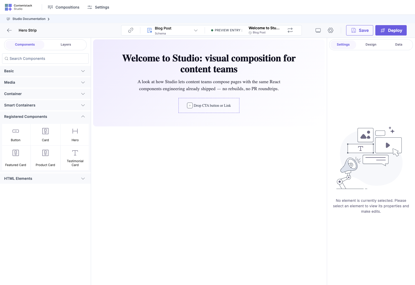
Once you drop a Section on the canvas and nest content inside, the composition renders inline with real bindings pulled from the linked Content Type:
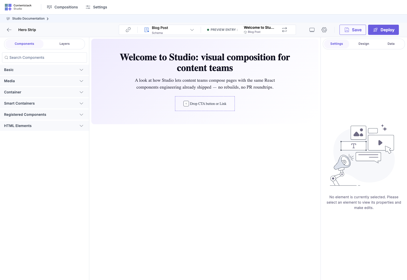
Every semantic dropdown (Heading level, Section spacing, Card variant) is a controlled list from your DS: no free text, no drift.
Building This in Studio: Step by Step
- Open the Sections palette, click Create Section, name it Hero — Centered.
- Set the target Content Type to landing_page (the linked schema).
- Drag Section onto the canvas. Configure spacing: spacious, contentAlign: center.
- Drag BackgroundMedia into Section’s children slot. Configure overlay: strong, height: tall.
- Drag Stack into BackgroundMedia’s foreground slot. Configure spacing: normal, alignment: center.
- Drag Heading into Stack. Bind text to landing_page.hero_headline via the Data Picker. Configure level: h1, emphasis: inverse.
- Drag Description into Stack, below Heading. Bind text to landing_page.hero_description. Configure emphasis: inverse.
- Drag Button into Stack, below Description. Bind label to hero_cta_label, href to hero_cta_url. Configure variant: default, size: lg.
- Save the Section. Repeat for other variants: save each as Hero — Split, Hero — Full-bleed, etc.
Template authors then drop the variant that fits their page. Same CT bindings, different composition: no code change per variant.
Testing
Once the Section is saved:
- Create a landing_page entry, fill in hero_headline / hero_description / hero_cta_label / hero_cta_url / hero_bg_image.
- Create a Template with URL pattern /landing/:slug, drop Hero — Centered on it.
- Visit /landing/<slug>. The Hero should render with the entry’s content, backed by the design-system tokens.
Related Recipes
- Feature grid from primitives
- Testimonial cards from primitives
- Pricing tiles from primitives
- Card grid with slots: the more advanced list-and-slot pattern