Quickstart 2: Register a Component With a Slot
Expose one of your React components to Studio’s palette. Declare a Slot on it so authors can drop other components inside it.
Watch the walkthrough (4:42): it opens by explaining what registering a component means and why you’d do it, then builds a Hero from five small single-purpose components. See all six videos.
Mental model (if you use Tailwind + shadcn/ui / Radix / Headless UI): the <Card> you register here is a Layer 2 container with a slot, the same shape as <Dialog><Dialog.Header/><Dialog.Body>{children}</Dialog.Body></Dialog> from shadcn/ui. Studio’s slot prop is the typed children you already use in compound components. Once you register a few Layer 1 atomics (<Heading>, <Text>, <Image>, <Button>) and Layer 2 containers like Card, authors compose them into Sections + Templates in the Canvas. Full analogy at The three-layer model § For readers coming from Tailwind + shadcn/ui / Radix / Headless UI.
Do It With a Skill
register-component reads your component, infers its prop schema and writes the registerComponent call.
curl -fsSL https://studio-documentation.contentstackapps.com/install.sh | sh
What You’ll Have at the End
- A <Card> component (or your own) visible in Studio’s palette.
- A Slot prop on the Card that renders as a drop-zone in the canvas.
- Authors can drop <Button> (or any registered component) inside the Card’s slot.
Prerequisites
- Quickstart 1 done: Studio SDK is bootstrapped, canvas loads.
- A React component to register. If you don’t have one, use the <Card> below.
Two Things Every Component Declares
A registered component has two surfaces Studio understands:
- Props: regular values Studio can bind to (a title string, an image URL, a number).
- Slots: drop-zones on the component for OTHER registered components to be placed inside. Declared as a slot-typed prop.
That’s it. Everything you build downstream (Sections, Templates, iteration) composes these two.
Steps
1. Write a component with a slot prop
// components/Card.tsx
export function Card({ title, content }: { title: string; content: React.ReactNode }) {
  return (
    <div className="card">
      <h2>{title}</h2>
      <div className="card-body">{content}</div>
    </div>
  );
}
title is a regular prop. content is a React node, the slot. Its type in your TypeScript signature is React.ReactNode. Studio treats it as a drop-zone.
2. Register the component
Create src/contentstack/register-components.ts, the same folder your initialize.ts lives in (Quickstart 1). registerComponents takes an array, so this one file is where every component you expose gets declared:
import { registerComponents } from "@contentstack/studio-react";
import { Card } from "../components/Card";

registerComponents([
  {
    type:        "card",              // stable string ID Studio's compositions reference
    component:   Card,                // the actual React component
    displayName: "Card",
    props: {
      title:   { type: "string", displayName: "Title", defaultValue: "Card title" },
      content: { type: "slot",   displayName: "Content" },
    },
  },
]);
Key names to internalise:
- type: the string ID Studio’s composition JSON references. Must be stable across renames of the file / class.
- component: the React function/class.
- props: the prop-schema map (NOT propTypes). Each entry’s type is the widget kind Studio renders in the right panel (string, number, imageurl, href, choice, slot, boolean, datestring, array, object, any, json_rte, html_rte).
Registering more than one component? Add another object to the same array: that’s the whole point of the plural registerComponents([...]). (A singular registerComponent({...}) also exists for the one-off case.)
Make it run before Studio’s canvas mounts by importing it once for its side effects at the top of contentstack/initialize.ts:
import "./register-components";
Full detail: Registering components.
3. Verify the component appears in Studio’s palette
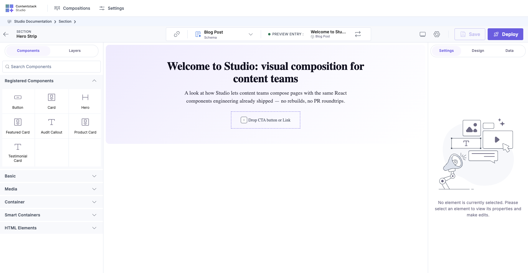
Reload Studio. Open your project’s canvas, then the left palette, then scroll to Registered Components. <Card> should appear.
Drop it on the canvas. You’ll see the title (with its default value “Card title”) and an empty drop-zone where the content slot is.
4. Drop another registered component into the slot
Any registered component works. Studio ships built-ins (Button, Image, Header), so drop a Button in there. It renders inside the Card’s body.
Screenshot check: the Button lives inside the Card’s frame: that’s the slot working.
Component Slot vs Section Slot: the One Thing to Know
You just declared a Component Slot in code. Studio also has a Section Slot, a very similar-looking drop-zone, but it lives inside a Section’s design (not in a component’s code) and is filled at Template authoring time (not Section authoring time).
Rule of thumb (full detail in Section Slots § Slot vs Section Slot):
Component Slot first. Escalate to a Section Slot only when the fill decision must be made per Template, not per Section.
You’ll meet Section Slots in Quickstart 4.
What Just Happened
Studio now knows your Card exists. Every Section and Template can drop it. The slot means authors compose Card’s contents without you shipping every possible variant.
Next
Quickstart 3: Build a Simple Section + Expose Props (~10 min).
Full-Detail References
- Bring your own components chapter
- Component schema: all prop types
- Optimizing load: lazy registration, for larger component libraries.