Card Grid With Slots
A complete end-to-end build of the list + slot pattern: one section owns the grid layout, a second section owns the card frame with named slots, and template authors compose the cards visually on the template canvas.
This is the richest pattern Studio supports for reusable layout. Once you have it, it generalises to tabs, accordions, carousels, anything else built on “repeat this shape, but let me customize each item”.
You’ll build:
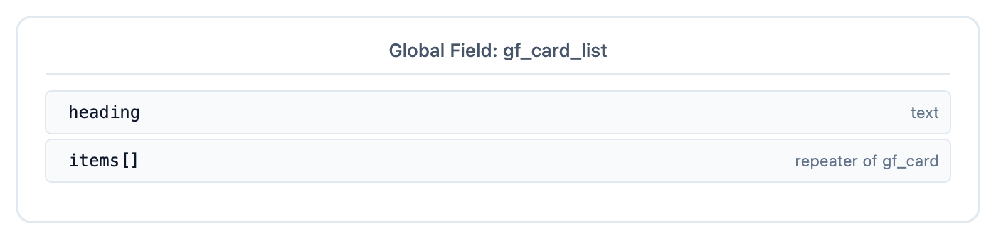
- A gf_card_list Global Field that defines “a list of card-shaped items”
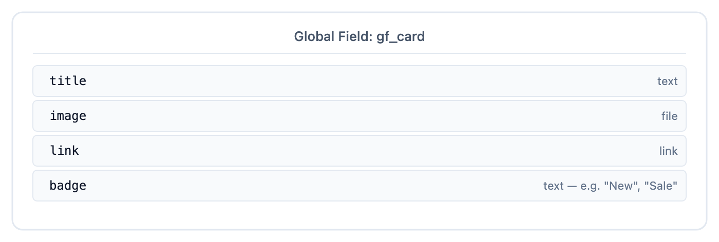
- A gf_card Global Field that defines “what a single card looks like as data”
- A card_grid section: the wrapper + iteration
- A product_card section: the visual card with 4 named slots
- A landing_page content type that uses gf_card_list for its featured products
End state: a single card_grid drop on the template, with product_card filling its slot, renders N cards with real product data.
Do It With a Skill
build-repeating-section builds the parent Repeater and Section Slot, and use-section-slot carves the slot if the section already exists.
curl -fsSL https://studio-documentation.contentstackapps.com/install.sh | sh
Step 1: Define the Global Fields in Contentstack
In your stack:
gf_card
gf_card_list
landing_page content type
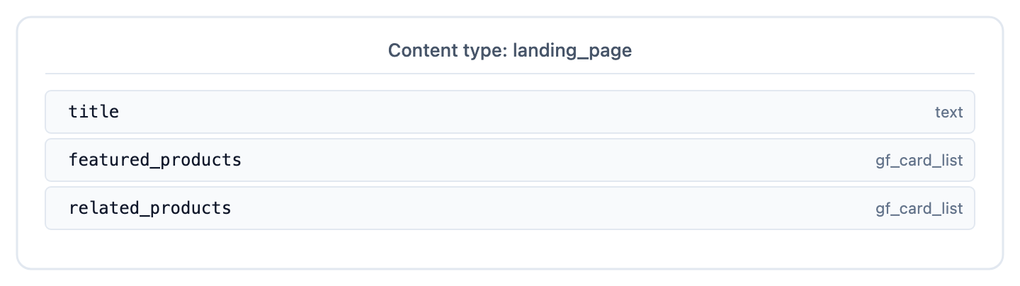
Two gf_card_list fields so we can verify Studio’s multi-match picker later.
Populate one landing_page entry with values in featured_products.items[] (5 products) and related_products.items[] (3 products).
Step 2: build the card_grid Section in Studio
- In Compositions, open the Sections tab and select + New Section. Name it card_grid
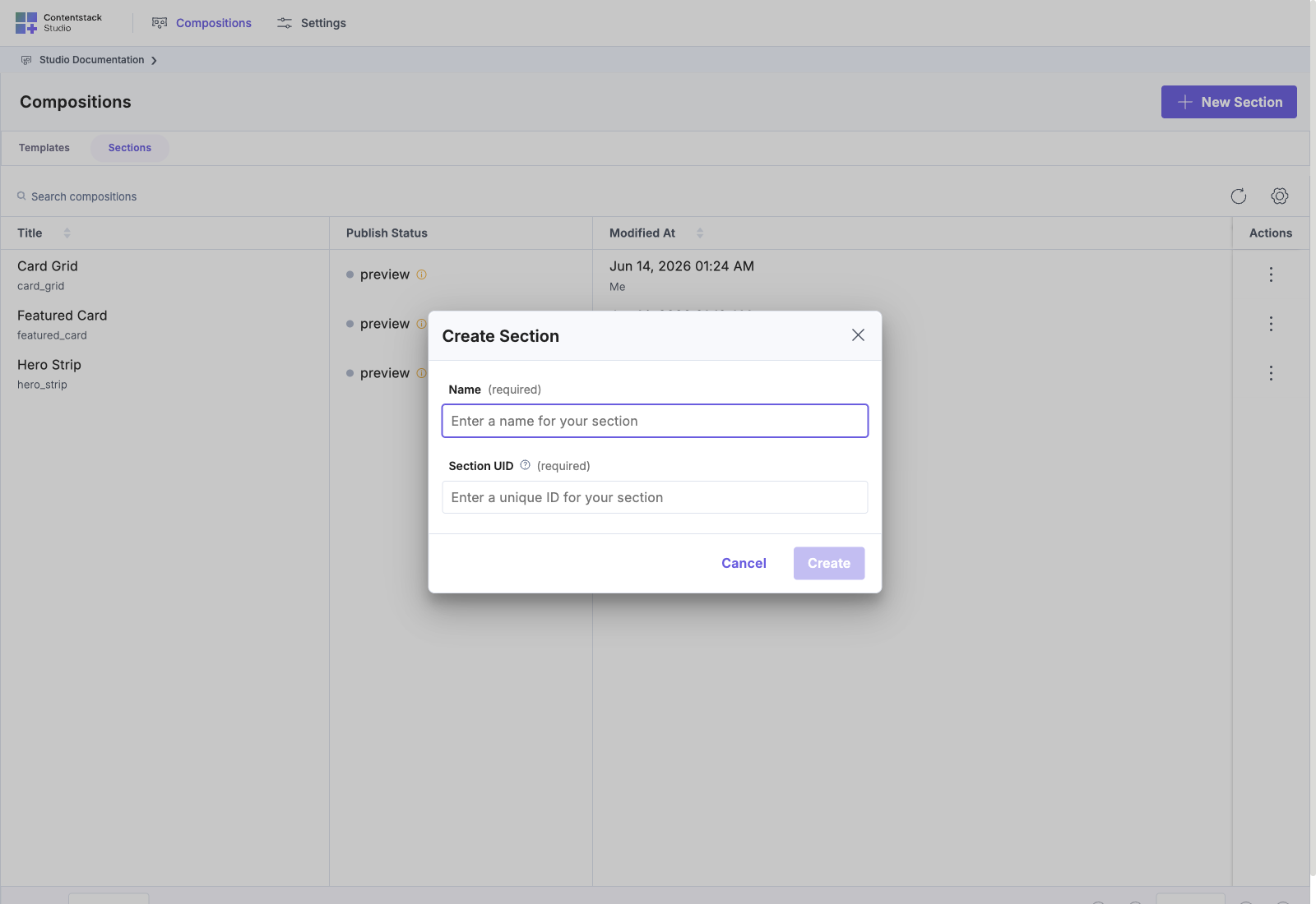
- In the section settings, open Link Schema and pick gf_card_list (the Global Field)
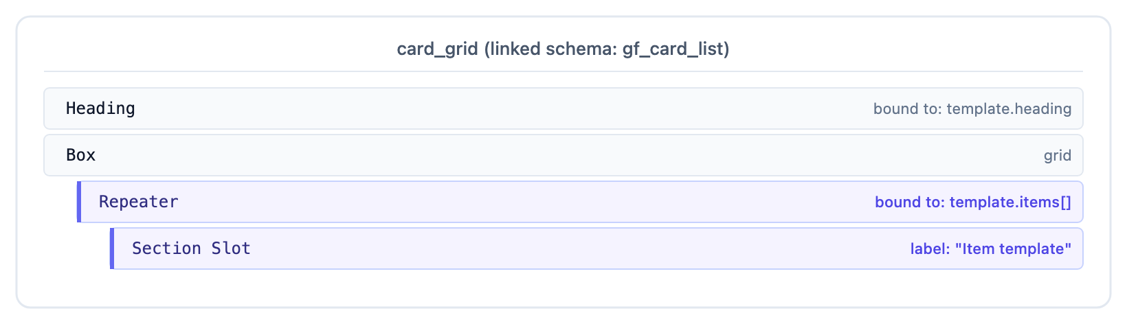
- On the canvas, drop a Box at the root: this is the grid container. Set its CSS to a grid layout via the Design panel:
display: grid
grid-template-columns: repeat(auto-fit, minmax(250px, 1fr))
gap: 24px
- Drop a Heading above the grid Box. Bind it to template.heading.
- Inside the grid Box, drop a Repeater from the Smart Containers palette. Bind its source to template.items[].
- Inside the Repeater, drop a Section Slot from Smart Containers. Label it Item template.
- Save.
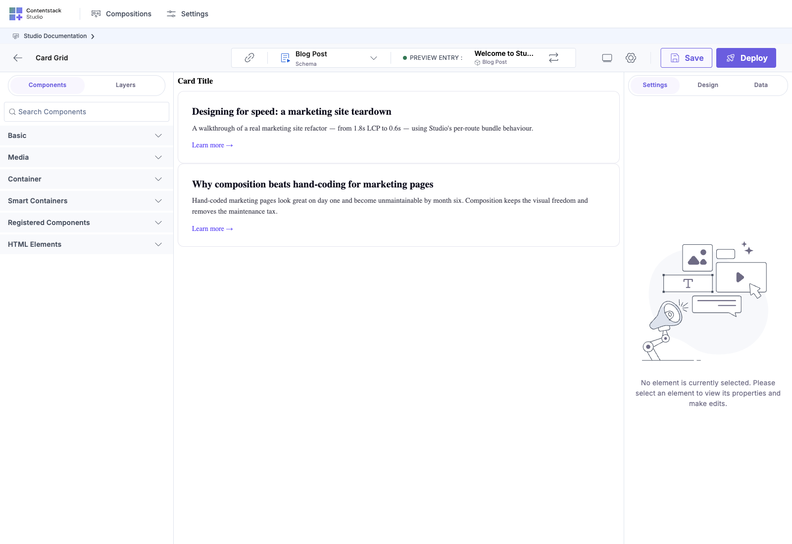
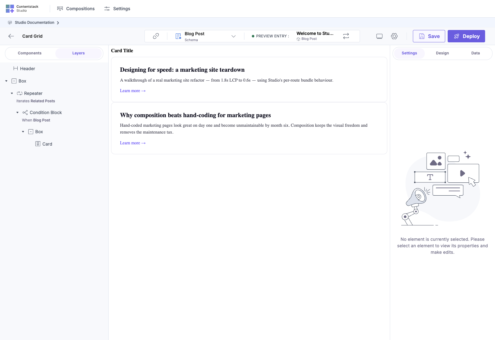
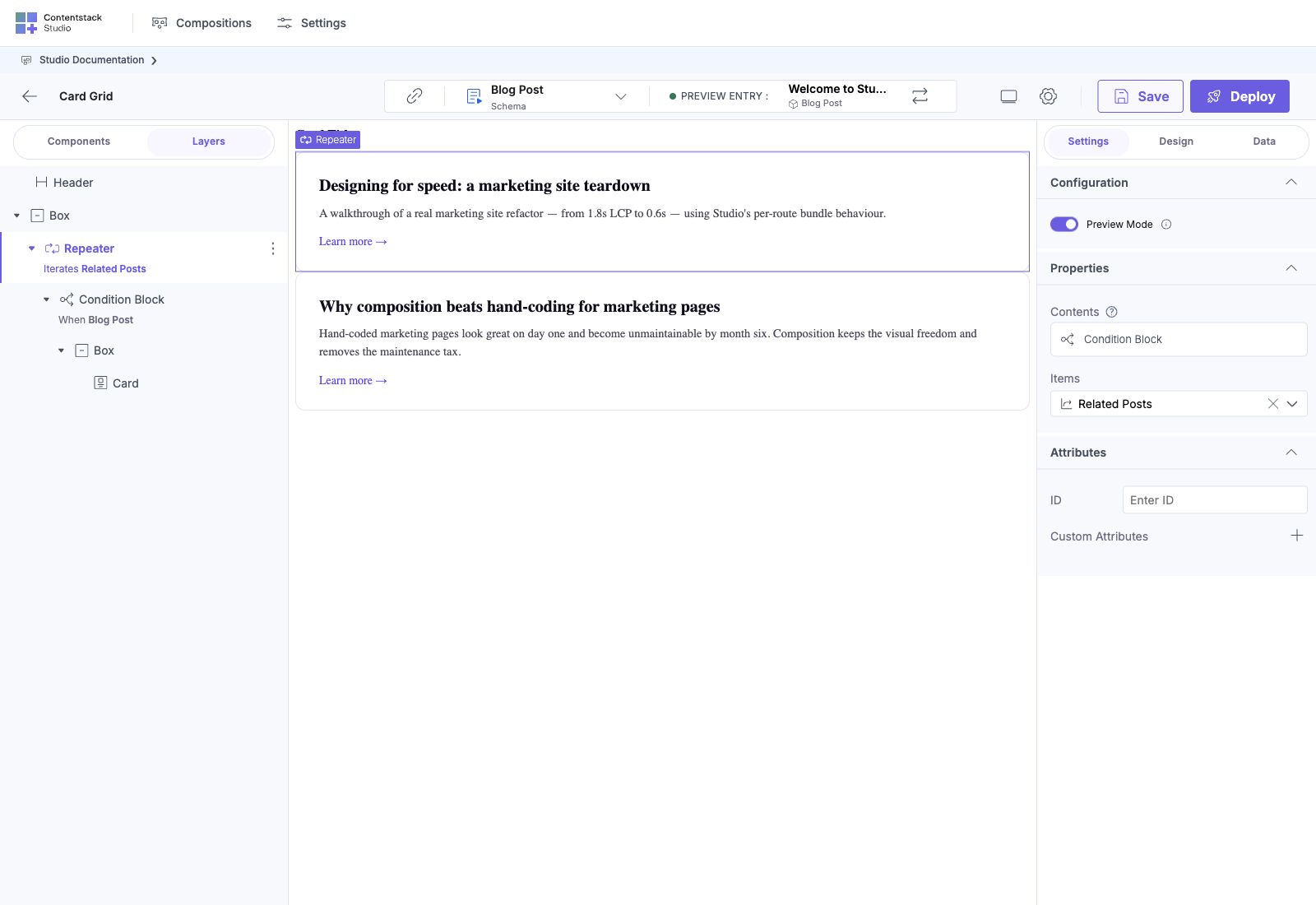
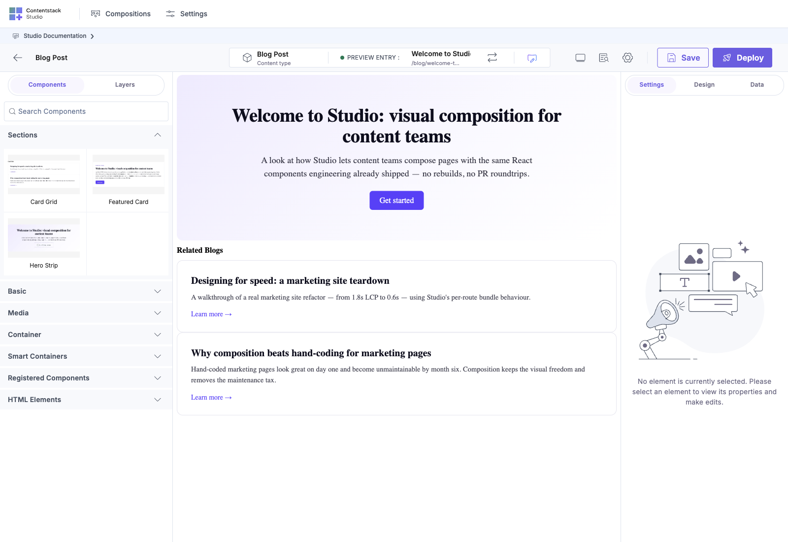
Selecting the Repeater node surfaces its Properties panel, including the Preview Mode toggle, the Items source (here Related Posts), and the Contents descriptor showing the Condition Block child. This is where you flip Preview Mode on to see real iteration on the canvas:
The section structure:
Step 3: build the product_card Section
- In Compositions, open the Sections tab and select + New Section. Name it product_card
- In Link Schema, pick gf_card
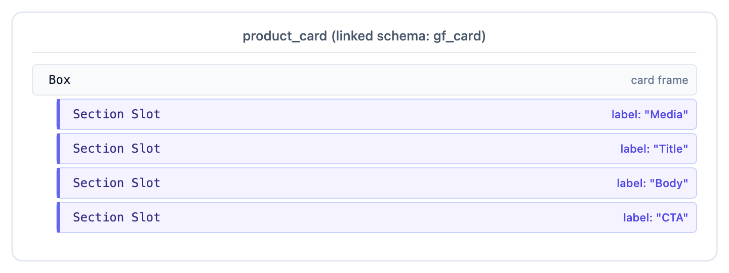
- On the canvas, drop a Box at the root: this is the card frame. Style it: border-radius, padding, shadow.
- Inside the card Box, drop four Section Slots (Smart Containers palette) labeled:
- Media
- Title
- Body (optional content)
- CTA
- Save.
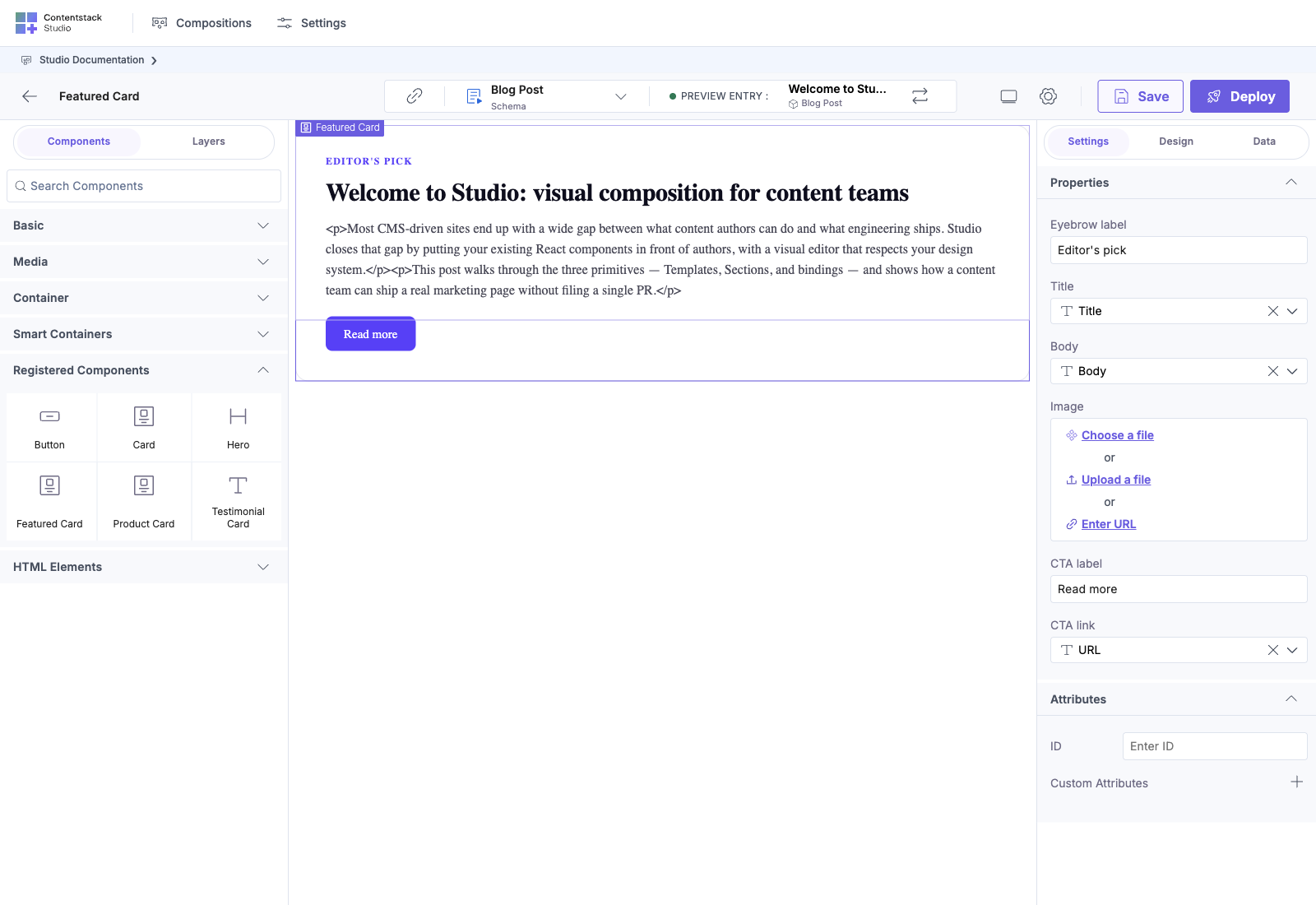
Studio’s Expose Props modal opens on Save. Skip it (no props to expose yet: these are slots, not values).
The section structure:
Step 4: build a connected Template against landing_page
- In Compositions, open the Templates tab and select + New Template. Pick landing_page
- Drag the card_grid section onto the canvas
Studio auto-binds: card_grid linked to gf_card_list, and landing_page has two gf_card_list fields. Multi-match: Studio binds to one of them and shows a dropdown.
- In the right panel for the card_grid instance, you’ll see a Linked Field dropdown with featured_products and related_products. Pick featured_products.
The Repeater inside card_grid is now iterating over the entry’s featured products. The slot inside the Repeater renders as a single drop target: Item template.
- Drag your product_card section onto the Item template slot.
Studio uses scope-root matching: the iteration item shape is gf_card, which matches product_card‘s linked schema. No manual binding needed. product_card is automatically bound to the current iteration item.
The product_card‘s four slots now appear: Media, Title, Body, CTA. Fill them:
- Media: drop an Image component, bind src to template.image
- Title: drop a Heading, bind text to template.title
- Body: leave empty (cards in gf_card don’t have body copy)
- CTA: drop a Button, bind label to template.title (use as link text) and href to template.link
Save the template.
Step 5: Verify the Render
Open the route on your site that matches the template’s URL pattern, for example /landing/<slug>.
You should see:
- The page’s featured_products.heading rendered as a heading
- 5 cards in a responsive grid, one per product entry in featured_products.items[]
- Each card showing the entry’s image, title, and CTA
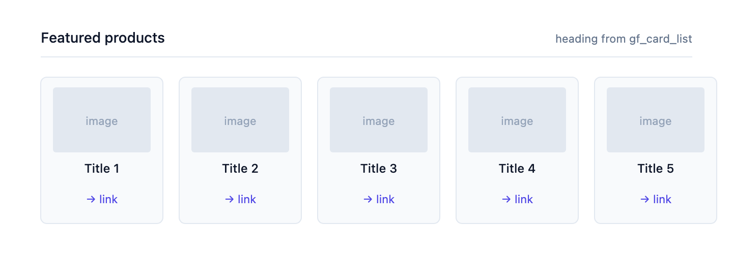
One template, two sections, real product data, full visual control.
Step 6: drop the same Section a second time for related_products
Back on the template canvas:
- Drag a second card_grid onto the template (below the first)
- In the right panel for this instance, the Linked Field dropdown shows the same two options. Pick related_products this time
- Drop a product_card into the second grid’s slot, exactly as before
- Fill its slots, and notice you can fill them differently than the first instance
Both card_grid instances render with their own bound list. Both product_card instances have independent slot contents. Per-instance customization: same sections, different page-level fills.
Why This Pattern is Powerful
Three independent layers of reuse:
| Layer | Owns | Reused across |
|---|---|---|
| card_grid | Grid layout (columns, gap, responsive) + iteration wiring | Any list of gf_card_list |
| product_card | Card frame (border, shadow, padding) + named regions | Any gf_card iteration item |
| Leaf components | The actual visual content of each slot | Filled per template instance |
Change the grid’s columns once and every page that uses card_grid updates. Change the card frame’s shadow once and every card on every page updates. Change one slot’s binding on one page and only that page changes.
Variants of the Same Pattern
The List + Slot pattern works for:
| Section | Wrapper | Slot |
|---|---|---|
| card_grid | Repeater + grid Box | Item template |
| tabs | Repeater over tabs | Tab content |
| accordion | Repeater over panels | Panel body |
| carousel | Repeater over slides | Slide content |
| two_column | No Repeater | Left, Right |
| hero_with_cta | No Repeater | Headline, Subhead, CTA |
All built the same way: section wraps the layout, slots own the variable content, linked schemas drive auto-binding.
See Also
- Section Slots: the concept reference
- Linked schema: multi-schema sections
- Auto-binding: scope-root matching
- Multi-schema section: same product_card across blog_post, product, event