Compose Pricing Tiles From Primitives
A three-tier pricing table (tier name, price, feature list, CTA per tile) built from the same primitives as Heroes, Feature grids, and Testimonials. The middle tier gets a highlighted treatment via a different Card variant.
Prerequisite reading. Design a component library that composes, not sprawls.
Do It With a Skill
compose-marketing-section assembles this from registered primitives; build-repeating-section handles the tile list.
curl -fsSL https://studio-documentation.contentstackapps.com/install.sh | sh
What You’ll Build
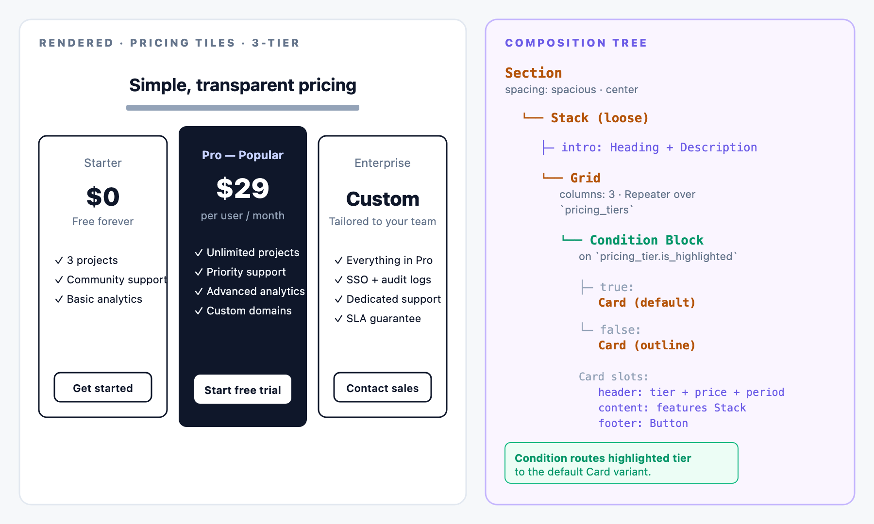
- Section intro (heading + description, centered)
- 3-column Grid (Repeater over pricing_tiers)
New to binding inside a Repeater? See the Data Picker + Repeater walkthrough in the Feature Grid recipe, same flow. Inside the Condition Block, the picker scope is the current iteration’s pricing_tier entry.
- Per-tier Card with tier label + price + period (header), feature list (content), CTA (footer)
- The “most popular” tier styled distinctly via Card.variant: default. Others variant: outline
Prerequisite: the Content Type Shape
landing_page: with:
| Field UID | Type | Notes |
|---|---|---|
| pricing_section_title | Single-line text | Section heading |
| pricing_section_description | Multi-line text | Section intro description |
| pricing_tiers | Reference (multi) to pricing_tier | The list the Grid repeats over |
pricing_tier: one entry per tier:
| Field UID | Type | Notes |
|---|---|---|
| tier_name | Single-line text | e.g. “Starter”, “Pro”, “Enterprise” |
| tier_tagline | Single-line text | Short qualifier: e.g. “Most Popular”, “Free forever” |
| price | Single-line text | e.g. “$0”, “$29”, “Custom” |
| period | Single-line text | e.g. “Free forever”, “per user / month”, “Tailored to your team” |
| features | List of strings (multiple) | Feature bullets |
| cta_label | Single-line text | Button label |
| cta_url | Link | Button target |
| is_highlighted | Boolean | Drives the Card variant + Button variant per tier |
Composition Tree
Section (spacing: spacious, background: none, contentAlign: center)
└── Stack (spacing: loose, alignment: center)
    ├── Stack (spacing: normal, alignment: center)                       ← section intro
    │   ├── Heading (text: "Simple, transparent pricing", level: h2)
    │   └── Description (text: "Pick the tier that fits your team.", emphasis: muted)
    └── Grid (columns: 3, spacing: normal)                                ← Repeater over `pricing_tiers`
        └── Card (variant: <default | outline>, padding: loose)           ← per-tier iteration
            ├── header:
            │   └── Stack (spacing: tight, alignment: left)
            │       ├── Description (text: <tier_tagline>, emphasis: muted | default)
            │       ├── Heading (text: <price>, level: h2)
            │       └── Description (text: <period>, emphasis: muted)
            ├── content:
            │   └── Stack (spacing: tight, alignment: left)               ← Repeater over `features`
            │       └── Description (text: "✓ <feature>", emphasis: default)
            └── footer:
                └── Button (label: <cta_label>, variant: <default | outline>, size: default)
Note. The feature list uses Stack of Description today. If pricing sections become a common pattern across the library, add a dedicated FeatureList atom with items: array<string> + checkmark: boolean. That’s an incremental addition, not a re-registration.
Bindings
Section-level (static):
- Section.spacing: spacious
- Grid.columns: 3
- Card.padding: loose
Repeated per pricing tier (the Grid becomes a Repeater over landing_page.pricing_tiers):
- Card.variant is Condition-bound: default when pricing_tier.is_highlighted is true, else outline
- Header Description (tagline) binds to pricing_tier.tier_tagline
- Header Heading (price) binds to pricing_tier.price
- Header Description (period) binds to pricing_tier.period
- Content: inner Stack Repeats over pricing_tier.features, and per-feature Description.text binds to the feature value
- Footer Button.label binds to pricing_tier.cta_label
- Footer Button.href binds to pricing_tier.cta_url
- Footer Button.variant is Condition-bound: default when highlighted, else outline
The highlighted-tier logic is a Condition Block wrapper in Studio, keyed on pricing_tier.is_highlighted. Two branches: highlighted (default variants), non-highlighted (outline variants).
Varieties From the Same Tree
- 4-tier pricing: Grid.columns: 4 for Freelance / Team / Business / Enterprise ladders.
- 2-tier pricing: Grid.columns: 2 for Personal vs Business.
- Compact tile without feature list: omit the content slot’s inner Stack. Just tier + price + CTA.
- Ghost tiles on a brand background: Card.variant: ghost + Section.background: brand for a “picked from the catalog” feel.
- Toggle-based billing period: add a Section-level Exposed Prop billingPeriod: monthly | annual. Content bindings resolve to different price and period fields.
Which Layout Props to Expose
- Good Exposed Props: Grid.columns (2 / 3 / 4 tier ladders), Section.background.
- Static per Section: Card.padding, atom props.
- Condition-bound: Card.variant + Button.variant based on the tier’s is_highlighted boolean.
Building This in Studio: Step by Step
- Create the pricing_tier Content Type with all fields listed above.
- Add a pricing_tiers Reference-multi field to landing_page.
- Create 3 pricing tier entries: Starter (highlighted: false), Pro (highlighted: true), Enterprise (highlighted: false).
- Open the Sections palette, Create Section, name it Pricing Tiles — 3-tier.
- Set the linked schema to landing_page.
- Drag Section: spacing: spacious, contentAlign: center.
- Drag outer Stack: spacing: loose, alignment: center.
- Build the intro: inner Stack + Heading (level: h2, bind to pricing_section_title) + Description (muted, bind to pricing_section_description).
- Drop Grid below the intro: columns: 3. Bind list to landing_page.pricing_tiers.
- Drop a Condition Block into the Grid iteration, keyed on pricing_tier.is_highlighted.
- In the true branch: drop Card (variant: default, padding: loose). Build header + content + footer.
- In the false branch: drop Card (variant: outline, padding: loose). Mirror the header + content + footer, with Button variant: outline.
- In each Card’s header: Stack + Description (tagline, bind to tier_tagline) + Heading (level: h2, bind to price) + Description (muted, bind to period).
- In each Card’s content: drop a Stack (spacing: tight, alignment: left), bind its list to pricing_tier.features (this makes the inner Stack a Repeater), then add a Description (bind to the feature string value, prefixed with "✓ ").
- In each Card’s footer: Button, bind label + href, variant matches the branch.
- Save the Section. Preview: three tiles render, middle one highlighted.
Testing
- Fill a landing_page entry with pricing_section_title, pricing_section_description, and 3 pricing_tier references.
- Drop Pricing Tiles — 3-tier on a Template.
- Verify: three tiles render, Pro (highlighted: true) uses default Card + default Button. Starter and Enterprise use outline variants.
- Toggle is_highlighted on another tier and republish. Highlighting moves without a schema change.