Bring Your Own Components
Studio ships with a small set of default components: Box, Row, Heading, Text, Image, Repeater, and a few more. These defaults demonstrate core registration mechanics and serve as a reference implementation.
For real work, you register your own components. After that, Studio’s palette shows your Button, your Card, your Hero alongside the defaults, and authors compose pages with the components your design system already provides.
Before you write your first registerComponent() call, read Component shape rules. Five tactical rules for shaping React components that bind cleanly to Studio: one prop per CT field · never hardcode child components in a wrapper’s .map() · wrappers use slots · structural name-matching · Sections are the reusable unit. Skipping the rules is the #1 source of “why is this rendering blank?” and “why can’t the author edit this?” bugs.
Coming from Tailwind + shadcn/ui / Radix / Headless UI? Studio’s registration model maps one-to-one to how you already structure a component library.
- Register Layer 1 atomics first: leaf primitives like <Heading>, <Text>, <Image>, <Button>. These are your utility-styled <h1 className="text-4xl font-bold"> and <img className="w-full">, one field maps to one visual.
- Compose them into Layer 2 containers with slots: Card with a body slot, Split with left/right slots. Same shape as shadcn/ui’s <Dialog><Dialog.Header/><Dialog.Body>{children}</Dialog.Body></Dialog> or Radix compound components: parent owns shape, slots carry content, slot props are typed children.
- Also register Layer 2 layout components: <ThreeColumn> = <div className="grid grid-cols-3 gap-6"> extracted into a named component so every author uses the same grid.
Marketers then drop these Layer-1 and Layer-2 components onto Sections and Templates in the Studio Canvas. Full mapping table across Studio, Tailwind/shadcn, and Figma at The three-layer model § For readers coming from Tailwind + shadcn/ui / Radix / Headless UI.
Do It With a Skill
design-component-library decides the shape of your library, which atomic and layout primitives to register, before any registerComponent call is written.
curl -fsSL https://studio-documentation.contentstackapps.com/install.sh | sh
Then register-component writes the registrations.
The Model in One Diagram
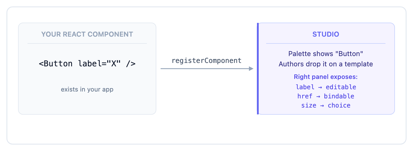
You declare a schema (prop names, types, defaults, validation, help text). Studio uses it to render the palette tile, the right-panel form, and the data picker. Your React component runs unchanged: Studio just feeds it the right props at render time. This separation means your component stays framework-agnostic. Only the schema needs to understand Studio’s UI contracts.
What You Get for Registering
| Surface | What appears |
|---|---|
| Left palette | A tile labeled with your displayName, with your thumbnailUrl (placed under the palette category named in sections. User-registered components default into the “Registered Components” section) |
| Canvas | Your component renders inline with the right props bound |
| Right panel: Settings | Each prop gets a form field (typed input, dropdown, link picker, image picker) |
| Right panel: Data | Each prop has a “bind to data” chip that opens the data picker |
| Right panel: Design | If you declared styles, style controls appear here |
| Layers panel | Your component shows by displayName in the layer tree |
What’s in This Chapter
| Page | Covers |
|---|---|
| Registering components | The three register APIs: registerComponent, registerComponents, registerLazyComponent |
| Component schema | The schema shape: every field, every prop type |
| Default data | What renders when an author drops a component before binding anything |
| Optimizing load | Lazy registration, Suspense, bundle impact |
| Design tokens | Map your design system’s tokens so Studio’s controls match brand |
| Studio CLI | csdx plugin for scripted component registration, Figma sync, token import |
| Figma to Studio (copy/paste) | The author flow: paste a Figma frame into the canvas |
| Figma to Studio (generate) | The agentic CLI: generate React components from Figma into your project |
| Testing your components | Preview in isolation, validate prop changes |
| Publishing the library | Share your component library across multiple Studio projects |
The Minimum to Get Started
A registered Button, end-to-end:
// src/lib/studio-components.ts
import { registerComponent } from "@contentstack/studio-react";
import { Button } from "@/components/Button";
import buttonIcon from "@/assets/icons/button.svg";

registerComponent({
  type:        "Button",
  displayName: "Button",
  thumbnailUrl: buttonIcon,
  component:   Button,
  props: {
    label: { type: "string", defaultValue: "Click me" },
    href:  { type: "href",   defaultValue: "#" },
  },
});
Import that file once at app boot (alongside @/lib/contentstack) and Button appears in Studio’s palette under Registered Components.
Order of Operations Matters
registerComponent must run before the canvas iframe loads, otherwise Studio doesn’t see your components in the palette. The safest place is a shared module imported at app boot. See Troubleshoot § “Registered components don’t appear” if they’re missing.
Tip: Install the skill pack (curl -fsSL https://studio-documentation.contentstackapps.com/install.sh | sh), then ask: “register my Button component as a Studio component”. The LLM reads your component file, infers the prop shape, and writes the registry entry for you.