The Three-Layer Model: Atomic Components, Containers, and Sections
Studio has three kinds of things you’ll ever build. Once you can name them and know which is which, everything else in the docs makes sense.
This page walks the whole model in one read. Start here before register-component, build-section, or any of the how-to skills. Those all assume you’ve already made the classification decisions on this page.
Have a design in hand? Run decompose-design. It takes a Figma URL, screenshot, PDF mock, wireframe, or natural-language description and emits a full three-layer inventory (atomics + containers + layout components + Sections + proposed Content Type shape) ready to feed the downstream registration skills. This page is the mental model. That skill is the executor.
Do It With a Skill
decompose-design applies this three-layer model to a real artifact: a Figma frame, a screenshot, a PDF mock, a wireframe, even a description in prose. It emits a build sheet and then chains the skills that build it.
curl -fsSL https://studio-documentation.contentstackapps.com/install.sh | sh
decompose-jsx-to-atomics does the same from existing JSX rather than from a design.
For Readers Coming From Tailwind + Shadcn/ui / Radix / Headless UI
If you already build with Tailwind and headless-component libraries like shadcn/ui, Radix, or Headless UI, the whole Studio model has a clean one-to-one analogy. This table gets you 80% of the mental model instantly:
| Studio concept | Tailwind + shadcn/ui / React equivalent |
|---|---|
| Layer 1 atomic (<Heading>, <Text>, <Image>) | A utility-styled primitive: <h1 className="text-4xl font-bold">, <img className="w-full">. One field maps to one visual. In shadcn/ui terms, the leaf-level components you copy into components/ui/. |
| Layer 2 container with slots | Compound / headless components such as <Dialog><Dialog.Header/><Dialog.Body>{children}</Dialog.Body></Dialog> from shadcn/ui, Radix, or Headless UI. Parent owns shape. Slots carry content. slot props are typed children. |
| Layer 2 layout component (<ThreeColumn>) | A named component wrapping utility classes: <div className="grid grid-cols-3 gap-6 md:gap-8">. Extracted to enforce brand consistency instead of letting each caller re-type the grid. |
| Design-system rules in code (Layer-2 components + prop types) | tailwind.config.js: colors, spacing, breakpoints, typography scale defined once in code. |
| Studio’s Design Panel (the escape hatch) | Tailwind’s arbitrary values (className="w-[437px]") the tool of last resort you use sparingly for genuine one-offs. |
| Section (canvas composition) | JSX composition, except done visually by the marketer, not in code by the engineer. |
| Content Type root / Group / Reference / Modular Block (schema scopes) | Data shape flowing into the composition: the props a component receives, structured by shape. |
| Data Picker binding (a prop bound to a CMS field) | Passing props.headline = entry.title through the tree, but written in a canvas UI instead of JSX. |
The one-line summary: Studio is shadcn/ui + Tailwind + a marketer-facing canvas replacing the JSX layer.
Vocabulary Map: “atomic / Skeleton / Pattern” Tiers
Some teams (particularly design-system teams migrating from Figma) use a three-tier vocabulary: atomic / skeleton / pattern. It maps cleanly onto Studio’s three layers with one useful additional distinction inside Layer 2:
| Design-system tier | Studio layer | What it is |
|---|---|---|
| Atomic | Layer 1 | Single-value leaf (Heading, Button, Image). One scalar prop maps to one visual. Zero CMS knowledge, zero layout knowledge. |
| Skeleton (shell) | Layer 2, slot-based | Layout frame with named slot props for drop-in content (Card with body slot, Split with left/right slots, <ThreeColumn> with column slots). Layout/style props only, never data props. |
| Pattern (sealed) | Layer 2, hybrid | Fully bound composition matching one schema shape (ProductCard bound to a product Group, AuthorCard bound to entry.author). All data props bound in registration, no slots. Brand-consistent, propagates edits everywhere. |
| - | Layer 2, self-iterating | (type: "array" prop bound to a multi-value field, .map() internally, TagList, FeatureList). Not in the atomic/skeleton/pattern vocabulary. A Studio-specific variant. |
| - | Layer 3 (Section) | Canvas composition, not code. Combines atomics + skeletons + patterns against a schema scope. |
Both vocabularies are correct. Use whichever the customer’s design-system team uses. Wherever docs or skills refer to atomic / skeleton / pattern, they mean the Layer-1 / Layer-2-slot / Layer-2-hybrid rows above.
Decision rule between skeleton and pattern: does the design system want this content region to vary per usage? If it varies, use a skeleton (slot). If the content is the same everywhere, use a pattern (bound). See When to expose a slot vs bind a scalar for the full framework.
Governance Dial: What Marketers Can and Can’t Change
Every registered prop and every Section decision falls into one of three governance states. Deciding this consciously is what makes Studio adoption succeed: authors get real flexibility where the design system allows it, and get zero flexibility where consistency matters.
| State | Applies to | Author experience |
|---|---|---|
| Content, bound and sealed | Headlines, copy, images, links, prices. The scalar CMS field maps to the scalar prop. | Marketer edits the entry in Contentstack. Every page using the CT updates. Can’t override per-page. |
| Layout/style, exposed props with token-constrained values | Columns, media side, gap, background, variant, alignment. Choice props limited to design-token literals. | Marketer picks from approved options in the section’s Properties panel. Cannot invent values (no columns={7}). |
| Variable areas, marketer-open | Story flows, campaign bodies, promoted-content strips. Modular Blocks fields, Section Slots, Freeform templates. | Marketer adds / reorders / chooses components per-page in the canvas without code changes. |
Target: five marketer decisions per page, not fifty. A Section that exposes every prop is a design failure. Authors either drift the design system or ignore Studio entirely. Fully data-driven Sections expose nothing (all-bound). Reserve exposed props for real design-system dials (<TwoColumn media_side="left" | "right">), not vanity toggles.
Rule of thumb: bind data props, expose layout/style props, never expose a bound data prop. Content correctness comes from the CMS entry. Visual flexibility comes from constrained exposed props. Structural freedom comes from slots and Modular Blocks.
For Readers Coming From Figma
If you build design systems in Figma, the mapping is almost 1:1. Studio’s three layers are the same primitives Figma calls Components, Instance Slots, and Frames.
| Studio concept | Figma equivalent |
|---|---|
| Layer 1 atomic (<Heading>, <Text>, <Image>) | A Component with only property overrides, a leaf primitive with text / image / icon props |
| Layer 2 container with slots | A Component with Instance Slots (or a “swap instance” region). The outer shape stays. Instance decides what fills the swap zone |
| Layer 2 layout component (<ThreeColumn>) | A Component built with auto-layout frames: grid tracks, gaps, breakpoints encoded in the component so every instance renders consistently |
| Scalar prop bound to a CMS field | A Component property overridden per instance. Figma binds the value in the properties panel, Studio binds it via the Data Picker |
| defaultValue on a prop | The Component’s default property value shown in the assets library preview |
| choice prop (enum) | Figma Variants, a component with named states (size = sm/md/lg, intent = default/danger) |
| slot prop | The swap instance region. The parent Component leaves this area open for the instance to fill |
| Section on canvas | A Figma Frame (with auto-layout) composed of Component instances |
| Template composing Sections | A Figma page composed of Frames, same structural role at the page level |
| Design-system rules encoded in Layer-2 components | Main Components in your Figma library, the source of truth every instance inherits from |
| Design Panel (rare escape hatch) | Instance overrides in Figma. You can override any auto-layout value on an instance, but doing it every time breaks the design system |
The cleanest correspondence: Layer-2 components are your Figma Main Components, Sections are Figma Frames using auto-layout, the Data Picker replaces manually typing property overrides.
Where the analogy breaks: Studio’s Layer-1 atomics bind to live CMS data, not static values. The “override” isn’t a designer typing a string, it’s the CMS field flowing in at render time. Everything else structurally matches.
The Three Layers
Every page you’ll build in Studio decomposes into these three layers, top-down:
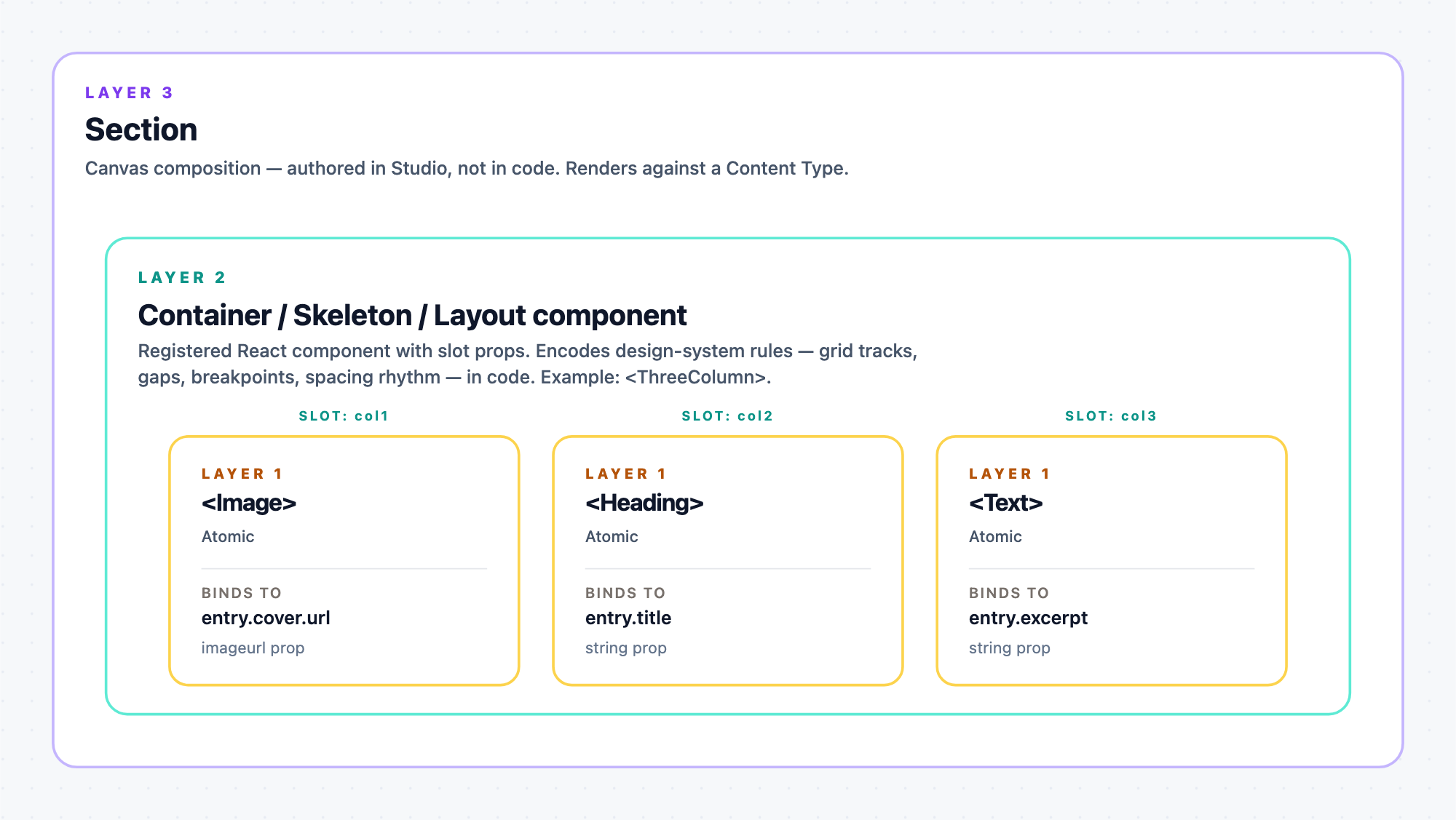
- Layer 1, Atomic components render one CMS field at a time. <Heading> renders a string, <Image> renders an image asset, <RichText> renders a JSON-RTE. They’re the leaves. You register them.
- Layer 2, Container / Skeleton / Layout components are anything registered that isn’t a pure Layer-1 atomic. Three shapes: slot-based (drop zones for children: <Card>, <Split>, <Modal>), self-iterating (type: "array" prop bound to a multi-value field, renders .map() internally: <TagList>, <FeatureList>), and self-composing (type: "object" prop bound to a Group: <AddressBlock>, <ContactCard>). A single component can combine shapes + scalar bindable props (hybrid).
- Layer 3, Sections are what the composition actually is. Not code. A Section is a Studio-canvas composition of Layer-2 containers + Layer-1 atomics, saved and reusable. Sections render against a Content Type. Every entry of that CT renders through the same Section. You build them in the canvas. You don’t write them in code.
Rule of thumb: if you’re wondering “do I make this a component or a Section?”, ask “does this thing render CMS content?” If yes, make it a component (Layer 1 or 2). If no, make it a Section (Layer 3, built in Studio’s canvas, not in code).
Layer 1: Atomic Components Map CMS Fields to Visuals
An atomic component is a 1:1 map from one CMS field type to one visual element. No children, no drop zones, just props that bind to entry fields.
Every CMS field type in your Content Type has a canonical atomic:
| CMS field type | Studio prop type | Canonical atomic |
|---|---|---|
| Single-line text (text) | string | <Heading>, <Text>, <Label> |
| Multi-line text (multi_line) | string | <Paragraph> |
| Number (number) | number | <Counter>, <Rating> |
| Boolean (boolean) | boolean | <Toggle>, <Badge showIf> |
| Enum / dropdown (text w/ options) | choice | <VariantChip>, <StatusPill> |
| Date (isodate) | datestring | <Date>, <TimeAgo> |
| URL / link (link) | href | <Button>, <Link> |
| Image / asset (file where image) | imageurl | <Image> |
| Rich text (json_rte) | json_rte | <RichText> |
| Reference (single) | (via container) | (referenced entry renders through its own atomics) |
| Reference (multi) / Modular Block | (via container) | (rendered via Repeater, see Layer 2) |
What “atomic” means in practice
Look at your existing component library. Every component whose interface is:
<X propA={scalar} propB={scalar} propC={scalar} />
Where every prop is a scalar value (string, number, boolean, URL, image URL, date, enum), it is an atomic. Register it with type: "string" / type: "imageurl" / etc. for each prop.
How to recognize an atomic in your code
An atomic component meets all four of these conditions:
- No children prop that renders arbitrary content.
- No React.ReactNode prop that could be a whole subtree.
- No array-of-objects prop like items={[{...}, {...}]}.
- It renders one identifiable “thing”: one heading, one button, one image.
The 10-second decision
If your component’s TypeScript interface is:
{ title: string; url: string; imageUrl: string }
The component is atomic. Three scalar props. Register with three scalar-typed props.
If it’s:
{ title: string; children: React.ReactNode }
The component is not atomic. It has a drop zone. See Layer 2 below.
If it’s:
{ items: Array<{ title: string; url: string }> }
The component is not atomic, because it renders many items, not one. But it IS registerable, as a Layer-2 self-iterating component (type: "array"). The component takes the bound array and does its own .map() internally. Common shapes: <TagList> bound to a multi-Reference, <FeatureList> bound to a multi-value Group. See Layer 2 below and register-component § Array & object props. Reach for adapt-collection-component only when the design needs template-instance swap or Modular-Block polymorphism, cases the array-prop pattern can’t handle.
If it’s:
{ address: { street: string; city: string; zip: string } }
The component is not atomic, because it renders a nested shape. But it IS registerable, as a Layer-2 self-composing component (type: "object") bound to a matching Group field on the entry. See Layer 2 below.
Reference: full atomic + non-atomic patterns in register-component.
Layer 2: Container / Skeleton / Layout Components Declare Drop Zones
These are the wrappers. A container’s job is to hold other components (Layer-1 atomics or nested Layer-2 containers) inside a declared shape: a card frame, a two-column split, a modal chrome, a hero-band layout, a design-system grid.
They all mean the same thing: we use “container,” “skeleton,” and “layout component” interchangeably. Some teams prefer one word over the others. Layer 2 = any registered component that isn’t a pure Layer-1 atomic. Three shapes cover the common cases:
- Slot-based container: has at least one type: "slot" prop for a drop zone (Card, Modal, Split). Fill supplied by the Section author dropping components into the slot.
- Self-iterating component: has a type: "array" prop bound to a multi-value field. Component receives the bound array and renders .map() internally (TagList, FeatureList, LogoBar). No Studio Repeater needed for simple cases. Use a List Section (Step 5 in decompose-design) when template-author swap or Modular-Block polymorphism is needed. Reference sources need data_sources.resolvedReferences. Group / Modular Block / scalar multi-values live on the entry and need no resolution.
- Self-composing component: has a type: "object" prop bound to a Group scope. Component receives the group object and renders its subfields internally (AddressBlock, ContactCard, StatBlock).
A single Layer-2 component can combine any of these plus scalar bindable props (a hybrid). The taxonomy runs on the shape’s role, not just one distinguishing feature.
A Layer-2 container can bind to CMS content and expose slots
The Layer-2 role isn’t “no bindings, only structure.” It’s “has at least one drop zone.” Containers routinely do both jobs at once: their own scalar props bind to a scope (a Group, a Reference, a Modular Block), and their slot props open drop zones for child components that bind to fields inside that scope.
Concrete example. An <AuthorCard> component might be scoped to a Group field named author on the entry. It can:
- Take a scalar prop authorName (type string) that binds directly to author.name.
- Take a scalar prop authorRole (type string) that binds to author.role.
- Expose a slot prop avatar where an <Image> component is dropped and itself binds to author.avatar.url.
- Expose a slot prop bio where a <RichText> component is dropped and binds to author.bio_rich_text.
The container carries its own bindings for the fields it “owns,” and delegates other fields to children via slots. When the design nests further (an author Group containing an inner credentials Group) the child dropped into a slot can be another Layer-2 container bound to that inner Group, exposing its own slots for still-deeper atomics. Layer 2 nests recursively.
Two shapes to keep in your head:
- Pure-slot container: <Card body>, <Split left right>, <Modal children>. No CMS bindings on itself. Everything comes through children in slots. Simplest case.
- Hybrid container: has scalar props that bind to a scope + slot props for children that bind to inner scopes. The realistic case for most design-system components (Author cards, product cards, reference tiles, structured callouts).
The 10-second decision below flags a component as Layer 2 as soon as it has any slot prop. Whether it also has bindable scalars is orthogonal.
When to expose a slot vs bind a scalar
The choice (“should this area be a scalar prop bound to a specific field, or a slot prop the Section author fills?”) comes down to one question:
Does the content in this area vary across the places the component is used?
- Same content shape everywhere the component is used, so bind as a scalar prop. The component always renders the same field in the same visual role. There’s no reason to make the caller wire it up every time.
- Different content per usage, so expose a slot. A card that shows a product image on the PDP but an author avatar on the blog page. A callout whose body is rich text on one Section and a stat tile on another. Any area whose content changes shape or source depending on where the component lives.
The rule is pragmatic, not aesthetic: expose exactly as many slots as the reuse pattern requires, no more, no fewer.
Concrete: an <AuthorCard> used on both blog posts and case studies always renders author.name, author.role, and author.avatar, same three fields, same visual roles. Those stay as scalar props on the container, bound directly. But the bio region might be a short <Text> on blog posts and a <RichText> on case studies, plus a <StatTile> counting published articles on the author landing page. Different content per usage, so expose bio as a slot.
The failure modes:
| Mistake | Symptom |
|---|---|
| Over-exposing (too many slots) | Every Section author has to fill every slot for every drop. Component becomes tedious to use for its most common case. |
| Under-exposing (too few slots) | The component gets forked into <AuthorCardBlog> / <AuthorCardCaseStudy> / … variants. The design-system’s identity gets duplicated with drift. |
Slots are the joint between design-system stability (the component’s shape stays fixed) and composition flexibility (what fills each region varies per Section). Every slot you add is a place the design lets Studio decide. Every scalar prop is a place the design has already decided.
The slot prop: Studio’s drop-zone type
type: "slot" in a registration turns a prop into a canvas drop zone. Whoever authors a Section can drop any component (atomic or another container) into that slot.
// The component's TypeScript
function Card({ title, body }: { title: string; body: React.ReactNode }) {
  return <div className="card"><h3>{title}</h3>{body}</div>;
}
// The registration
registerComponent({
  type: "site-card",
  displayName: "Card",
  component: () => import("./Card"),
  props: {
    title: { type: "string",  displayName: "Title", defaultValue: "Card title" },
    body:  { type: "slot",    displayName: "Body" },   // ← the drop zone
  },
});
title binds to a CMS field (atomic behavior). body becomes a canvas drop zone where the Section author drops <RichText>, <Image>, or even another <Card>, whatever the design calls for.
Common container shapes
| Shape | Purpose | Typical slot props |
|---|---|---|
| Card frame: border, radius, padding | Contains a title + body | body |
| Split / two-up | Left content + right content | left, right |
| Columns: 2, 3, 4-up grid encoded in the component’s CSS | Multi-column layout with brand-consistent gaps and breakpoints | col1, col2, col3 (or a repeating pattern) |
| Rows / Stack: vertical stack with brand-standard spacing | Vertical layout that respects the design system’s rhythm | items (repeating) |
| Modal / panel chrome | Header + body + footer | header, body, footer |
| Section wrapper: colored band, max-width, header row | Header + main content region | header, main |
| Accordion / tab shell | Named regions per tab | tab1, tab2, tab3 |
| Callout / alert box | Icon + message + action | icon, content, action |
Every one of these is structure encoded in code. Their defining feature is that they expose drop zones for children. They may also carry their own bindable scalar props (a Card with a bindable title prop plus a body slot is normal). See § A Layer-2 container can bind to CMS content and expose slots below.
Design-system rules in code. Composition in Studio
Studio’s whole pitch is that composition (which sections go on which pages, in what order, filled with which content) moves out of code and into a visual authoring tool. That’s true, and it’s what Layer 3 (Sections and Templates) is for.
But composition and design-system rules are two different things:
- Composition: which sections appear where, filled with what. Author’s decision. Studio owns this (canvas + Data Picker).
- Design-system rules: the design system itself: column counts, gaps, breakpoints, spacing rhythm, typography scale, color tokens. Design team’s decision. Code owns this (Layer-2 components).
The two-word summary: compose in Studio. Encode design-system rules in code.
Studio has a Design Panel on its canvas: free-form spacing, grid tracks, alignment, breakpoints. It exists as a rare escape hatch for one-off cases where your Layer-2 component library doesn’t cover the shape the design calls for. It is not the default authoring surface for layout.
The reason: brand consistency. A design system says “marketing pages use 3 columns at desktop, 2 at tablet, 1 at mobile, with these gaps.” If you let authors set columns and gap via Studio’s Design Panel per Section, every author’s page drifts from the design system slightly differently. Encode the rule once in a <ThreeColumn> (with slot props). Authors compose from approved layouts, they don’t invent new ones.
So the correct classification for common layout primitives is:
| Component | Register as Layer 2? | Why |
|---|---|---|
| <Columns> / <ThreeColumn> / <TwoColumn> with CSS-encoded grid tracks + gap + breakpoints | Yes. Slot props per column. | Encodes design-system layout decisions. Authors pick approved layouts. |
| <Row> / <Stack> with CSS-encoded flex + gap | Yes. Slot prop for items. | Same, the spacing rhythm is a design decision. |
| <Container> / <PageWrapper> with max-width, padding | Yes. Slot for children. | Encodes the design system’s page-container rules. |
| <Grid columns={n}> where the author picks n via a prop | Register, but with choice prop, not free number. Limit n to design-system-approved values (2, 3, 4), not 1..12. | Preserves brand consistency. Author can’t invent unauthorized column counts. |
| <Box>, a generic div with no design decisions | No. This one is genuinely just a div. But if you find yourself wanting to register Box, ask whether you actually need a specific layout component (Columns, Stack, Container) instead. | Box has no design identity. Registering it invites authors to hand-roll layout, the very thing this rule prevents. |
Design Panel usage, the “very rare” case: an author needs a truly one-off layout that no Layer-2 component covers, and the design team has approved this specific Section’s deviation. The escape hatch is there. It should be exceptional, not the default authoring surface.
Rule of thumb: does the layout decision belong to the design system (recurs across the site, has brand-standard values) or is it a one-off for this Section? Design-system decisions belong in a Layer-2 component. Genuine one-offs go to the Design Panel escape hatch. If a “one-off” keeps recurring across three or more Sections, promote it to a Layer-2 component and stop using the Design Panel for it.
The 10-second decision
If your component’s TypeScript interface has:
{ title: string; children: React.ReactNode }
or:
{ header: React.ReactNode; body: React.ReactNode }
The component is a Layer-2 container. Register with slot-typed props for the ReactNode positions.
If it’s:
{ items: Array<{...}> }
See adapt-collection-component. The component is neither Layer 1 nor Layer 2, and it needs decomposition into a wrapper + Repeater + leaf.
If it’s:
<Grid columns={3} gap="1rem">{children}</Grid>
Don’t register it. Layout goes into the Section’s canvas, not a registered component.
Reference: full slot patterns in register-component § Exposing extensible regions with slot props, and use-section-slot.
Layer 3: Sections Are Canvas-Authored Compositions
A Section is what you get when you combine Layer-1 atomics and Layer-2 containers on a Studio canvas, wire their props to a Content Type’s fields, and save. You build Sections in Studio’s canvas, not in code. The canvas is the layout.
Each Section:
- Renders against a specific Content Type or structural schema (a Global Field, a Group, a Modular Block).
- Contains a tree of dropped components (atomics + containers).
- Has its atomics’ props bound to fields of that schema via the Data Picker.
- Is reusable, the same Section renders against every entry of its Content Type.
Two Section flavours
- Simple Section: no root Repeater. Renders one instance. Example: a Hero for a Blog Post CT.
- List Section: root is a Repeater over a multi-value field (Reference, Modular Block, Group multi). Renders once per item. Example: a Related-Posts grid iterating a Reference field. See build-repeating-section and adapt-collection-component.
What lives in a Section vs in a component
| Concern | Where it lives |
|---|---|
| Rendering a single field | Layer-1 atomic |
| The frame around a group of atomics | Layer-2 container’s DOM |
| Where atomics/containers go on the page (grid tracks, alignment, spacing between them) | Layer-3 Section’s canvas layout (Design Panel) |
| Which CMS field each prop binds to | Layer-3 Section’s Data Picker |
| How the whole Section repeats over a list | Layer-3 Section’s root Repeater (List Section) |
The layout of the Section itself (where the Card lives relative to the Heading, how much space between them, three-columns vs two) is Studio’s job, done in the canvas Design Panel. You don’t write layout code for a Section.
Reference: understand-sections, build-section.
Where Section boundaries fall: the schema-shape rule
Once you know a Template renders against a Content Type, the next question is where do the Section boundaries go? Studio’s answer is mechanical:
Each Section is rooted at exactly one schema scope on the Content Type. A new scope means a new Section.
A “scope” is any of: the CT root, a Global Field, a Group, a Modular Block, a Reference. Every schema shape has a canonical Section shape:
| Schema shape in your Content Type | Section shape | Repeater at root? |
|---|---|---|
| Content Type root: fields declared directly on the CT | Simple Section bound at the entry root. | No |
| Global Field: a named schema reused across CTs | Simple Section bound to the Global Field’s schema. Reusable, the same Section renders against any CT that includes this Global Field. | No |
| Group (single): a named subfield with structure | Usually a Layer-2 container inside a bigger Section, bound to the Group scope. Promote to its own Simple Section if the Group is complex enough to be reusable on its own. | No |
| Group (multiple): a named subfield with multiple: true | List Section: Repeater iterating the group’s items. | Yes |
| Modular Block: polymorphic list of typed blocks | List Section: Repeater + one Condition Block per allowed block type. Each block type’s rendering path lives inside its own branch. | Yes |
| Reference (single-value): points to one entry of another CT | Simple Section bound to the reference-target CT. Fills from the referenced entry’s fields. | No |
| Reference (multi-value): points to N entries of another CT | List Section: Repeater iterating the reference. Add a Condition Block per allowed content-type if the reference is polymorphic (multi-CT). Skip the Condition Block if it references only one CT. | Yes |
The Template composes multiple Sections, each rooted at a different scope of the same underlying entry.
Concrete example: the Blog Post walk-through below produces four Sections from the blog_post CT:
| Section | Rooted at scope | Reason |
|---|---|---|
| Hero | blog_post root | Uses fields title / excerpt / cover_image / read_time directly on the CT. |
| Author Card | blog_post.author (Reference, single) | Renders the referenced author entry’s fields. A distinct scope. |
| Body | blog_post root | Uses field body on the CT. Same scope as Hero, so in principle the two could merge, but keeping it as its own Section makes the “text body” component reusable across CTs that also have a body field. |
| Related Posts | blog_post.related_posts (Reference, multi) | A multi-value reference becomes a List Section with a Repeater. |
Why the rule is mechanical. Studio’s auto-binding matches a Section’s linked-schema shape against the schema at the drop location. If the shapes don’t match, the Section can’t auto-bind. Each Section has one scope precisely so this matching stays deterministic. When in doubt: draw the CT’s schema tree, mark each scope you’ll bind against, and each mark is a Section boundary.
Common exceptions to the “one scope = one Section” rule:
- Multiple Sections at the CT root are fine. Hero and Body both bind at the blog_post root above. Splitting the root scope across Sections is a reuse decision, not a schema decision.
- A Section bound to a nested Group inside a Reference: the scope is blog_post.author.credentials. Nested-scope Sections are valid. The auto-binder walks the chain.
- Global Fields reused across CTs: one Section bound to a Global Field can render inside any CT that includes that Global Field. This is the design-system reuse mechanism at the Section layer.
Reference: build-section, understand-sections, build-repeating-section, use-condition-block.
Component Slot vs Section Slot: the two-word difference
The word “slot” is used at two different layers of Studio. They compose but they’re distinct mechanisms, and picking the wrong one is one of the most common Layer-2 mistakes.
| Aspect | Component Slot (type: "slot" prop) | Section Slot (Smart Container element) |
|---|---|---|
| Where declared | Inside component code, as registerComponent({ props: { body: { type: "slot" } } }) | Inside a Section’s canvas, dropped as a Smart Container element |
| Who declares it | Engineer registering the component | Author building the Section |
| When filled | At Section-authoring time. Whoever drops the component fills its slots then. The fill is locked into that Section | At Template-authoring time. The Template author picks the fill per instance. Each Template using the Section can fill differently |
| What can fill it | Any registered component or Section | Any registered component or Section |
| Design intent | “This component’s body can hold different content depending on where the component is dropped” | “This Section’s region can be filled differently per Template that uses it” |
Concrete example, same design, two different mechanisms:
- A <Card> has a body Component Slot. When the Section author drops the Card into a Hero Section, they fill body with an <Image> + <Text>. That fill is baked into the Hero Section. Every template that drops the Hero Section gets that same body content.
- Inside a Blog Post Template, the author drops a Section Slot Smart Container in a specific spot (“Promoted content area”). Template A fills it with a <CaseStudyBand>. Template B fills it with a <CustomerLogos>. Same Section slot, different fills per Template.
Rule of thumb: does the variation happen at the Section-building step or the Template-building step? Variation at the Section-building step means a Component Slot. Variation at the Template-building step means a Section Slot. Both mechanisms compose. A Card with a Component Slot can be dropped inside a Section that itself has Section Slots.
Deeper reference: understand-section-slots is the canonical skill. Run it before touching either mechanism.
When to promote a Group to its own Section vs keep it a Layer-2 container
Groups sit right on the boundary between Layer-2 container and Layer-3 Section. Three questions decide it:
- Does this Group appear on 2+ Templates or 2+ Content Types? If yes, promote it to a Section (or a Global Field bound to a Section, if the shape recurs across many CTs). Reuse is what Sections buy you.
- Does the Group have its own iteration or polymorphic structure? Group with multiple: true, or Group containing a Modular Block or Reference, is a strong signal to promote to Section. Iteration + drop-target mechanics are Section-level concepts.
- Does the Group need Template-instance-specific fills? (Different Templates want different content in one of the Group’s regions). Promote to Section so Section Slots are available to defer the fill to Template time.
If all three are “no”, keep it as a Layer-2 container inside its parent Section. Simpler. No extra Section to maintain.
Nested scopes: worked example
The schema-shape rule permits Sections rooted at nested scopes, a chain walked by the auto-binder. Concrete example.
Content Type blog_post has an author Reference (single) to CT author. The author entry has a credentials Group inside it. Two valid designs:
Design A, flat. One Section for blog_post.author (Simple Section bound to author CT scope). Internally it uses a Layer-2 <CredentialsBlock> container bound to credentials Group. The container is a component, not a Section. Ship this if <CredentialsBlock> is only ever used inside the Author Card.
Design B, nested Sections. One Section for blog_post.author (bound to author CT). Another Section for credentials (bound to credentials Group scope). The Author Section drops the Credentials Section inside itself, which auto-binds because the shape at the drop location is a Group matching the Credentials Section’s linked schema. Ship this if <CredentialsBlock> recurs across CTs. The Credentials Section is now reusable inside any CT with an author reference.
The auto-binder walks the chain: blog_post → author → credentials. As long as each hop’s shape matches, binding succeeds.
Rule of thumb: nest as deep as reuse demands, no deeper. If a nested Section only ever appears inside one parent, demote it back to a Layer-2 container.
Reference: understand-linked-schemas, understand-auto-binding.
Deciding how to iterate: array prop, Repeater in a Simple Section, or List Section?
You’ve spotted a list in the design. Three patterns can render it. Picking the wrong one is one of the most common (and most expensive) Studio design decisions, because switching mid-build means unwiring bindings and rebuilding registrations.
The three patterns:
| Pattern | Where iteration lives | Author control | Reusable as a Section? |
|---|---|---|---|
| Self-iterating component (type: "array" prop, renders .map() internally) | Component code | None, code owns the per-item template | No, it’s just a Layer-2 component |
| Repeater inside a Simple Section | Section’s canvas (not at the root) | Author edits the iteration in the canvas. Other Section parts stay fixed | Only as part of that Simple Section |
| List Section (Repeater at the Section root) | Section’s canvas, at the root | Full author control per iteration. Template author can swap fills via Section Slots | Yes, the List Section is a reusable Section drop |
Decision: five questions in order. Stop at the first Yes:
Is the list polymorphic? (Modular Block with per-block-type rendering, or multi-CT Reference where each type needs its own branch.)
- Yes, use a List Section with Repeater + Condition Block per allowed type. The array-prop pattern can’t express per-type rendering. Condition Blocks are the only way. See use-condition-block.
Do template authors need to swap what fills each iteration on different Templates? (Template A fills the item slot with <CaseStudyCard>, Template B fills it with <CustomerLogo>.)
- Yes, use a List Section with a Section Slot inside the iteration. The Section Slot mechanism only works at the Section layer. See use-section-slot.
Does the author need to customize individual items visually? (Add / remove / reorder items in the canvas, override per-instance props on one specific card, drop different atomics into one item vs another.)
- Yes, use a List Section (or a Repeater inside a Simple Section). Author authoring happens on the canvas. The array-prop pattern renders a fixed template per item. No in-canvas per-item edits.
Is this iteration reusable, will the same shape be dropped into multiple Templates or land as a Section-in-Slot elsewhere?
- Yes, use a List Section (Repeater at root), so it becomes a reusable Section drop.
- No, but the surrounding Section has non-iterating parts too, so use a Repeater inside a Simple Section. The Simple Section owns the fixed parts (header, footer, CTA). A Repeater at a specific position in the canvas iterates the list.
None of the above. The iteration is single-shape, code-decides-the-template, no author variability needed, not reusable.
- Use a self-iterating component with a type: "array" prop. Simplest path. Component owns the loop.
Concrete examples:
| Design element | Pattern | Why |
|---|---|---|
| A logo bar across the site footer showing 8 brand logos | Self-iterating <LogoBar> with logos: array bound to a multi-Reference | Uniform, code-owned template, no author variability. |
| A “features” bullet list on a product page | Self-iterating <FeatureList> with items: array bound to a Group multi | Fixed shape, on-entry data (no resolvedReferences), no author-per-item control needed. |
| A related-posts card grid where each card must render depending on whether it’s a Blog Post, Case Study, or Guide | List Section + Repeater + Condition Block per CT | Polymorphic, so an array prop can’t branch per type. |
| A page-level “sections list” of Modular Blocks, each block a different type of Section | List Section + Repeater + Condition Block per block type | Same reason. |
| A card grid where marketing wants Template-A cards to have a CTA and Template-B cards to have a badge in the same slot | List Section with Section Slot inside the iteration | Only the Section Slot mechanism defers the fill to Template time. |
| A carousel of testimonials the marketer edits directly on the canvas (adds/removes/reorders per-page) | Repeater inside a Simple Section (or List Section if the carousel is a reusable Section drop) | Author needs canvas editing per item. |
| A “recent posts” list embedded in the middle of a Blog Post Simple Section | Repeater inside a Simple Section | Iteration is one part of a Section that also has fixed header/body/footer. |
Anti-patterns to reject in code review:
- Registering a <CardGrid items={…}> with type: "array" because “it’s simpler,” when the marketing team actually wants to add/remove items on the canvas. Self-iterating hides the canvas from the author. Escalate to Repeater in a Section.
- Registering a <TagList> with a slot prop and expecting authors to drop N tag components one-by-one, which is over-authoring. Self-iterating with type: "array" is correct.
- Using a <Repeater> at the root of every List-shaped Section without asking Q4. Some are one-off iterations that fit better as a Repeater inside a Simple Section, keeping the Section boundary at a coarser grain.
Migration flavour: if you’re wrapping a production component whose interface already takes an array prop AND its leaf can’t be simplified to type: "array" cleanly (nested objects, per-item slot needs, etc.), reach for adapt-collection-component, the wrapper + Repeater + leaf adapter pattern. That’s a fourth pattern layered on top of #3 to #5 above, specific to legacy migrations.
Reference: build-repeating-section, use-repeater, use-condition-block, use-section-slot.
Walk-Through: Decomposing a Real Design
The best way to internalise the layers is to run one design through them. Take a Blog Post detail page with four Sections stacked (Hero at the top, Author Card, Body, Related Posts at the bottom) and decompose each into its Layer-1 atomics, Layer-2 containers, and Layer-2 layout components:
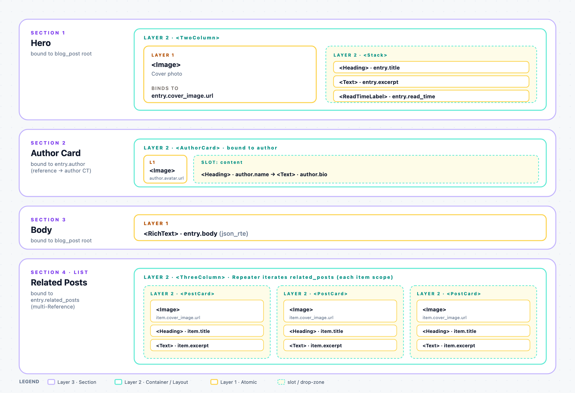
The Content Type blog_post has fields: title, excerpt, cover_image, read_time, body (json_rte), author (Reference to author CT), related_posts (multi-Reference to blog_post).
Step 1: Identify atomics (Layer 1)
Look at every leaf visual, every place a single CMS field renders as one visual element:
| Visual leaf | CMS field | Atomic component |
|---|---|---|
| Cover image | cover_image.url | <Image>: one imageurl prop |
| Title (large heading) | title | <Heading>: one string prop |
| Excerpt (paragraph) | excerpt | <Text>: one string prop |
| Read time (“5 min read”) | read_time (number) | <ReadTimeLabel>: one number prop |
| Author name | author.name (via reference) | <Text>: one string prop |
| Author bio | author.bio | <Text> |
| Author avatar | author.avatar.url | <Image> |
| Body | body (json_rte) | <RichText>: one json_rte prop |
Eight atomic components. All register with scalar prop types. Reuse across the design. <Heading>, <Text>, <Image> each get dropped multiple times.
Step 2: Identify containers (Layer 2)
Look at every shape that holds atomics but doesn’t itself render CMS content:
| Shape | Role | Layer-2 registration |
|---|---|---|
| Author card frame (avatar left, text right, border + padding) | Holds an image + text block | <AuthorCard> with slots: avatar, content (or left, right) |
| Related-posts card (product image, title, excerpt) | Holds three atomics with fixed layout | <PostCard> with slots: image, title, excerpt |
Two content-shaped containers. Both have slot-typed props. Note these are the card frames. Layout containers come next.
Step 3: Identify the layout components (also Layer 2)
Every layout decision (column counts, gaps, breakpoints, vertical rhythm) is a design-system rule that should be encoded in a registered component, not set per Section via Studio’s Design Panel:
| Layout in the design | Layer-2 component | Slot props |
|---|---|---|
| Hero’s image-left / text-right split | <TwoColumn> with CSS grid 1fr 1fr w/ breakpoint stack + brand-standard gap | left, right |
| Related-posts 3-across grid | <ThreeColumn> with CSS grid, brand-standard gap and responsive rules | (used inside a Repeater, see below) |
| Vertical space between Sections | <Stack> on the Template, brand-standard vertical rhythm | items (repeating) |
The related-posts card grid actually combines a List Section (Repeater iterating related_posts) inside a <ThreeColumn> layout container. The container encodes “3 across at desktop, 1 at mobile”. The Repeater fills the columns from the CMS.
Step 4: What does not get registered as a component
- <Box>: generic wrapping div with no design identity. Not registered. If the design needs a wrapper here, it’s actually one of the Layer-2 layout components above.
- The whole page structure (hero top, body middle, related bottom) is the Template composing Sections. Not a component and not a Section either. Templates are Studio Layer-3 constructs composed of Sections + Layer-2 Stack/Container components.
- Nothing “raw” via the Design Panel. Every layout decision has a registered component behind it. Design Panel is the escape hatch, used only when the design has a genuinely one-off layout the component library doesn’t cover.
Step 5: Build the Sections (Layer 3)
Four Sections come out of this design, each mapped to a piece of the blog_post schema:
| Section | Root schema | Contains |
|---|---|---|
| hero | blog_post root | <TwoColumn> layout component with <Image> in left slot (bound to cover_image.url), and a <Stack> in right slot containing <Heading> (title), <Text> (excerpt), <ReadTimeLabel> (read_time). Layout is baked into <TwoColumn>‘s code, no Design Panel needed. |
| author_card | blog_post.author (Reference to the author CT) | <AuthorCard> container with <Image> in avatar slot, <Heading> + <Text> in content slot. Bindings inside the reference’s scope. |
| body | blog_post root | <RichText> bound to body. Simplest possible Section. |
| related_posts | blog_post.related_posts (multi-Reference) | <ThreeColumn> layout component with a Repeater inside (List Section), iterating <PostCard>, each iteration fills one column. Column count / gap / breakpoints encoded in <ThreeColumn>‘s CSS. |
The Template composes these four Sections into the page. Same Sections, reusable on other Blog Post entries. Every post automatically gets this layout.
What we did not do
- Did not register <HeroSection> as a component. It’s a Section, not code.
- Did not register <AuthorCard> with hardcoded fields. We registered it as a container with slots. The atomics inside are separately registered and bind to the CMS.
- Did not register <RelatedPostsCarousel> as a component with an items array prop. We built it as a List Section: Repeater + <PostCard> container + atomics. See adapt-collection-component if the design started from an existing Carousel component.
Cheat Sheet: Mapping Design Elements to Studio Artifacts
Print this. Every design element you look at falls into one row:
| Design element you see… | What it becomes in Studio |
|---|---|
| Any single piece of CMS-driven text, number, date, image, link | Layer 1 atomic component (register with a scalar prop type). |
| A card, panel, split, modal, callout that holds other things with a fixed shape | Layer 2 container (register with slot props for each holdable region). |
| A grid, columns, rows, stack, a layout with design-system-defined tracks / gaps / breakpoints | Layer 2 layout component (register with slot props. Encode tracks + gaps in the component’s CSS). |
| A list of N items rendering the same shape | List Section (Repeater in a Section), see build-repeating-section. Often lives inside a Layer-2 layout component (e.g. Repeater inside <ThreeColumn>). |
| A production Carousel/CardGrid/Marquee whose interface takes an array prop | Migration adapter, see adapt-collection-component. |
| A whole page (hero, body, related, footer) | Studio Template composing multiple Sections, often wrapped in a Layer-2 <Stack> for vertical rhythm. |
| Any “brand-new atomic or layout component” from a fresh design | Only time you touch code. Write the React component (CSS encoded), then register. |
| A truly one-off layout the component library doesn’t cover | Studio’s Design Panel, the escape hatch. Use rarely. If a shape recurs, register it as a Layer-2 layout component instead. |
Common Mistakes and How to Spot Them
| Mistake | Symptom | Fix |
|---|---|---|
| Setting design-system rules (columns, gaps, breakpoints, spacing rhythm) via Studio’s Design Panel per Section | Different pages drift from the design system: spacing off, columns inconsistent, breakpoints slightly wrong per Section | Encode the rule in a Layer-2 layout component (<TwoColumn>, <ThreeColumn>, <Stack>, <Container>) with slot props. Design Panel is the rare escape hatch for genuine one-offs. |
| Registering <Grid> with a free-number columns prop | Authors invent unauthorized column counts (5, 7, 12), so brand consistency breaks | Constrain to a choice prop with design-system-approved values (2, 3, 4), or register specific <TwoColumn> / <ThreeColumn> variants. |
| Registering <Box> (a generic div) as a component | Authors use it as a swiss-army wrapper, hand-rolling layout inside via className props | If you need a wrapper, register a specific layout component instead (Columns / Stack / Container). If it’s genuinely generic, don’t register at all. |
| Registering a whole HeroSection component with 10 hardcoded props | Every prop is a scalar, there’s no drop zone, and changing the design means editing code | Break it up: register the atomics + a layout container (with slots). Build the Section in the canvas. |
| Registering a Carousel with an items array prop | Palette shows manual-entry sub-fields. Author types items in by hand | See adapt-collection-component, the wrapper + Repeater + leaf pattern. |
| Registering <Card> without a slot prop | Card is monolithic. Authors can’t put different content in each Card instance | Add a slot-typed prop. Use use-section-slot at the Section level. |
| Registering the same visual as both a Section and a component | Duplicated definitions. Changes have to be made in two places | Decide: layer 2 container (has slots, rendered inside a Section) or layer 3 Section (canvas composition). Not both. |
What You Already Have and Your Path Forward
Studio can meet you at any starting state. Pick the row that matches what’s in hand right now.
Every path below is fully automated end-to-end: you tell your LLM what you have (attach the design, name the CT, etc.) and it drives from decomposition through to a verified composition without manual canvas clicks. The developer’s role is to (a) provide inputs, (b) accept the plan, (c) review the result. Manual Studio-canvas clicking is only needed as a last-resort fallback when no CMA management token and no Playwright MCP are available.
| You already have… | Your path (top-down) |
|---|---|
| Just a design (Figma / screenshot / mock / description) | 1. decompose-design emits atomics, Layer-2 containers, layout components, Sections, and a proposed Content Type shape. 2. provision-studio-stack to create that CT in Contentstack. 3. Re-run decompose-design with the concrete CT UID for a plan grounded in real fields. 4. register-component per atomic and Layer-2. 5. build-section per Section. 6. build-connected-template per Template. 7. verify-setup. 8. deploy-studio-site. |
| Design + Content Type | 1. decompose-design with the CT UID as a constraint, so output is grounded in the existing schema. 2. register-component per atomic + Layer-2. 3. build-section. 4. build-connected-template. 5. verify-setup. |
| Design + CT + atomic component library (existing React components with scalar props) | 1. discover-sections scans your existing components + reports which ones are already Layer-1 atomics vs which need Layer-2 wrapping. 2. decompose-design with “existing library: X, Y, Z” as a constraint reuses your atomics. Proposes only the Layer-2 containers + Sections you still need. 3. register-component per missing atomic + per Layer-2 container. 4. build-section. 5. build-connected-template. 6. verify-setup. |
| Design + CT + atomics + Layer-2 layout/container library | 1. design-section-from-jsx to sanity-check each Section’s linked-schema shape against the existing CT. 2. Skip straight to build-section per Section, since atomics + Layer-2 are already registered. 3. build-connected-template. 4. verify-setup. Consider the byoc-end-to-end orchestrator for the whole chain. |
Every row assumes Studio is installed (install-studio done) and the Contentstack stack has Visual Experience enabled (enable-visual-experience). If not, run those first. See Installation & configure.
Migrating an existing site instead of starting from a design? The Brownfield collection-migration playbook covers the list-shaped Section migration. Migrate hand-coded pages covers the per-route conversion program.
Where to Go Next
- Have a design (Figma / screenshot / mock / description) and want a plan? decompose-design applies this whole page’s taxonomy to your specific design and emits a machine-readable plan for every atomic, container, layout component, and Section. The recommended starting point for anyone with a design in hand.
- Ready to register your first component? See register-component.
- Not sure which of your existing components maps to which layer? discover-sections surfaces Section candidates from an existing codebase. The taxonomy on this page classifies the individual components.
- Migrating a real page from hand-coded JSX? docs/recipes/brownfield-migration-playbook.md covers the process from the existing route to the finished composition.
- Want to see this decomposition played out in a real project? See Quickstart: Simple Section and Quickstart: List Section.
See Also
- register-component: mechanics of registering Layer-1 atomics and Layer-2 containers.
- understand-sections: deeper on Layer 3.
- use-section-slot: the drop-zone type you’ll use most inside a Section.
- plan-studio-architecture: full architecture planning skill. Assumes you’ve internalised the three layers.
- Section Slot vs Component Slot: the two-word difference that trips people up.