Compose Testimonial Cards From Primitives
A testimonial row (quote, avatar, author name, role per card) built from the same primitives as Heroes and Feature grids. The Card’s footer slot uses SplitRow to place the avatar beside the author info.
Prerequisite reading. Design a component library that composes, not sprawls.
Do It With a Skill
compose-marketing-section assembles this from registered primitives; build-repeating-section handles the card list.
curl -fsSL https://studio-documentation.contentstackapps.com/install.sh | sh
What You’ll Build
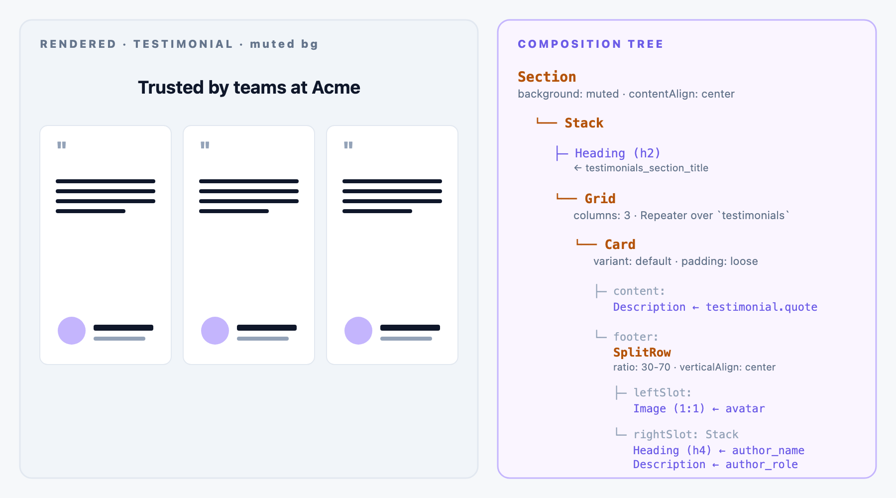
- One Section with a muted background and a heading
- A 3-column Grid acting as a Repeater over testimonials
New to binding inside a Repeater? See the Data Picker + Repeater walkthrough in the Feature Grid recipe: same flow, same picker, scope shifts to one testimonial entry inside the Repeater slot.
- Per-testimonial Card with quote (content) + avatar + author name + role (footer via SplitRow)
Prerequisite: the Content Type Shape
landing_page: with:
| Field UID | Type | Notes |
|---|---|---|
| testimonials_section_title | Single-line text | Section heading |
| testimonials | Reference (multi) to testimonial | The list the Grid repeats over |
testimonial: one entry per quote:
| Field UID | Type | Notes |
|---|---|---|
| quote | Multi-line text | The testimonial body |
| author_name | Single-line text | Name displayed after the quote |
| author_role | Single-line text | Title / company |
| author_avatar | File (asset) | Circular avatar image |
Composition Tree
Section (spacing: spacious, background: muted, contentAlign: center)
└── Stack (spacing: loose, alignment: center)
    ├── Heading (text: "Trusted by teams at", level: h2)
    └── Grid (columns: 3, spacing: normal)                    ← Repeater over `testimonials`
        └── Card (variant: default, padding: loose)           ← one iteration per testimonial
            ├── content:
            │   └── Description (text: <quote>, emphasis: default)
            └── footer:
                └── SplitRow (ratio: 30-70, verticalAlign: center)
                    ├── leftSlot:
                    │   └── Image (src: <avatar>, aspect: 1:1, fit: cover)
                    └── rightSlot:
                        └── Stack (spacing: tight, alignment: left)
                            ├── Heading (text: <author_name>, level: h4)
                            └── Description (text: <author_role>, emphasis: muted)
Bindings
Section-level (static):
- Section.spacing: spacious
- Section.background: muted
- Grid.columns: 3
- Card.variant: default
- Card.padding: loose
- SplitRow.ratio: 30-70
Repeated per testimonial (Grid is a Repeater over landing_page.testimonials):
- Section Heading.text binds to landing_page.testimonials_section_title
- Per-card Description.text (quote) binds to testimonial.quote
- Per-card Image.src (avatar) binds to testimonial.author_avatar.url
- Per-card Heading.text (name) binds to testimonial.author_name
- Per-card Description.text (role) binds to testimonial.author_role
Varieties From the Same Tree
- 2-column layout: Grid.columns: 2 when quotes run long and each testimonial deserves more room.
- Ghost cards on a plain background: Card.variant: ghost + Section.background: none for a lighter, borderless treatment.
- Add a brand logo per testimonial: drop a small Image at the top of each Card’s header slot. Bind to a new brand_logo field on the testimonial CT.
- Stars / rating: introduce a Rating atom (small addition) or use an Image with a rating-visual asset per testimonial.
- Longer, hero-style testimonials: Grid.columns: 1 renders as a single-column stack of full-width testimonials, useful for landing pages that lead with proof.
Which Layout Props to Expose
- Good Exposed Props: Grid.columns (2 or 3 for landing-page density variations), Section.background (muted / brand / none), Card.variant.
- Static per Section: everything on the atoms.
Building This in Studio: Step by Step
- Create the testimonial Content Type with quote, author_name, author_role, author_avatar.
- Add a testimonials Reference-multi field to landing_page.
- Create 3+ testimonial entries with real quotes.
- Open the Sections palette, Create Section, name it Testimonial Cards — 3-column.
- Set the linked schema to landing_page.
- Drag Section. Configure spacing: spacious, background: muted, contentAlign: center.
- Drag Stack. Configure spacing: loose, alignment: center.
- Drop Heading (level: h2, bind to testimonials_section_title).
- Drop Grid below the heading. Configure columns: 3.
- Bind Grid to landing_page.testimonials, becomes a Repeater.
- Drop Card into the Repeater iteration. Configure variant: default, padding: loose.
- In Card’s content: drop Description, bind text to testimonial.quote.
- In Card’s footer: drop SplitRow, configure ratio: 30-70, verticalAlign: center.
- In SplitRow’s leftSlot: drop Image, bind src to testimonial.author_avatar.url, configure aspect: 1:1, fit: cover.
- In SplitRow’s rightSlot: drop Stack (spacing: tight, alignment: left), then Heading (level: h4, bind to testimonial.author_name) and Description (emphasis: muted, bind to testimonial.author_role).
- Save the Section. Preview: 3 testimonials render as 3 Cards.
Testing
- Fill a landing_page entry with testimonials_section_title and 3 testimonial references.
- Drop Testimonial Cards — 3-column on a Template with URL /landing/:slug.
- Verify each card renders with quote, avatar, name, and role.
- Add a 4th testimonial to the reference list. The Grid picks it up automatically and wraps to a second row.