The Data Tab in the Right Panel
Freeform-only surface. The Data tab renders only when Enable Freeform Feature is on for the Studio project. With Freeform off, the right panel collapses to Settings only: no per-component Data tab, no pinned-entry picker, no external-data source. This page lives under the Freeform chapter for that reason. To enable Freeform, see Freeform overview: Turning Freeform on.
Do It With a Skill
Binding through this tab is part of authoring, so reach for build-section or build-connected-template.
curl -fsSL https://studio-documentation.contentstackapps.com/install.sh | sh
For the underlying contract, which binding types exist and where they live in the composition JSON, read author-composition-bindings.
What Changes When Freeform is Off vs On
| Freeform ON: three-tab right panel | Freeform OFF: Settings only, no tab strip |
|---|---|
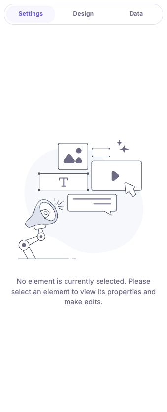 | 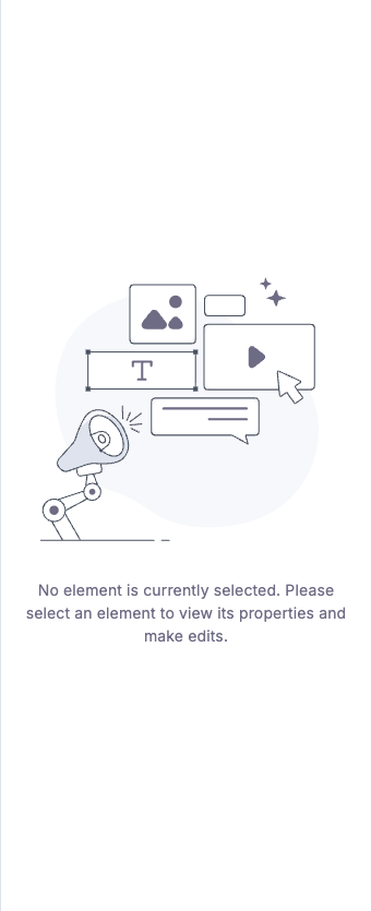 |
| Data tab visible alongside Settings and Design. Selecting a component reveals pinned-entry binding, external-data pickers, and per-component data sources. | No tab strip. Selecting a component only exposes Settings-level prop editors. The Data tab and everything it hosts are gone. |
When you select a component on the Studio canvas, the right panel switches into a per-element editor. The Data tab (also called Settings) is where you decide what content each component renders. It is paired with the Design tab (styles) and, at the page level, with a separate Page Data view that holds the data sources the whole composition can draw from.
This page explains, from a marketer’s point of view, what each subsection does and walks through pinning an entry so its fields become bindable inside any component.
When the Data Tab Appears
The Data tab is only meaningful when an element is selected.
- If nothing is selected, the panel shows the empty state “No element is currently selected. Please select an element to view its properties and make edits.”
- If the selected component has no exposed props, the panel shows “This component does not have fields to set data.” In that case, the developer must expose props on the component first.
- For Section components, an additional Section field binding area appears so you can map the section’s slots and props at once.
What Each Subsection Does
When a component is selected, the Data tab renders three accordions, top to bottom:
1. Configuration
Component-level switches that change how the element renders (for example, “Show/Hide Hidden Elements”). This is the section to use when you want to toggle behavior without touching individual fields.
2. Properties
The heart of the Data tab. One row per exposed prop on the component. Each row is a NodePropInput that opens the Data Picker popover when clicked. The picker lets you bind the prop to one of five data sources, defined in dataSources: DataSource[]:
- Linked Template Entry: the entry attached to the current template. Use this for the main page content.
- Additional Entry Data: any extra entries you pinned to the composition from the Page Data view (see below). Tooltip: “These entries are directly pinned to this section. Their data is always rendered regardless of which template uses the section.”
- Contentstack Query: a saved query (built via the Query Builder) that returns a list of entries.
- Component Default Data: the built-in default values the developer shipped with the component. Useful as fallbacks.
- Repeater Data: only available inside a Repeater. Exposes the current iteration’s fields.
A sixth source, Static value, is registered for binding lookups but does not appear as a picker option. Static values are added via the static-value drop interaction.
3. Attributes
HTML-level metadata: the element ID and any custom key/value attributes. Reserved keys (class, style, and Studio-internal attributes) are blocked.
(For Section components, the Attributes accordion is hidden because attributes belong to the children inside the section.)
Pinned Entries, Pinned Queries, External Data: Where They Live
These three concepts are page-level, not per-component. They appear on the Page Data view (sibling of the right-panel component editor), driven by src/components/PageData/index.tsx. Each one is a card in the empty state and an Accordion once populated:
| Card | What it represents | How to add |
|---|---|---|
| Pinned Entries | Entries pinned to the composition. Backed by the contentstack data source. | Click the card, or use Link Entry in the Additional Entry Data accordion. |
| Pinned Queries | Saved Contentstack queries. Backed by the query data source. | Opens the Query Builder modal. Requires the PAGE_DATA_QUERIES SDK capability. |
| External Data | A schema slot for non-Contentstack data the host app injects at runtime. Backed by the external data source. | Click the card to initialize an empty external data object. |
Once any of these are populated, the matching entries, queries, or props become selectable in the per-component Data Picker under Additional Entry Data, Contentstack Query, or Component Default Data respectively.
Walkthrough: Pinning an Entry and Binding It
- Open the composition and switch the right panel to Page Data.
- Click the Pinned Entries card (or, if entries are already pinned, the Link Entry button in the Additional Entry Data accordion, test ID link-entry-button).
- In the entry picker, select one or more entries and confirm. Studio writes them onto the composition via actions.canvas.updateDataSourceEntries.
- Select a component on the canvas. Open its Data tab.
- Under Properties, click the prop you want to bind. The Data Picker popover opens.
- Choose the Additional Entry Data source. Expand the entry you just pinned and pick a field. Studio writes the binding and the canvas re-renders with the field’s value.
The entry now travels with the composition: any template that uses this section renders the same pinned content.
Design Props: Settings That Change Per Screen Size
Some properties carry a small breakpoint tag next to their label. These are design props: visual settings (padding, gap, corner rounding, …) that can hold a different value per breakpoint. The control always edits the breakpoint the canvas is currently showing:
- Pick a value on desktop. It applies to every screen size.
- Switch the canvas to mobile (the breakpoint switcher in the top bar) and pick a different value. Mobile now overrides desktop, and an override dot appears next to the property.
- Reset removes the override so the value inherits from wider breakpoints again.
Each breakpoint’s value can also be bound to data via the database icon, exactly like other properties: one source (manual value or binding) per breakpoint. Whether a property is a design prop is decided by the developer who registered the component (developer guide).
See Also
- CMS binding: how bindings are serialized into the composition JSON.
- Layers: selecting the right node so the Data tab targets what you intend.
- Design panel: the styles-side counterpart to the Data tab.
- Composition overview: where the Data tab sits in the larger authoring flow.