Standard Studio Page Anatomy: One Template, Three Sections
You ship a blog post route in React today. This walkthrough converts it into Studio’s model: a Template at the top, holding an ordered list of Sections underneath. No prior Studio knowledge assumed. About 15 minutes.
You’ll pick up:
- Two anchor concepts: Template (bound to a URL) and Section (a named part of a page).
- Component registration: the contract that lets Studio call your React components.
- Two kinds of Slot: the extension points that keep your compositions reusable without forking components or Sections.
- How the three parts of your existing <BlogArticle> (hero, body, related) become three sibling Sections plus a Template that composes them.
- What changes in your existing route code (spoiler: nothing you don’t opt into).
Do It With a Skill
plan-studio-architecture produces this anatomy for a page of your own: the Sections and their linked schemas, the Section Slots, the content types, and Connected versus Freeform per page. It prints the plan for approval and builds nothing until you approve it.
curl -fsSL https://studio-documentation.contentstackapps.com/install.sh | sh
Mental Model: the Three Things Any CMS-driven Page Does
Any page that reads from a CMS does exactly three things. Studio’s building blocks map one-to-one to them:
| The page needs to… | Studio primitive |
|---|---|
| 1. Fetch the data | The Template. It’s bound to a URL + Content Type, so hitting the URL fetches the matching entry. Additional data comes from the same source family (pinned entries or saved queries) all declared on the composition. |
| 2. Iterate over the schema | A List Section: a section whose root is a Repeater. Used whenever a field holds N items: a reference field, a modular blocks field, or a group with multiple: true. It walks the items and (for MB / references) branches per matched type via a Condition Block. |
| 3. Bind schema fields to component props | A Simple Section: a section with no root Repeater. It maps one field to one prop (headline maps to hero’s title, body maps to text-block’s content, and so on). This is the “component + schema binding” pair Studio’s whole model is built on. |
That’s the whole loop: fetch, then iterate, then bind. Every composition (from a single hero to a marketing page with a dozen sections) is a combination of these three. Your existing route code stays as-is. Studio just becomes the layer that decides which Section renders what data at each spot, driven by config the CMS ships.
The rest of this page is that mental model expanded: how the three parts of a typical <BlogArticle> map to a Template, a Simple Section (hero), and two List Sections (body modular-blocks and related references).
Prerequisite: Register Your Components
Every React component you want Studio to render is registered once, a small declaration per component that tells Studio the component exists, which props it accepts, and gives it a stable string ID for the compositions to reference. Full mechanics + all the options: Registering components (canonical home).
Before you write your first registerComponent() call, read Component shape rules. Five tactical rules that determine whether Studio can bind to your components at all. The most common failures (silent blank renders, unreachable child bindings, unbindable inner components inside a wrapper’s .map()) all trace back to skipping these rules. This walkthrough assumes you’ve applied them.
For this walkthrough you’ll register <Hero>, <TextBlock>, <ImageBlock>, <RelatedResources>, <ArticleCard>, <PodcastCard>. Not <BlogArticle> itself. You’ll see why in Step 2. Notice each of these is a Layer-1 or Layer-2 shape: atoms (a <TextBlock> with one text prop) or layouts with slots (a <Hero> with a cta slot prop for the CTA). No monolithic <BlogArticle> with 20 props bound to 20 fields.
Two strings that share a name. Don’t confuse them. Content types in Contentstack have Modular Block fields, and each block inside has a block-type string like text_block. Registered components ALSO have a componentUid / type string like "text-block". Naming them similarly is convention. The binding is manual, done once when you author the Section. Studio doesn’t link them by name automatically.
Hard constraint you’ll rely on later: Studio can only bind to props the component already accepts. If <Hero> doesn’t declare a subtitle prop today, no Studio work adds one. That’s still a code change to the component. Registration is the contract. Studio never exceeds it. Corollary: a child component that appears as hardcoded JSX inside another component’s render is invisible to Studio’s binding UI: its props exist in React but not in Studio’s authoring surface. See Component shape rules § Rule 2 for the extract-to-slot fix.
Prerequisites for the rest of this walkthrough: you have a Studio project set up and can open its canvas in a browser. If not yet, run Getting Started: Quickstart 1 (Setup) first (~15 minutes), then come back.
Step 1: the Page Today
Picture a normal blog post: one hero at the top, some content blocks in the middle, and a “related articles” carousel at the bottom.
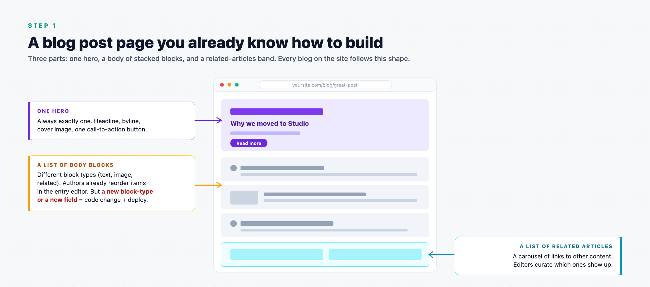
In code you have one component that renders the whole thing:
function BlogArticle({ entry }) {
  return (
    <article>
      <Hero {...entry.hero_group} />
      {entry.body_sections.map(section => /* if/else per block-type */)}
      <RelatedArticlesBand refs={entry.related} />
    </article>
  );
}
<BlogArticle> is a wrapper, no visual identity of its own. It composes three sub-parts in a fixed order. That’s important, because Studio’s model does not have a “BlogArticle” concept. It has a Template that composes three sibling Sections.
Where Studio removes the code-half of “schema change plus code change” asks:
- Adding a new block-type to the body (say video_block): schema change plus <BlogArticle>‘s if/else dispatcher today. Schema change plus adding a Condition Block in Studio with Studio.
- Rebinding an existing prop to a different schema field: JSX edit today. Right-panel action with Studio.
- Swapping which component renders a block-type: JSX edit today. Point the CB at another registered component with Studio.
- Reusing this composition on a landing-page Template with different bindings: duplicated JSX today. Drop the same Section on another Template.
Two things Studio does NOT do, often assumed to be Studio wins but not:
- Reorder / add / remove instances of an existing block-type. That’s a CMS entry-editor feature. It worked before Studio.
- Click-to-edit content inline on the live page. That’s Visual Editor, a sibling Contentstack product. Studio is about composition. Visual Editor is about in-place authoring.
Step 2: the Studio Model, One Template, Three Sections
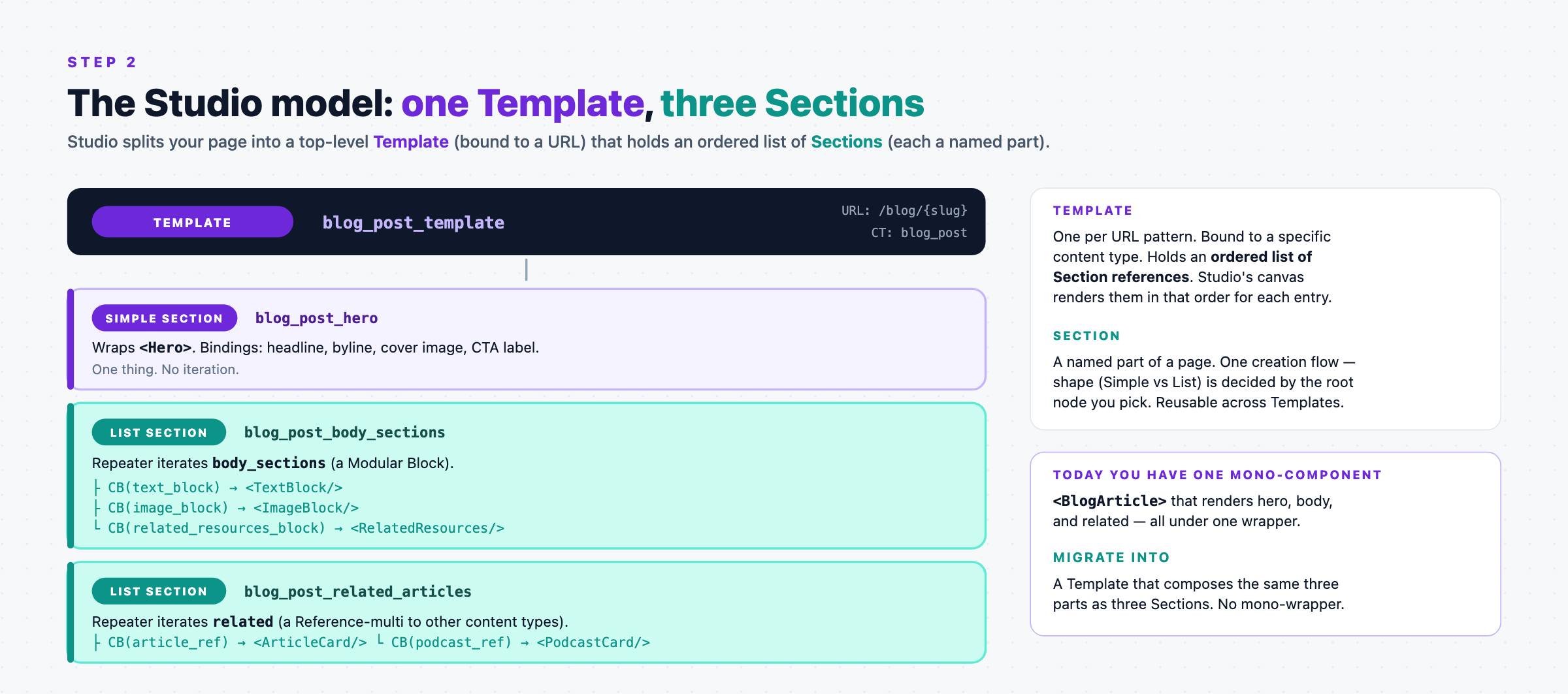
Two new concepts to name:
- Template: the top-level composition. Bound to a URL pattern (e.g. /blog/{slug}) and a content type (blog_post). Holds an ordered list of Section references. Studio renders those Sections in order for each entry. One Template per URL pattern.
- Section: a named, reusable part of a page. Never bound to a URL itself. It’s a piece that gets composed into one or more Templates.
For our blog post page:
- Template: blog_post_template, URL /blog/{slug}, CT blog_post.
- Section 1: blog_post_hero, wraps <Hero>. No iteration.
- Section 2: blog_post_body_sections, iterates the body_sections Modular Block.
- Section 3: blog_post_related_articles, iterates the related Reference-multi.
<BlogArticle> disappears as a Studio concept. Its only job today is “render the three parts in order,” and the Template does that job now. Your React <BlogArticle> file can stay for backward compat, be deleted, or be refactored. Studio doesn’t care.
One creation flow, two Section shapes. Studio does NOT have “Simple Section” and “List Section” as separate primitives. There’s one command: + New Section. The shape you end up with depends on the Section’s root node:
- Root is a Repeater bound to a multi-shaped field (Modular Block, Reference-multi, Group multiple:true), so the Section behaves as a List Section. Iterates and dispatches per item via Condition Blocks.
- Root is anything else (typically a component with prop bindings), so the Section behaves as a Simple Section. One shape, no iteration.
“Simple” and “List” are the mental categorization the community uses. In Studio’s UI they’re the same command. Every Section is just a Section. Its root decides the mechanics.
Step 3: Meet Slots, the Two Extension Points
Before we build any Sections, one 90-second concept every reader needs: Slots. Studio has two kinds, and they solve two different problems.
A Slot is a place where something can be plugged in later.
The two kinds differ in where they live and when they get plugged in.
Kind 1: Component Slot
A placeholder inside your React component, declared as a prop.
Says: “when someone drops this component into a Section, they can drop another registered component into this placeholder.” Filled when you author the Section: one Section, one filling.
Real example. Your <Hero> component’s CTA today is hard-coded to <a href=…>Label</a>. That’s fine on the blog page. But on a webinar landing page you’d want a form widget in the CTA area. On a pricing page you’d want a plans-comparison button. Without a Component Slot, you have three options: fork <Hero> three ways, hardcode branching inside <Hero>, or fork the Section three ways. All bad.
The fix: declare a slot prop in <Hero>:
function Hero({ headline, subhead, cover_image, cta }) {  // ← `cta` is a slot
  return (
    <section className="hero">
      <img src={cover_image} alt="" />
      <h1>{headline}</h1>
      <p>{subhead}</p>
      <div className="hero-cta">{cta}</div>              {/* ← fill point */}
    </section>
  );
}

registerComponent({
  type: "hero",
  component: Hero,
  props: {
    headline:    { type: "string" },
    subhead:     { type: "string" },
    cover_image: { type: "image" },
    cta:         { type: "slot" },                       // ← declared Component Slot
  },
});
Now, when you build blog_post_hero in Studio’s canvas, Studio shows cta as an empty drop-zone. Drop <PrimaryButton> into it and bind its label + href to hero_group.cta.label / hero_group.cta.href. Done. On the webinar Template, a different Section (webinar_hero) uses the same <Hero> but drops <InlineForm> into cta. Same component, three uses, three different CTAs.
When to reach for a Component Slot: the swappable piece is inside a specific component’s layout, and it’s a component-authoring decision to make that region pluggable.
Kind 2: Section Slot
A placeholder inside a Section, marked while you’re authoring the Section in Studio’s canvas.
Says: “when a Template embeds this Section, the Template can plug a Section or a Component into this placeholder.” Filled per embedding, so the same Section can look different on different Templates.
Real example. The area below the Hero should show different things on different Templates: a “reading time · share” strip on the blog Template, a “trust logos” band on marketing landing, a “recent posts by this author” list on the author profile Template. None of that is <Hero>‘s job. It’s page-shape territory, one level above the component. Without a Section Slot: three near-identical blog_post_hero_v1/v2/v3 Sections that diverge only in the below-hero band, and every schema change to the Hero fields would need three sync’d edits.
The fix: expose a Section Slot in blog_post_hero (in Studio’s canvas):
- In the Section tree, click the empty area below <Hero>.
- Choose + Add Section Slot.
- Name it notes_area.
- Optionally constrain what can plug in (any Section that binds to a “notes shape”, or leave open).
No React changes. The Section now looks like:
Section: blog_post_hero
  <Hero> (component)
    headline, subhead, cover_image bindings
    cta slot → <PrimaryButton>
  ── Section Slot: notes_area ──
    (empty — Template fills it)
Blog Template plugs a share_bar Section into notes_area. Marketing Template plugs trust_logos. Author-profile Template plugs recent_posts. Same blog_post_hero embedded in all three.
When to reach for a Section Slot: the swappable piece isn’t natural to any single component’s API. It’s page-shape territory, and the swap decision belongs to the Template that embeds this Section.
First, the plain version: a LEGO analogy for someone brand new
Skip this box if you’re already comfortable with Studio. The rules below still apply.
Think of Studio as three layers of LEGO:
- A LEGO piece = a component your engineer designed. Say, a door piece with a hollow doorway.
- A LEGO kit = a Section: a small set your designer builds once (“Hero kit”, “Card Grid kit”). The kit says which pieces snap together, in what arrangement.
- A finished LEGO scene = a Template: the whole page (Blog Post scene, Product scene), assembled from kits.
Now the three primitives, in plain terms:
- Component Slot = the hollow doorway on the door piece. Whoever builds the kit (Section author) decides what stands in the doorway: a flowerpot, a lamp, a small figure. Default to this. If the choice is a design decision the kit-builder can make once, put a hollow spot in the piece and let them fill it.
- Section Slot = a kit that ships with ”place your own piece here” stickers. The scene-builder (Template author) decides what goes in that spot, freshly, every time they use the kit. Use this only when the choice truly belongs to the scene, not the kit, because the same kit is used in scenes that need genuinely different fills.
- Exposed Section Prop = a knob on the kit: “you can change the door color per scene.” Not a whole swap, just a value tweak.
How to decide, in one sentence: “Would every scene using this kit want the same thing here? Component Slot. Would each scene want to pick something different? Section Slot. Just changing a value? Exposed Prop.”
The natural progression is a Component Slot first, then a Section Slot only when needed, then an Exposed Prop for value tweaks. The rules below are the same idea in Studio’s vocabulary.
Decide: default to Component Slots
Three primitives handle variability. They are not peers. They have a strong default order:
1. Default to Component Slots. Design your components to accept plug-in children wherever the shape is variable. This is where most swap-ability should live. It’s decided at Section authoring time, and any Section that uses the component gets it for free.
2. Reach for a Section Slot ONLY when the fill decision belongs to the Template author, not the Section author. If the swap has to happen per-Template (blog vs marketing vs product), a Component Slot alone can’t do it. The Section author fills it once and it’s locked on Save. That’s the moment for a Section Slot.
3. Use Exposed Section Props when only a value needs to change: a label, a href, a tone. Not a whole region, just a scalar.
Combined lookup:
| The variable piece is… | Fill decision belongs to… | Reach for |
|---|---|---|
| A region inside a component’s layout | Section author (drops component in the Section) | Component Slot (slot prop), the default |
| A region inside a Section, between/around components | Template author (per Template instance) | Section Slot |
| A single value on something already placed | Template author (per Template instance) | Exposed Section Prop |
One-line heuristic:
Component Slot first. Escalate to a Section Slot only when the Template needs to make the call. Use Exposed Props for value-level tweaks.
Two follow-on rules that catch the common mistakes:
- Don’t reach for a Section Slot when a Component Slot would do. If the swap is decided once by the Section author and doesn’t need to vary per Template, keep it in the component. Section Slots exist for Template-time decisions. Using them for Section-time decisions adds a rung of indirection with no payoff.
- Many exposed props on the same subtree ≠ region control. If you find yourself exposing three or four props on the same subtree so Templates can restyle it wholesale, escalate to a Section Slot: one droppable region beats N overridable values.
The two chain naturally: a Component Slot in the design can hold a Section Slot. The section author drops a Section Slot into the component’s slot prop, deferring that specific region’s fill to the Template. That’s the escalation path from “Component Slot handles it” to “Template needs to decide.”
The bigger picture: a Section is a compound component
Everything you build with these primitives adds up to this: a Section is a compound component you assembled in Studio. It has the same two surfaces a code component has, and templates consume them the same way:
| Code component | Section equivalent | Template author controls |
|---|---|---|
| Props (title, href, tone, …) | Exposed Section Props | Which values are overridable per instance |
| children / slot props | Section Slots | Which regions are droppable per instance |
Design a Section by asking those two questions: what should the template author be able to change (Exposed Props), and what should they be able to drop into (Section Slots). Everything else is locked structure. Full framing: Section Slots: Sections are compound components.
What you’d have lost by skipping Slots: every variation becomes a new component or a new Section. Slots keep that from ballooning.
Build the Example End-to-End
Everything so far has been the mental model. To see it built (three Sections composed into a Connected Template, with the exact canvas actions per step), see the full walkthrough:
Build the Studio Page example: full walkthrough
Ten steps (Section 1 Hero + Section 2 Body List + Section 3 Related Articles + Template assembly + route swap + nested iteration + how the runtime handoff works). ~15-30 min end-to-end.
Or take a newcomer path with self-contained, uniform-shape Quickstarts:
- Quickstart 3: Build a Simple Section: the Hero equivalent.
- Quickstart 4: Build a List Section: the Body / Related Articles equivalent.
- Quickstart 5: Create a Template + URL: the Template assembly.
What You Gain, Precisely
Things authors already do via the entry editor (reorder items, add/remove instances of an existing block-type, edit field values) aren’t in this table. What Studio uniquely removes is the code half of every “schema change plus code change” ask.
| Concern | Before | With Studio |
|---|---|---|
| Add a new block-type to a Modular Block | Schema change + edit dispatcher | Schema change + add a CB in Studio |
| Swap which component renders a block-type | Edit dispatcher in JSX | Point the CB at a different component |
| Rebind an existing component prop to a different field | JSX edit | Right-panel binding picker |
| Swap a whole Section variant on a Template | New file + route change | Drop a different Section variant |
| Reuse a bound arrangement across pages | Component-level reuse only | Section-level reuse (bindings included) |
| Bind an entire Template to a URL, data-driven | Route file per page shape | One Template, entries drive the URL |
| Different rendering of a block-type per page shape | Fork the parent component / Section | Expose the CB’s Slot as a Section Slot |
What to Read Next
- Sections chapter: full authoring reference for both Section shapes.
- Templates chapter: Connected Templates in depth.
- Migrate a page from hand-coded: the per-route conversion playbook.
- register-component, build-section, build-repeating-section, build-connected-template: skills that automate each step.