Quickstart 3: Build a Simple Section + Expose Props
Build a Hero Section bound to a Group field on your content type. Expose one prop so each Template can override it per-instance.
Watch the walkthrough (7:26): it also covers the section canvas route, filling a Section Slot from a Template, and exposing a prop. See all six videos.
Do It With a Skill
build-section links a Section to a structural schema and drops your registered components onto it, which is what this quickstart does by hand.
curl -fsSL https://studio-documentation.contentstackapps.com/install.sh | sh
What You’ll Have at the End
- A hero_section Section composition in Studio.
- Bound to a hero Group field on the blog_post content type (fields: headline, subhead, cover_image).
- One prop (headline) exposed so each Template that drops this Section can rename it.
- Two Templates using the same Section, showing different headlines.
Prerequisites
- Quickstart 2 done: a <Hero> component is registered. If you don’t have one:
export function Hero({ headline, subhead, cover_image }: { headline: string; subhead: string; cover_image: string; }) { return ( <section style={{ backgroundImage: `url(${cover_image})` }}> <h1>{headline}</h1> <p>{subhead}</p> </section> ); } registerComponent({ type: "hero", component: Hero, displayName: "Hero", props: { headline: { type: "string" }, subhead: { type: "string" }, cover_image: { type: "imageurl" }, }, }); - A blog_post content type with a hero Group field (subfields: headline: text, subhead: text, cover_image: file). Create it in Contentstack under Content Types if missing.
- A section canvas route: a dedicated /canvas route mounting <StudioCanvas />, plus a matching Canvas URL in project Settings. Set up in the one-time step below if you haven’t already.
What “simple Section” Means
A Simple Section has NO Repeater at its root. It renders one shape, one time. Bound to:
- One content type, or
- One Global Field, or
- One Group field, or
- One block from a Modular Block, or
- One target CT of a Reference field.
Iterating collections is a List Section: Quickstart 4.
Before You Build: Set up the Section Canvas Route (one-Time)
A Section has no URL of its own, so the wildcard route from Quickstart 1 (<StudioUrlRenderer />) can’t render it for editing. Sections author on a dedicated canvas route that mounts <StudioCanvas />. You only do this once. Every Section you ever build reuses it. It has two halves that must agree:
a. Add the dedicated route in your app
Add a /canvas route alongside the wildcard route in src/App.tsx. Never replace the wildcard, and never point the wildcard at <StudioCanvas />:
import { Route, Routes } from "react-router";
import { StudioCanvas } from "@contentstack/studio-react";
import "./contentstack/initialize";
import { StudioUrlRenderer } from "./contentstack/StudioRenderer";

function App() {
  return (
    <Routes>
      <Route path="/canvas" element={<StudioCanvas />} />
      <Route path="*" element={<StudioUrlRenderer />} />
    </Routes>
  );
}

export default App;
<StudioCanvas /> is editing-only. It renders null outside Studio, so visiting http://localhost:3010/canvas directly just shows a blank page. That’s expected. It only comes alive inside Studio’s iframe.
b. Point Studio at that route
In Studio, open your project and go to Settings, then Configuration:
- Set Canvas URL to /canvas (must match the route path above, exactly).
- For Environment and Language, pick the ones whose Base URL resolves to your running app (the origin you set in Prerequisites § Environment Base URL).
If the path in Settings and the path in your router don’t match, the section canvas loads blank or errors with MISSING_CANVAS_URL.
Steps (in Studio’s Canvas)
1. Create the Section
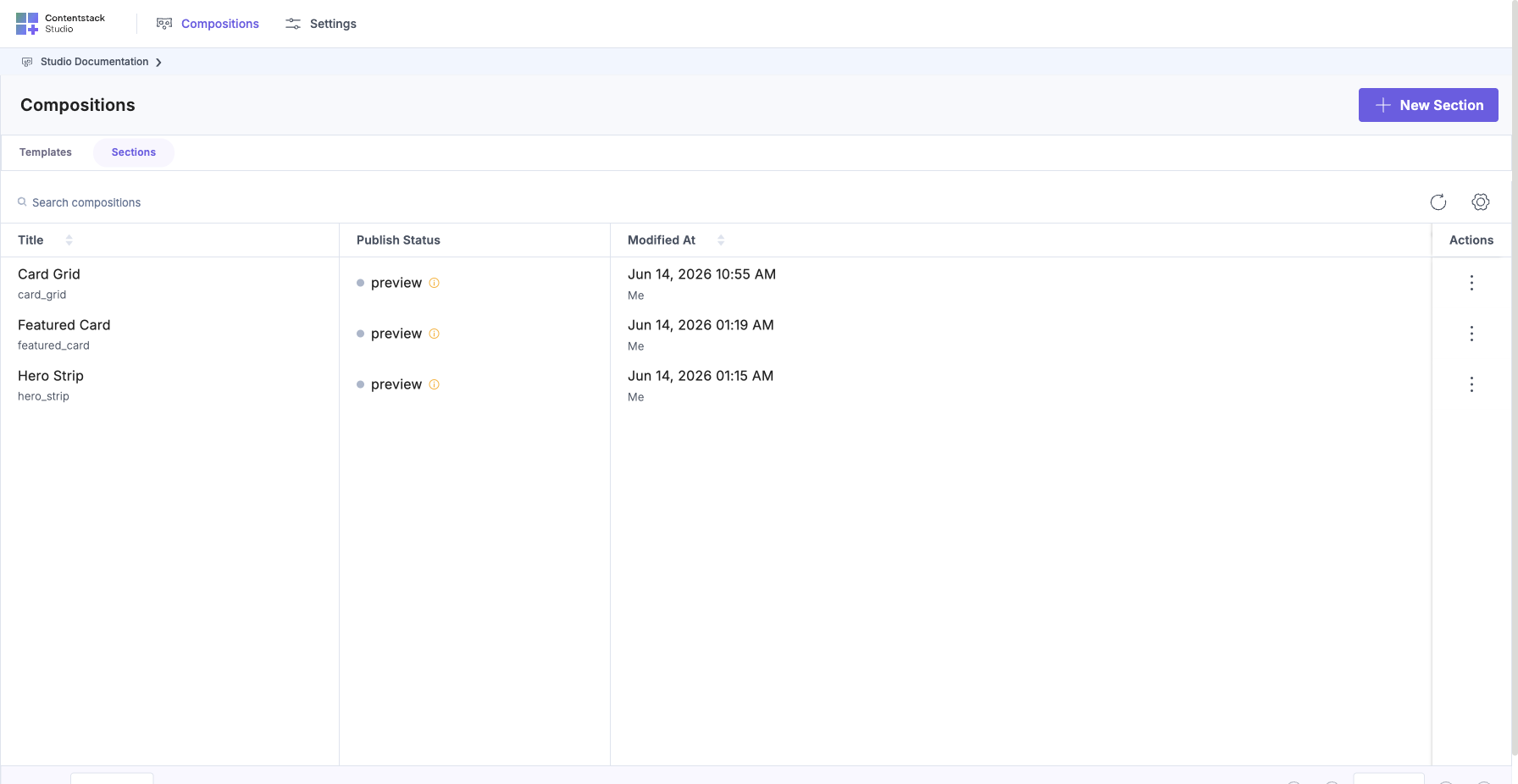
In Studio, open your project, go to Compositions, select the Sections tab, and click + New Section.
In the modal that opens:
- Title: Hero Section.
- Composable UID: hero_section.
- Link to schema: pick the blog_post content type, then set Selected field: to hero (the Group). This tells Studio “this Section renders one hero group’s shape.”
Save.
2. Drop the Hero component + inspect its bindings
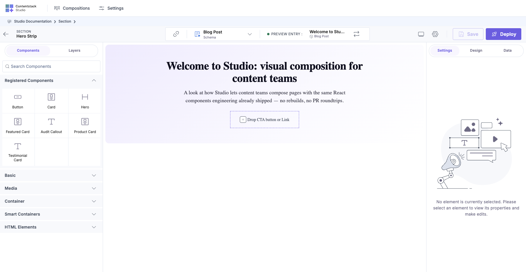
In the left palette, open Registered Components, then drag <Hero> onto the canvas.
Because the Section is linked to hero, Studio auto-binds the component’s props to the matching fields in the Group:
- Hero.headline maps to hero.headline (bound to the entry’s title field in the shot below)
- Hero.subhead maps to hero.subhead (bound to excerpt)
- Hero.cover_image maps to hero.cover_image
Click the Hero on the canvas (or in the Layers tab), and the right panel switches to Properties and lists every prop with its current binding:
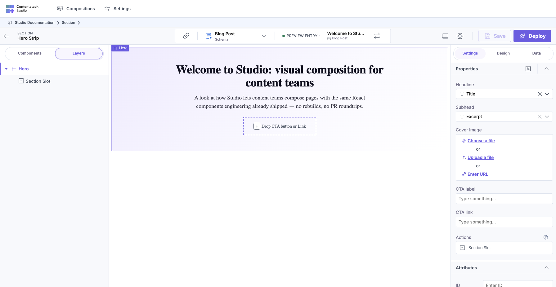
No manual binding needed. The field names matched, so Studio wired them. Full detail on how auto-binding works: Binding to CMS.
3. Save + Expose a prop
Click Save. The Expose Props modal opens.
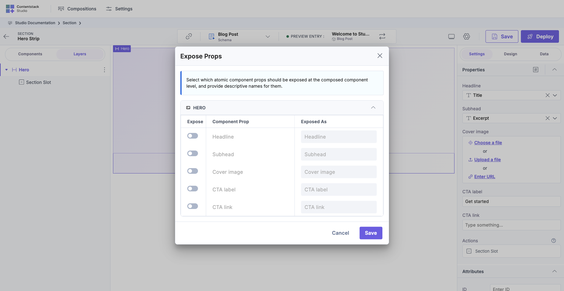
The modal lists every component prop as a row with a toggle:
- Expose ON means the Template that drops this Section can override this prop per instance.
- Expose OFF means the value is locked at whatever the Section author set. Templates can’t touch it.
Toggle headline ON. Rename it to something Template-authors will recognize (Card Title or Hero headline) in the “Exposed As” column. Leave subhead and cover_image off (they’ll always come from the entry’s hero group).
Save.
4. Drop the Section on two Templates
Skip if you don’t have Templates yet. This ties into Quickstart 5.
If you do have Templates:
- Open Template A and drop hero_section. The right panel shows one field, Hero headline, with the default value from the entry.
- Type “Welcome to the blog”, then save.
- Open Template B and drop the same hero_section. The right panel shows Hero headline with the entry’s default.
- Type “Featured posts”, then save.
Same Section. Two Templates. Different headlines. subhead and cover_image still come from each entry’s hero group.
Verify
- Opening the Section shows your app’s canvas in the iframe (not a blank page or MISSING_CANVAS_URL), confirms the /canvas route + Canvas URL setting agree.
- Hero Section appears in the Sections tab of your project’s Compositions list.
- Its linked_schemas in the entry JSON is [{ content_type_uid: "blog_post", selected_field: "hero" }].
- headline is in ui.metadata.sectionExposedProps (the exposed-props declaration).
- Dropping the Section on a Template shows exactly one editable field in the right panel.
What Just Happened
- Linked schema told Studio which slice of the entry this Section renders: the hero group.
- Auto-binding matched the component’s prop names to the group’s field names. You didn’t wire manually.
- Expose Props turned one internal prop into a Template-editable value. Everything else stays locked as the Section author decided.
Together: a Section = a compound component you built in Studio. Exposed Props are its props. You haven’t met Section Slots yet. That’s the children, covered in Quickstart 4.
Next
Quickstart 4: Build a List Section with Section Slots (~15 min).
Full-Detail References
- Sections chapter
- Binding to CMS: linked schema + auto-binding
- Expose Section Props: modal, labels, edge cases
- Section = compound component